Did you know that real GDP in the U.S. grew at a 3.7% annualized rate of growth in the first quarter of 2010? Instead of the 2.7% inflation-adjusted rate of growth that was originally reported?
Neither did we, until we realized that the Bureau of Economic Analysis revised the inflation-adjusted GDP data going back to the first quarter of 2007 with the advance release of the new GDP data for the second quarter of 2010.
That means, of course, that we get to go back and revise our forecasts, since we incorporate data from recent history into our calculations. The chart below shows how things stand after we do:
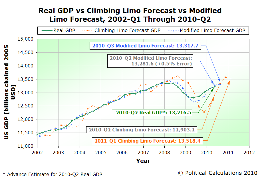
So, instead of missing the bullseye by 1.2%, with the newly revised data, our Modified Limo GDP forecasting method would only have missed the mark by 0.5% to the upside.
But then, that's only going by the advance release - the real target we're after is where GDP will be after the original data is revised for the second time in September 2010.
We've also updated our GDP temperature gauges in the right-hand margin to show the advance release data for the second quarter of 2010.
Labels: gdp forecast
 Welcome to the Friday, July 30, 2010 edition of On the Moneyed Midways! Each week, we review hundreds of posts to bring you the best posts we found from the business end of the blogosphere, at least according to the selection provided by the past week's money and business-related blog carnivals.
But quite possibly, the money and business blog carnivals we review each week may have missed what Tyler Cowen has called "the best blog post of this year so far."
The post to which he's referring is this one by StatsGuy of The Baseline Scenario. Titled "Good Government vs. Less Government, StatsGuy wonders if the correlations revealed by the Heritage Economic Freedom Index are really communicating that it's "better" government that correlates with greater economic growth, instead of "less" government, which is how many read the evidence.
It's a very good post, one that would almost certainly have been picked up by the now off-again "Carnival of the Capitalists" in years past. It most definitely would have made OMM if it had been contributed to a business or money-related blog carnival.
But the best post of the year so far? We'll show you the answer to that question in our annual wrap-up edition for 2010 early next year....
In the meantime, the best posts we found among the blog carnivals that are still running are ready for your review!
| On the Moneyed Midways for July 30, 2010 | |||
|---|---|---|---|
| Carnival | Post | Blog | Comments |
| Best of Money | It's OK to Talk About Money | DINKS Finance | Kristina says it's okay to talk about money, if you don't do three things: don't brag about it, don't be ashamed of your bank balance and don't be afraid to listen to any financial advice you might hear from the people with whom you might have a conversation on the topic! |
| Carnival of Debt Reduction | Can You Stop Foreclosure & Get Your Debt Cancelled? | The Smarter Wallet | Lawyer Earl Fischer describes the steps you need to take that might just save your home and settle your debt. |
| Carnival of HR | Top Summer Reading for Business Leaders | HR Ringleader | Trish McFarlane polls her fellow HR types to find out what they're reading this summer. The good news: it's not all dry HR type stuff - real people could enjoy some of the reading choices too! |
| Carnival of Personal Finance | Saving Money for Opportunities | The Best Money Blog | John turns Frugal Dad's advice to establish savings to deal with potential emergencies to instead focus on making sure you have the funds you need to take advantage of opportunities. Absolutely essential reading! |
| Cavalcade of Risk | With CRM Tools, Will the Hospital's Marketing Department Diagnose You Before Your Doctor Does? | Health Business Blog | What's the downside to having all your medical records be available electronically? David E. Williams reports that the technology exists for hospitals to access those records for the purpose of generating and directing specific marketing to individual patients based on what's in those records in The Best Post of the Week, Anywhere! |
| Festival of Frugality | Hit the Links for Less: Some Obvious and Not So Obvious Ways to Save on Golf | Free Money Finance | Golf was once ranked as being among the most expensive sports an individual could play. Jenna Ellis offers eight suggestions that could help you better afford the game that ruins perfectly good walks! |
| Carnival of Money Stories | My Teenage Son, His Cell Phone, and the Bill for $1,055.20 | Len Penzo dot Com | Len Penzo discovers that both his cell phone provider and his 13-year-old son take unlimited texting very seriously, as he finds out what unlimited texting is really means in terms of a erroneous monthly bill. Absolutely essential reading! |
OMM's Running Index for 2010
Presented in reverse chronological order....
- On the Moneyed Midways - July 30, 2010
- On the Moneyed Midways - July 23, 2010
- On the Moneyed Midways - July 16, 2010
- On the Moneyed Midways - July 9, 2010
- On the Moneyed Midways - July 3, 2010
- On the Moneyed Midways - June 25, 2010
- On the Moneyed Midways - June 18, 2010
- On the Moneyed Midways - June 11, 2010
- On the Moneyed Midways - June 4, 2010
- On the Moneyed Midways - May 28, 2010
- On the Moneyed Midways - May 21, 2010
- On the Moneyed Midways - May 14, 2010
- On the Moneyed Midways - May 7, 2010
- On the Moneyed Midways - April 30, 2010
- On the Moneyed Midways - April 23, 2010
- On the Moneyed Midways - April 16, 2010
- On the Moneyed Midways - April 9, 2010
- On the Moneyed Midways - April 2, 2010
- On the Moneyed Midways - March 26, 2010
- On the Moneyed Midways - March 19, 2010
- On the Moneyed Midways - March 12, 2010
- On the Moneyed Midways - March 5, 2010
- On the Moneyed Midways - February 26, 2010
- On the Moneyed Midways - February 19, 2010
- On the Moneyed Midways - February 13, 2010
- On the Moneyed Midways - February 5, 2010
- On the Moneyed Midways - January 29, 2010
- On the Moneyed Midways - January 23, 2010
- On the Moneyed Midways - January 15, 2010
Older Editions
- OMM: The Best Posts of 2009 and our full index for the year!
- OMM's Running Index for 2008
- OMM's Running Index for 2007
- The Best Blogs Found in 2006 (and our full 2006 index)!
Labels: carnival
 Since January 2008, we've made some 75 predictions where we can determine whether or not they were right or wrong, spanning everything from where stock prices might go next to how many wins or losses certain major league baseball teams would have at the end of the regular season in 2010. But we have an ongoing nagging question: are we really any good at it?
Regular readers of Political Calculations know we take the crystal ball business pretty seriously, providing quarterly updates for all the predictions we've made. Better still, we apply the absolutely unforgiving plus-minus statistic from hockey and basketball, where we gain a point if we're right, lose a point when we're wrong, and score a zero for when the outcome of a prediction cannot yet be determined, or in the case where we make multiple predictions that ultimately cancel each other out.
Ultimately, the plus-minus score counts the number of times our predictions were right more than they were wrong. If we're no better at predicting the future than a coin toss, our plus-minus score will gravitate toward zero. If we're better at predicting the future than that, our score will rise over time. And if we're really bad at prognostication, our score will fall over time.
We say unforgiving because we either hit our defined prediction target, or we don't. Near misses don't count. Which is sad for us because we've had more than a few....
Feh. Enough pity. Let's talk about how we've done since our last update.
We went back over our full track record and found a counting error in our plus-minus score through April 2010, which reduced our score from +24 to +23. We then also noticed that we hadn't closed out the second part of a prediction we made back in May 2009, which dropped our plus-minus score to +22, since it worked out to be a split decision.
So how have we done once we incorporate all the latest predictions we've made since April 2010? For the 75 predictions where we've been able to determine their outcome, we've scored 49 as correct and 26 as incorrect, giving us a plus-minus score of +23. As an alternative way of measuring how effective we are at predicting the future, we can say that things have turned out the way we anticipated they would some 65.3% of the time.
We're kind of curious to see how that might compare with others. We'll have to do some research to find out if anyone keeps track of these things, or if like TV weathermen, it just doesn't matter how often you're wrong!
The table below shows the predictions that we either are still waiting to find out if they're correct or not or have been able to make a determination of whether they're correct or not.
| Political Calculations' Plus-Minus Score Update, 30 July 2010 | |||
|---|---|---|---|
| Date | Prediction | Outcome | +/- Score |
| 26 May 2009 | We pick up on an unlikely correlation between the timing of plunges in the stock market and the results of our preferred method for determining the probability of recession in the U.S. We predict stocks will dive in value around 16-23 June 2009 and 10-16 September 2009. | One down, one to go. The timing for the June drop actually coincided with the work week, beginning on Monday, 15 June 2009 and ending a week later. We'll have to see where things stand in September to see if we scored a two-fer here! Update: It was only a one-fer, as stock rose from 10 September 2009 through 16 September 2009. The split decision knocks our score to zero for the two predictions. | +0 |
| 13 August 2009 | We make fun of 47 economists for predicting that the U.S. recession would end in the third quarter, based on the "Cash for Clunkers" program. We point out that the dividend futures data for the S&P 500 has been saying the recession would be over in 2009Q3 for months, long before C4C even became legislation! | Too soon to tell. This prediction looks pretty likely, but we'll have to wait for the NBER to get around to declaring the date of the end of the recession. Update: Looking more and more likely. | +0 |
| 21 December 2009 | Using incomplete data for the month of December 2009, economy would dip in the second quarter of 2010, with a slow recovery afterward. We anticipate that meaningful growth in the number of jobs would likely begin with the third and fourth quarters of 2010. We anticipate that the NBER will declare the recession they found to have begun in December 2007 to have ended in the third quarter of 2009, but we make a case for 2010Q2 as a more realistic alternate. | Too soon to tell. It will be a while before we get a full confirmation for these predictions. On the potential plus side for us, different branches of the Federal Reserve have used their own models for predicting what the NBER will do to find that July 2009 is the month they will most likely declare to be the ending date for the recession. | +0 |
| 31 March 2010 | Using the finalized data for the fourth quarter of 2009, we project GDP for the first quarter of 2010 will be within 2% of $13,276.5 billion chained 2005 U.S. dollars! We even give nearly 70% odds of GDP falling between $13,136 and $13,417 in the first quarter! | We won't know the answer until the BEA releases the finalized GDP data at the end of June 2010. Update: At the end of June 2010, real GDP was announced to be within 0.3% of our target value. Score! | +1 |
| 4 May 2010 | Not having the data we needed to project stock prices, we do something radical - we solve the inverse problem, taking the data we have (stock prices) and using it to project the values we don't have (expected dividends for an unknown future quarter), then using that projected data to predict the data we want (stock prices). We predict stock prices in May 2010 will range between 1148 and 1200 for the S&P 500. Sure, we know we're much more likely to have big errors between our forecast and reality, but how wrong can we be? | As it happens, stock prices came in about 2.0% off the low end of our range, as the S&P 500 averaged 1125.06 during the month of May. If only this were one of our GDP forecasts, where having our target come within 2% of the finalized data qualifies as a correct call.... | -1 |
| 21 May 2010 | With over a third of the month's trading days left to go, but more importantly, before it happened, we observed that the future expectations for dividends per share appeared to be deteriorating, indicating that the average of the S&P in May would come in below the low end of our projected range. | It's surprising how much timing matters where predictions are concerned. Here, what matters is that we posted our revised forecast *before* it came to pass. After all, if you don't have enough time to make decisions or take actions based on a forecast, what's the point? | +1 |
| 1 June 2010 | Still not having the data we need to accurately project where stock prices will go, we turn to our backwards math again, this time anticipating that the S&P 500 will average between 1007 and 1071 during the month of June 2010. | Arggh! The S&P 500 averaged 1083.36 in June 2010, just over 1.1% above the high end of our predicted range. | -1 |
| 14 June 2010 | Another mid-month course correction! Only this time, because we suddenly could see farther into the future with just a portion of the data for which we'd been starving in the previous two months (it still doesn't look ahead far enough to be what we really need - the dividend futures data we have available to us only goes through mid-2011, while we believe the market is reacting to what it expects will be the situation in the second half or end of 2011!) But with that new dividend futures data that only goes through June 2011, we were able to nail down the average target range for the S&P 500 in June 2010 to fall between 1074 and 1118. | Since we were watching a lot of the FIFA World Cup during June, let's just say "GOOOOOOOOOOOOOL!" | +1 |
| 30 June 2010 | We predict that the S&P 500 will range between 1014 and 1052 during July 2010. (Yes, still using our inverse method.) | There's no question that prediction was wrong for the month of July 2010. Interestingly though, it was correct for the first 7 trading days of the month. More interestingly, our model correctly anticipated where stock prices would go next (1091-1122), but we assumed it wouldn't get there until we were well into the month of August. Our best guess is that the market is a bit ahead of where our model suggests it should be, but we'll have more on that soon. Along with a pretty scary prediction for where it might go next. | -1 |
| 1 July 2010 | We forecast real GDP for the second quarter of 2010 will be within 2% of $13,374.8 billion constant 2005 U.S. dollars (which is how the BEA likes to report it these days!) | The advance report for U.S. GDP in the second quarter of 2010 put the inflation-adjusted number at $13,194.1 $13,216.5 billion (constant 2005 U.S. dollars), which means our target value overestimated where GDP would be by 1.4% 1.2%. That's within our +/- 2% target range, so we score a hit! | +1 |
| 14 July 2010 | We make two predictions for the 2010 major league baseball season: The Arizona Diamondbacks will lose around 100 games and the New York Yankees will end the season with about 105 wins. We'll call these predictions correct if we're within +/- one game of the final standings. | What can we say? We do some predictions just for fun! We'll find out in October.... | +0 |
Previously on Political Calculations
The following links will take you to our previous prediction outcome reports, which we've presented below in the order they've appeared here approximately every three months beginning with April 2009. You can get the most recent status updates by clicking the "track record" tag at the bottom of the post.
- Plus-Minus for Predictions - 16 April 2009
- Our Plus-Minus Is Now Seventeen! - 16 July 2009
- Predictions Plus-Minus Update - 15 October 2009
- Predictions Plus-Minus Update - 21 January 2010
- Predictions Plus-Minus Update - 26 April 2010
- Predictions Plus-Minus Update - 30 July 2010
Labels: carnival, track record
 Less that a couple of weeks ago, we considered the potential implications for poor and middle-class taxpayers if the U.S. Congress decided to punt instead of taking action on preventing the tax cuts passed in the Jobs and Growth Tax Relief Reconciliation Act of 2003 from expiring at the end of 2010.
After all, it's not like the leadership of the 111th United States Congress will get around to passing a budget on account of "deficit concerns", so why wouldn't the current majority party in the Congress attempt to play political blame games with the minority party and get rid of the hated Bush tax cuts once and for all, lock, stock and barrel, for the same stated reason?
But in doing our own analysis, we only considered the impact of the change in marginal tax rates that would take effect in 2011. We didn't consider the changes to standard deductions or the changes that were made in things like the child tax credit, to name just two features of U.S. tax law that changed in 2003.
Fortunately for us though, the Tax Foundation did! The Tax Foundation has unveiled the MyTaxBurden calculator, which is designed to do one thing: to help you determine what the impact may be to you should the Congress take one of the following three possible actions before the end of the year:
- Allow all the 2003 tax cuts to expire.
- Act to extend the 2003 tax cuts.
- Act to extend some of the 2003 tax cuts, along with some additional tax credits, as proposed by the President.
User Interface
 The user interface of the MyTaxBurden calculator is a bit involved, which is intended to accommodate a very wide range of possible factors that go into determining an individual's federal tax liability.
The data input fields are on the left-hand side of the web page, with the output data fields grouped by column on the right, based upon the three possible scenarios the calculator considers. The "Calculate" button is located below the input fields, which helps ensure users see all the potential options.
The descriptions of what data to enter and what output is provided are simple and clear. Although complex, we found it very easy to understand what kind of data we were supposed to enter as well as what the output results communicated.
We therefore find the compromise between a complicated user interface and the detailed results of the tool to be justified, especially given that completing a tax return is frequently even more difficult....
The tool does offer some features that streamline data entry for individuals depending upon their tax filing status. For example, individuals filing as Single can easily skip past the form input fields dedicated to dependent information, while those filing as either Married or Head of Household have additional options.
We're also fans of the tool's automatic update feature, which users have the option of disabling (by unchecking a box). This is a really nice touch, making it possible for users to change a number of fields without the distraction of having the output fields flicker and change with each edit.
On the other hand, if you want to run a series of "what-if" type calculations where you are just changing one input field, you can enable the automatic update feature and get quick results.
In Use
We ran a scenario for the median income household of 2008, assuming a married couple with one child, whom we assumed to be of Age 12. For the median income of $52,029, we assumed a roughly 60-40 split between the primary taxpayer and their spouse, with the primary taxpayer earning $31,217 (about $15 per hour if working full time) and the spouse earning $20,812 (about $10 per hour if working full time).
We assume our taxpaying household rents rather than owns their own home, so that helps us keep things simple as we ignored the fields for real estate taxes and for additional deductible items like the one for mortgage interest. Likewise, our Age 12 child assumption allowed us to also enter zeroes for both child care expenses and for college tuition.
The only extra line of data we entered was for state and local taxes, where we simply put the figure we found for a household earning between $50,000 and $65,000 in the 2008 Consumer Expenditure Survey.
The screen shot below shows our data input and our results for each of the three situations considered by the tool:

We found it very easy to consider the line-by-line impact between each of the three scenarios. We could quickly and easily see what was either the same or different between each, making it very straightforward to evaluate what the line-item or bottom line effect to our hypothetical household would be.
Speaking of which, for our test case, we find that the household would pay $1,637 more in 2011 than the $2,397 they would pay if the Bush tax cuts were extended. That's some 68.3% higher than what they would otherwise have to pay, thanks largely to the change in the standard deduction and the loss of the higher child tax credit that have been part of the U.S. tax code since 2003.
A maximum of about 12% of the change in the amount of taxes paid would be attributable to the change in the marginal tax rates that would apply for the family. The household would see their marginal tax rate increase from 25% to 28%.
Meanwhile, President Obama has proposed extending the Bush tax cuts for most but high income earners, and even ups the tax credit giveaway by proposing that the "Making Work Pay" tax credit from his first two years in office also be extended into 2011, which would lower our hypothetical taxpaying household's bill to the federal government to $1,597.
As we noted before though, a U.S. Congress with "deficit concerns" so great they've declined to pass a budget to detail their spending could very well just let the President's "Making Work Pay" tax credit and all the tax cuts from 2003 expire, leaving our test case family with a tax bill of $4,034.
Conclusion
The bottom line? The MyTaxBurden calculator is a very well done tool that will allow its users to obtain high quality information of special relevance to them.
The MyTaxBurden calculator, created by Nicholas A. Kasprak, therefore earns our second-highest online tool design award: the Silver Standard. The only thing keeping it from earning our Gold Standard is its very time-specific focus - it will only produce relevant results for the individuals who might use it in 2010 and 2011.
Even so, we find those results are very relevant for users within that period of time, providing high quality information in a well-organized, easy-to-follow layout.
We find that the user interface, while a bit involved, does allow a great deal of customization on the part of the user. We do note that it will be beneficial for users to have a copy of their previous year's tax return to use for reference while using the MyTaxBurden calculator.
As you might expect, it goes by your level of education:
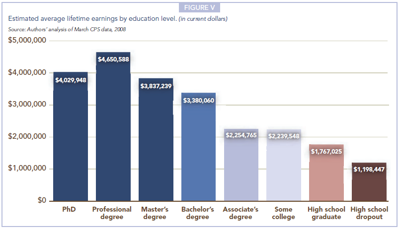
Going by Census data available through 2008, an individual with a bachelor's degree would earn about three times as much money over their life than an individual who dropped out of high school, and a bit under twice what a high school graduate might earn. Meanwhile, an individual with just some college or an associates degree would earn double the lifetime income of a high school dropout.
Interestingly, a master's degree doesn't provide that much of a lifetime earnings premium over a basic bachelor's degree, nor does a PhD deliver much additional income over a master's degree.
But those who earn professional degrees on average tend to do quite well in comparison to individuals with lower levels of education.
Source: Georgetown University's Center on Education and the Workforce. Help Wanted: Projections of Jobs and Education Requirements Through 2018. June 2010.
Previously on Political Calculations
- What Kind of Job Can You Hope to Get With Your Education?
- Does It Pay to Go to Law School?
- Jobs Data, Stock Prices and the Age of Census Temps
Georgetown University's Center on Education and the Workforce is out with its latest publication: Help Wanted: Projections of Jobs and Education Requirements Through 2018. The report, written by Anthony P. Carnevale, Nicole Smith and Jeff Strohl, attempts to forecast what kinds of jobs will be available in the future along with their education requirements, in an attempt to help today's high school and college students, along with working adults seeking career advancement, determine what kind of education they'll need to acquire to be able to find the kind of work they want to do in the future.
But doesn't the Bureau of Labor Statistics do this for us already? As it happens, they do, but not very well:
The United States is unable to help people match their educational preparation with their career ambitions—not because it cannot be done but because it simply is not being done. All the information required to align postsecondary educational choices with careers is available, but unused. The forecast in this report demonstrates that projecting education and job requirements is technically feasible with a minimum amount of error. But the current education projections by the Bureau of Labor Statistics (BLS), use a methodology that underestimates the demand for postsecondary education.
The authors compared the results of using their forecasting methodology against that used by the BLS in a 1998 forecast looking ten years ahead in time, finding that the BLS underestimated the number of jobs that would require at least some post-secondary education by 2008 by 47%, while their method overestimated the actual figure by 4%. In terms of raw numbers, the 4% error corresponds to about 2 million workers, while we estimate that the BLS' 47% discrepancy failed to account for the minimum education requirements needed by 23.5 million American workers.
The authors explain why relying upon the BLS' official projections might represent a major problem for today's students:
Unfortunately, the poor quality of the official projections cascades downward through state and local data systems into the hands of policy makers. These numbers are not the only factor that determines policy, but they are the only data available on the economy’s demand for postsecondary education. Because the official data consistently underestimate the demand for postsecondary education, they encourage a consistent bias against investing in postsecondary education and training. Ultimately, the official data misinform the educational choices and career plans of individuals and their counselors.
So what kind of education will the jobs of tomorrow require? The Georgetown study breaks it down graphically by occupational categories for what they expect for 2018:

In the chart above, STEM stands for Science, Technology, Engineering and Mathematics. Next, let's take a closer look at where the authors expect new and replacement job opportunities will be found in the years from the baseline year of 2008 through 2018:

So there you are - the types of jobs the United States is likely to produce through 2018 as well as the percentage share that will be filled by people with varying levels of education.
Is it time to go back to school, yet?
Welcome to the Friday, July 23, 2010 edition of On the Moneyed Midways, where we've gathered the best posts from the past week's money and business-related blog carnivals just for you!
We have to admit that we're swamped this week, so we'll just get straight to this week's edition of OMM.
The best posts we found in the week that was begin... now!
| On the Moneyed Midways for July 23, 2010 | |||
|---|---|---|---|
| Carnival | Post | Blog | Comments |
| Best of Money | Too Big to Stop Failing | Control Your Cash | Betty Kincaid and Greg McFarlane compare and contrast the impact of the twin disasters caused by BP and Fannie Mae. Absolutely essential reading! |
| Carnival of Debt Reduction | What I Have Learned About Medical Bills | Miss Bankrupt | Christina, who knows a thing or two about being deeply in debt and having little-to-no money, lists the things you can do to take care of your medical bills if you find yourself in similar financial straits. The Best Post of the Week, Anywhere! |
| Carnival of HR | Salary Inflation II | Talent In China | Frank Mulligan knows China the way few people do - from the HR perspective! Here, he considers the demographic and legal changes that are behind the growing incomes of Chinese workers. |
| Carnival of Money Stories | Dating in College When You're Broke - Is It Possible? | Green Panda Tree House | MD navigates the dating scene in college to find ways to add value to the experience without spending money many college students just don't have. |
| Carnival of Personal Finance | The Pros & Cons of Credit Unions | Foreigner's Finances | Austin Morgan identifies what's good and not-so-good about credit unions in considering their value to banking service consumers. |
| Festival of Frugality | Rent vs Buy: Tools, Textbooks, Caskets? | Budgets Are Sexy | Should you buy or should you rent? Guest blogger Go Banking Rates identifies where to draw the line for things like textbooks, tools, evening gowns, prom dresses and, yes, caskets…. |
OMM's Running Index for 2010
Presented in reverse chronological order....
- On the Moneyed Midways - July 23, 2010
- On the Moneyed Midways - July 16, 2010
- On the Moneyed Midways - July 9, 2010
- On the Moneyed Midways - July 3, 2010
- On the Moneyed Midways - June 25, 2010
- On the Moneyed Midways - June 18, 2010
- On the Moneyed Midways - June 11, 2010
- On the Moneyed Midways - June 4, 2010
- On the Moneyed Midways - May 28, 2010
- On the Moneyed Midways - May 21, 2010
- On the Moneyed Midways - May 14, 2010
- On the Moneyed Midways - May 7, 2010
- On the Moneyed Midways - April 30, 2010
- On the Moneyed Midways - April 23, 2010
- On the Moneyed Midways - April 16, 2010
- On the Moneyed Midways - April 9, 2010
- On the Moneyed Midways - April 2, 2010
- On the Moneyed Midways - March 26, 2010
- On the Moneyed Midways - March 19, 2010
- On the Moneyed Midways - March 12, 2010
- On the Moneyed Midways - March 5, 2010
- On the Moneyed Midways - February 26, 2010
- On the Moneyed Midways - February 19, 2010
- On the Moneyed Midways - February 13, 2010
- On the Moneyed Midways - February 5, 2010
- On the Moneyed Midways - January 29, 2010
- On the Moneyed Midways - January 23, 2010
- On the Moneyed Midways - January 15, 2010
Older Editions
- OMM: The Best Posts of 2009 and our full index for the year!
- OMM's Running Index for 2008
- OMM's Running Index for 2007
- The Best Blogs Found in 2006 (and our full 2006 index)!
Labels: carnival
 Missouri Unemployment Line What if you lost your job today and became unemployed? How long might it take you to find a new job?
By and large, the answer to these questions depends specifically upon what kind of work you can do, but surprisingly, it also depends upon where you might work.
After all, if the unemployment rate in your state is high, then you can reasonably expect that it will take longer to find new work than would be the case if the unemployment rate in your state was low.
We took data presented by the left-leaning Economic Policy Institute's interactive map of median unemployment duration by state in 2009 and mashed up with the BLS' state unemployment rate data for June 2009 to create our first chart, which illustrates a pretty strong correlation between a state's unemployment rate and its median duration of unemployment. We also mapped out where the unemployment rate and median duration of unemployment for the entire United States was in 2009.
That last bit of information provides an important base reference point for comparing today's unemployment duration data with that of 2009. Using monthly U.S. median unemployment duration data collected by the St. Louis branch of the Federal Reserve, we can then take into account for the overall shift in the duration of unemployment that has taken place over the last year.
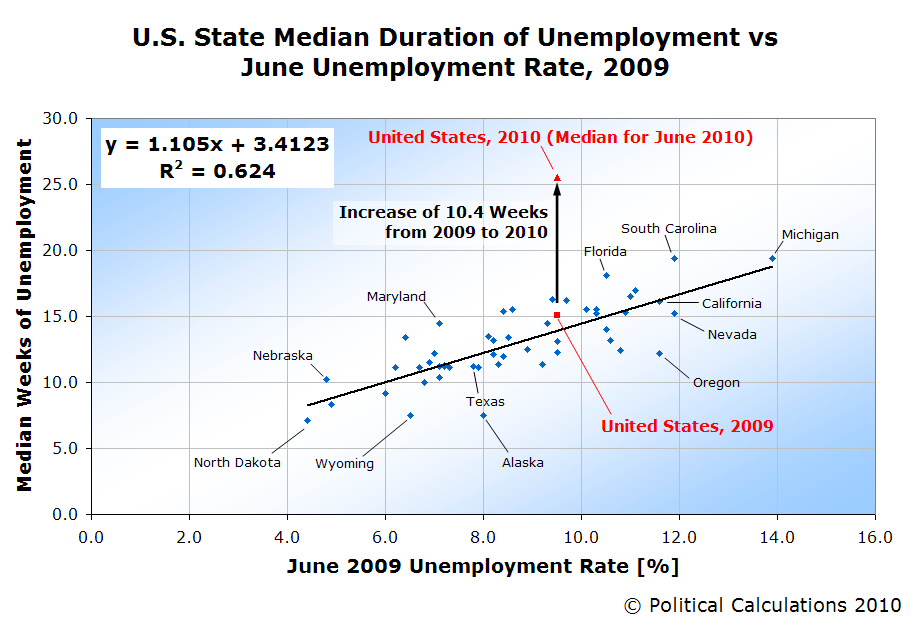 Here, we found that the median duration of unemployment has grown from 15.1 weeks for all of 2009 to 25.5 weeks as of June 2010, an increase of 10.4 weeks.
Meanwhile, we note that the U.S. has an identical rate of unemployment in June 2010 as it did in June 2009, and that many states have similar rates of unemployment as they did a year ago.
This last observation indicates that there is a severe shortage of jobs being created in the U.S. in 2010.
One way to think of the increase in the median duration of unemployment is like being in line at a supermarket that isn't adding enough cashiers to check out customers in a reasonable period of time in response to the demand for checking out groceries. The lines get longer and longer as customers queue up in them and they end up having to wait much longer in line just to be able to check out as a result.
By contrast, if the supermarket were adding cashiers in response to the demand for groceries, the wait time for customers would get shorter and shorter. The same scenario applies for the rate of job creation in the U.S. economy.
Going back to our original question, we now have enough information to develop a tool to approximate the median length of time it might take an average American to find a new job after becoming unemployed today, based on the current rate of unemployment in their state.
Just enter your state's latest unemployment data into the tool on the right and we'll run the numbers.
We'll close by emphasizing again that this data would apply for a generic American in 2010. Depending upon what work you specifically do, the amount of time you might reasonably expect to be unemployed can be very different from our projected median duration.
We should also caution you to be conservative - it may take much longer to find new work than our tool indicates. Our tool projects the median duration of unemployment, which means than although half of the unemployed will find new work in fewer weeks than what the tool indicates, half will take some weeks longer and in some states with high unemployment rates, there are individuals who have been unemployed for more than 99 weeks.
 Let's say, for a moment, that you're in charge of the U.S. Federal Reserve. You assumed the top job shortly after a significant surge in prices had taken place in the United States' housing markets, but the bubble on which those prices were rising has now long since dissipated.
Your initial response to try to stabilize the markets was to try to reset the relative value of housing through inflation. By making the prices of everything else rise with respect to housing, you might be able to make housing prices stabilize at levels higher on paper than those to which they might otherwise fall, protecting the balance sheets and solvency of the financial institutions you've deemed to be too big to fail.
But then you found that inflation doesn't inflate everywhere equally. Commodity prices began to soar and worse, the price of oil skyrocketed to all-time record levels.
The spike in oil prices combined with an already slowed economy from the housing bubble dissipation to send the U.S. economy into deep recession. And then, the full forces of deflation were unleashed, most significantly as U.S. automobile manufacturing specifically and industrial production generally took the brunt of the fallout from the public's reaction to record prices at the nation's gas pumps.
Suddenly, tens of thousands of highly skilled workers found themselves out of work, with little prospect of finding any new work that could utilize their long-accumulated skills anytime soon.
Believe it or not, the U.S. jobs situation is far worse for unskilled workers. Thanks to a 41% increase in the federal minimum wage that was incremented in steps from 2007 through 2009, millions of low-wage jobs have disappeared from the U.S. economy, with nearly two million of those lost jobs hitting the least skilled, least educated and least experienced portion of the U.S. workforce: teenagers. Who, by the way, only represent just over 3% of the entire U.S. workforce.
The two together, along with the prolonged expected joblessness, have added additional deflationary pressure to the U.S. economy, as many of these individuals rely upon unemployment benefits (for the skilled workers) while the unskilled workers (mostly teens) rely on their families, who are then harder pressed to make ends meet, cutting back their spending in response.
 So if you were the Fed Chairman, and you've previously announced and demonstrated that you have the ability to create inflation in the U.S. economy, or at least could act to lessen the effects of deflation, why might you choose to not act? Especially as the economy is now trending strongly toward deflation with some pretty notable economists screaming out their Keynesian-based fears of the potential impact?
We think the answer lies with the balancing act the Federal Reserve has to perform with the U.S. federal government. Here, since the current majority of politicians in Congress and the President are committing to ever more grandiose government spending projects and power grabs over large segments of the private sector of the U.S. economy, the government is growing increasingly reliant upon borrowing money to fund its operations, as well as to continue extending programs targeted at the jobless, such as unemployment compensation. All without having to cut into any pork-barrel spending that many politicians are counting upon to either get re-elected or to help pad their forced retirement if they lose their elections this November.
To facilitate the government's seemingly insatiable demand for borrowing, U.S. treasuries must be made more attractive with respect to those of other nations as well as other kinds of investments. And one way to do that in the short term is to tolerate a deflationary trend in the U.S. economy, which increases the real yield to investors for U.S. debt.
That it comes at a time when nominal yields for U.S. Treasuries are falling is icing on the cake - that lowers the cost of borrowing for the U.S. government, enabling it to do even more. We've been observing just such a trend since April 2010 and in fact, we think it may be behind the recent upswing in unemployment as the deflationary trend makes it relatively more expensive to hire new employees, especially unskilled teens earning the mandatory federal minimum wage than it did earlier this year. In effect, it's equivalent to a new hike in the minimum wage.
And that's likely why a perceived anti-deflation hawk like the current Fed Chairman might rationally choose to allow deflation, if only for a short time.
Labels: economics
The Frugal Law Student was wondering earlier this year if law school is really worth the extra cost it takes to go:
Given the economic crisis that is going on, the difficulty new lawyers are having getting jobs, and the soaring cost of law school, I’m doing a little analysis to see if law school is worth it for many prospective students. A lot of people go into graduate or professional school believing the debt and time spent will pay off in a more rewarding/higher paying career. While this may be happen for some, it’s by no means a guarantee.
The Frugal Law Student then runs through a couple of scenarios, but we thought that discussion might be improved by adding a visual touch, which we've done by creating charts that project the lifetime income-earning trajectories for a regular bachelor degree holder who enters the U.S. workforce at Age 22 versus a bachelor degree holder who goes on to law school before entering the workforce at Age 25.
 We'll base the lifetime income trajectory for our bachelor-degree holder on our model of the inflation-adjusted income that the average bachelor-degree holder saw between 1997 and 2007, assuming the average 2010 starting salary of $48,351, as reported by CNBC.
We've assumed that our hypothetical law student will earn an average of $10,000 more per year than our hypothetical average bachelor-degree holding income earner. That extra income comes at a cost however, in that we assume an average annual cost of $20,000 for law school, covering three years, in which our bachelor-degree holding law student also gives up the opportunity to have a real job. Law schools typically cost an average of $20,000 for state law schools, while private school's average $30,000 per year.
Attending a "prestige" institution can cost quite a bit more than those figures.
That extra $10,000 per year though is reasonable given that Payscale.com shows the typical range of annual salary for lawyers to run between $58,944 and $119,386.
 By comparison, our hypothetical bachelor-degree holder would see their salary range between $48,351 and $101,884.
But the real story is found in our cumulative comparison between the income earned by a bachelor-degree holder and the additional direct cost and opportunity cost for a law student.
Here, we find that even with the benefit of an additional $10,000 per year once they do enter the workforce, the lawyer doesn't catch up to the regular bachelor-degree holder until Age 57. And there is very little additional net benefit in the additional 10 years we show beyond that age to reach Social Security's full retirement age of 67.
We'll conclude with the bottom line offered by the American Bar Association's 2009 paper "The Value Proposition of Attending Law School", emphasis ours:
The combination of the rising cost of a legal education and the realities of the legal job market mean that going to law school may not pay off for a large number of law students. Dean David Van Zandt of Northwestern Law School estimates that to make a positive return on the investment of going to law school, given the current costs, the average law student must earn an average annual salary of at least $65,315.12 As the data above show, however, over 40% of law school graduates have starting salaries below this threshold. Thus, many students start out in a position from which it may be difficult to recoup their investment in legal education. Even students who do ultimately prosper over the course of a career face difficulties from high debt loads during the beginning of their career. High debt can limit career choices, prevent employment in the public service sector, or delay home ownership or marriage. In short, going to law school can bring more financial difficulty than many law students expect.
The lack of financial return, of course, does not mean that it is not valuable to go to law school. Many lawyers receive intrinsic benefits from a satisfying career that cannot easily be quantified. It does mean, however, that students should think twice before going to law school simply for the money. All too often, students who bank on reaping a positive financial return from law school lose out.
Labels: education
Welcome to the blogosphere's toolchest! Here, unlike other blogs dedicated to analyzing current events, we create easy-to-use, simple tools to do the math related to them so you can get in on the action too! If you would like to learn more about these tools, or if you would like to contribute ideas to develop for this blog, please e-mail us at:
ironman at politicalcalculations
Thanks in advance!
Closing values for previous trading day.
This site is primarily powered by:
CSS Validation

RSS Site Feed
JavaScript
The tools on this site are built using JavaScript. If you would like to learn more, one of the best free resources on the web is available at W3Schools.com.
Other Cool Resources
Blog Roll


