Have a Merry Christmas and a Happy New Year - we'll see you again in 2012! Until then, for the sake of all those people who are spending way too much time wrapping presents this season, here's our official countdown clock until the big day....

Labels: none really, tool
Does it pay to delay taking Social Security benefits?

Let's say you're considering one of three options: taking early retirement at Age 62, retiring at the traditional Age 65, or really holding off on retiring until you've reached Age 70. Which choice might be better for you?
The question matters because people who wait longer before drawing Social Security benefits can draw larger benefits than those who don't wait.
To find the answer, we've tapped Social Security's estimate of the maximum possible Social Security benefits that would be paid for individuals choosing to begin receiving payments in the first month after they've reached each of these ages in January 2012.
We then projected the accumulated total amount of benefits each individual would receive all the way out to Age 100.
But since most Americans won't live quite that long, we also projected how much longer a typical American can expect to live once they've reached the age at which they begin receiving Social Security benefits.
We've presented our results in the following chart, where we've used a solid line to indicate the portion of benefits that would be accumulated based upon a typical American's likely remaining life expectancy, and a dashed line to cover the period from that age all the way out to Age 100.

What we find is that based upon the typical life expectancy for most Americans, it does indeed pay to wait longer to draw Social Security benefits after becoming eligible.
For example, an individual who waits until the traditional Age 65 to begin receiving Social Security benefits will accumulate more money from the program than an individual who begins drawing benefits at Age 62 by the time both have reached Age 77. Since most Americans who reach either age can expect to live into their 80s, they would do better to wait than to take early retirement.
Likewise, by the time an individual reaches Age 82, they will have accumulated more benefits from Social Security by having waited to start receiving them at Age 70 than they will have by beginning to take them at Age 65.

There are two big wild cards in all this however. First is the major unknown of how long you will actually live - if you knew that, then you would know exactly which option might be better for your situation.
That's also complicated by whether or not you have a spouse. In that case, your Social Security benefits would continue to be paid to them in the form of survivor's benefits throughout the rest of their lives, which matters because they might live long beyond your years. That factor would argue in favor of waiting.
The second big wild card however is whether you have another source of income that can carry you from Age 62 through Age 70. Whether that's from regular retirement income that you set aside throughout your working years or from a job, both of which might be at the mercy of the economy, you might find it necessary to begin drawing benefits long before you would otherwise have chosen to do so in an ideal world.
Labels: personal finance, social security
If you're an investor looking to possibly put your money into an Exchange Traded Fund (ETF), how much can you expect that will that cost you?

ETFs are a lot like mutual funds, in that they are made up of a number of individual stock or bond holdings and have operating expenses that will be charged against your account, but they're not exactly. Unlike mutual funds, which are only allowed to change hands at the end of a business day, you can actively trade an ETF - placing market orders to buy and sell at any time when the market is open, just like the shares of stock or bonds you might own.
Combined, those characteristics make an ETF something of a hybrid between mutual funds and regular stocks. Which means that figuring out how much it costs you to own an ETF is a little more involved than looking at the fund's Operating Expense Ratio.
If you're shopping for an ETF, and you're looking to minimize your costs as a way to help maximize your return on your investment, you'll also need to consider the funds Bid-Ask Spread, the value of any trading commission you might have to pay, as well as how long you plan to keep your money in the ETF and also how much money you'll keep in the ETF.
Fortunately, our newest tool is here to do the job for you! Based on math presented by Michael Iachini in the Winter 2011 edition of Charles Schwab's On Investing magazine (the link will work once the print edition is published online), our latest tool can help you find out how much it owning an ETF will really cost you!
Just enter the relevant data below, and we'll do the rest!
Using the default values in the tool, we find that the approximate annual ownership cost for investing $10,000 for half a year in an ETF with an Operating Expense Ratio of 0.10%, a Bid-Ask Spread of 0.15% and a per-trade commission of $8.95 is 0.76%, or $75.80.
Different ETFs and different brokers however will have very different numbers. Using our tool will help give you a good way to compare the relative costs of owning those ETFs when it matters most: before you choose to invest in them!
Image Credit: The Digerati Life
 If you run a business and are looking at running a marketing campaign offering discounts on your products or services through social media marketing sites like Groupon or Living Social, what kind of discounts can you really afford to offer?
That question comes up because of a recent story from the United Kingdom, where Woodley baker Rachel Brown was forced to make 102,000 cupcakes to satisfy a torrent of customers who took advantage of the discount she had offered via Groupon, losing $20,000 in the process. Mashable's Stan Schroeder reports:
Group discounts can be a nice thing for both the seller and the customers, but you have to know your limits. A UK baker learned that the hard way, when she was forced to bake 102,000 cupcakes, after offering a 75% cupcake discount on Groupon.
The discount obviously sounded too good to Grouponers, 8,500 of whom signed up to buy 12 cupcakes for £6.50 ($10), down from the standard £26 ($40) price. Rachel Brown, who operates the Need a Cake bakery in Woodley (near Reading, UK), had to hire extra workers and try to bake the cupcakes to satisfy the swarming customers.
"Without doubt, it was my worst ever business decision. We had thousands of orders pouring in that really we hadn’t expected to have. A much larger company would have difficulty coping," said Brown, who lost up to £12,500 ($20,000) on the deal.
There's a lot that went wrong for our cupcake-baking heroine, but thanks to the folks at TheDealMix, who developed the formulas, we can now present a tool using simplified math that can help any business owner set up a deal for discounts to avoid the pitfalls into which Rachel Brown's bakery fell.
Just answer the following questions as they apply for your business - our tool will do the rest to help ensure that your business can handle the demand from your deal while still running in the black!
Our tool's results are designed to ensure that your business can afford to support the discount promotion you're thinking about running in two ways. First, by adding a positive amount to your Cost of Goods or Services Sold, you'll avoid the situation where you might discount your promoted item too greatly.
Second, by placing a limit on the number of deals that will be offered through your promotion, you'll largely avoid having to go to extraordinary means to satisfy customer demand should your promotion prove to be extremely popular.
And now, you shouldn't have to worry about whatever the equivalent of losing $20,000 to bake 102,000 cupcakes is for your business!
Nobody can predict where stock prices will go next, can they? Especially given the volatility of stock prices, especially in today's market, where the market can swing by more than 3% in any given day, right?
It's just not possible, is it?
To really find out, we ran a two-year long experiment, from April 2009 through April 2011, to see if we could forecast the average value of stock prices for a month at the end of the previous month. Here were our final results:

As you can see, we offered a split final forecast option for April 2011. Here's what we believed would happen instead:
What we believe is likely is that stock prices will track upward from the average level of 1304 they recorded in March 2011 toward the 1393-1429 level our primary method would forecast as the noise currently in the market subsides.
And that's what happened. In April 2011, stock prices did indeed track upward, rising to an average level of 1331 for the month, with the S&P closing the month at 1363.61.
We took the next several months off from offering public forecasts of where the S&P 500 would head next, but by 26 September 2011, we couldn't resist any more, and posted the following chart, which presents a graphical prediction that happens to cover the period through the end of 2011:
And here's what the updated chart looks like, through the end of 16 December 2011:

What can we say? We're still in the zone! And that concludes, for real this time, our public experiment in forecasting the future for the S&P 500!
Labels: forecasting, SP 500
If you use Google's Chrome web browser, there's a relatively new app that can make shopping a lot more economical: InvisibleHand.
When you're reviewing a commercial web site when shopping for a product, such as airline tickets, rental cars, or even dog food, InvisibleHand will let you know if you can buy the product more cheaply at other sources and link to them. We snapped the screen shot below to show what the discreet prompt looks like when it finds a lower price, which appears at the top of the browser window:

We've only been test driving it for a little while, but our initial impression is that the app is pretty cool! The app is free and versions are also available for the Firefox, Safari and Internet Explorer web browsers from InvisibleHand's web site.
Elsewhere on the Web
Carolyn Nicander Mohr offers a positive review of the InvisibleHand app.
C|net's Rafe Needleman reconsiders his initial positive review for the app based upon privacy issues related to cross-site data leakage, where his search for a product on one site was unknowingly communicated to Amazon's site.
Labels: review
Once upon a time, we developed a better method for detecting housing bubbles. Today, we're going back to the data mines to do some refinement and to see where things stand today!
Our first chart shows the relationship between median new house prices in the United States and median household income for the years from 1967 through 2010.

Here, we've revised our earlier look to better define the major trends evident in the data. Here, we see one major trend running from 1970 through 1986, then a second trend running from 1987 through 1999. After 1999, we see the housing bubble beginning its inflation phase as the relationship between median new house prices and median household income became decoupled, running through 2007. Since then, the U.S. housing bubble has been in its deflation phase, which appears to still be ongoing, as the relationship between the median prices of new houses and median household income remains decoupled.
One important thing to note is the shift in the trend that occurred after 1986. We believe this shift was triggered by the Tax Reform Act of 1986, which eliminated a number of debt-related tax deductions, but which left the long-standing mortgage interest deduction in place, even increasing the amount of the deduction.
The changes brought about by the Tax Reform Act of 1986 had two main effects. First, it incentivized home ownership by enhancing the tax benefits associated with owning property and having a mortgage. Second, in eliminating the favorable treatment of other debt interest, it made the home mortgage the primary channel by which people would choose to accumulate debt thanks to the interest on that debt being tax advantaged.
These changes however are not the cause of the U.S. housing bubble, as there is no correlation between the shift in trend and the beginning of the bubble in 2000. More interestingly though, we see that both trends would project nearly the same median new home price given the current level of the U.S. median household income.
Looking at the more recent trend that was defined in the period from 1987 through 1999, we can see that the relative affordability of a median new home in 2010 is still well elevated above where it would have been during that period. The following chart shows the percentage deviation between the 1987-1999 trend and actual median new home prices from 1987 through 2010, which gives a sense of how overpriced the median new home has been since 1999 thanks to the U.S. housing bubble:

Here, we see that the relative affordability of the median new home with respect to where it typically was from 1987 through 1999 peaked in 2005, with a percentage deviation of 25.7%. Since then, the median price of a new home has fallen, bottoming in 2009 at a level 11.9% over where the linear trend that ran from 1987 through 1999 would place it, before bouncing back up to be 14.4% higher than the level of the projected trend in 2010.
What's interesting to us is that it appears that we stumbled directly into something that looks very much like the Case-Shiller house price index!

Here, looking at both the 10-city and 20-city composite indices, we find that our representation above closely follows the pattern traced out by the Case-Shiller 20-city composite data - at least with respect to the linear trend we created in the chart for the period from 1987 through 1999.
But unlike the Case-Shiller data, because our method correlates house prices with household income data, it will better communicate the relative affordability of homes in the U.S. over time!
Since the Case-Shiller data has been updated more recently than the Census data, it appears that house prices in the U.S. have resumed falling in 2011. And even though those falling prices are making homes more affordable today, they would have to fall by roughly another 12-14% before they would be in the same ballpark for affordability that they were in the years from 1987 through 1999.
Or as the projected trend works out to be from our first chart, the same level of affordability that they were for Americans in the years from 1970 through 1986 as well.
Data Sources
U.S. Census. Median and Average Sales Prices of New Homes Sold in United States. http://www.census.gov/const/uspriceann.pdf. Accessed 13 December 2011.
U.S. Census. Current Population Survey, Annual Social and Economic Supplements. Table H-5. Race and Hispanic Origin of Householder--Households by Median and Mean Income: 1967 to 2010. [Excel spreadsheet]. Accessed 13 December 2011.
Standard and Poor. Case Shiller Seasonally Adjusted Home Price Index Levels, September 2011. [Excel spreadsheet]. Accessed 13 December 2011.
Labels: data visualization, real estate
How many calories does your body need to maintain its current weight? Or rather, if we were to take your current weight level and assume that you're consuming enough Calories to maintain it, how many Calories is that per day?
Math is a wonderful thing and yes, we can use it to work out approximately how many Calories you're eating every day! Our tool below uses the math developed by M.D. Mifflin, S.T. St. Jeor, L.A. Hill, B.J. Scott, S.A. Daugherty and Y.O. Koh in their 1990 paper "A new predictive equation for resting energy expenditure in healthy individuals" to estimate your basal metabolic rate, or rather, the number of Calories your body would consume when it's "resting", which we then mashed with the old Harris-Benedict approximations for taking your daily level of physical activity into account.
All you need to do is to enter your age, gender, weight and your approximate level of daily physical activity into our tool below. Unless you're a true athlete, with lots of lean muscle mass that burns even more Calories, or perhaps have a thyroid condition that directly affects your metabolic rate, you can expect the results to be pretty close to the actual ballpark in which your body burns Calories to maintain your current weight!
Best of all, if you're getting set to do something about your weight or fitness level, you now have some idea of how many Calories you're really consuming every day!
And really, that might be the most surprising result you'll find out from our tool!
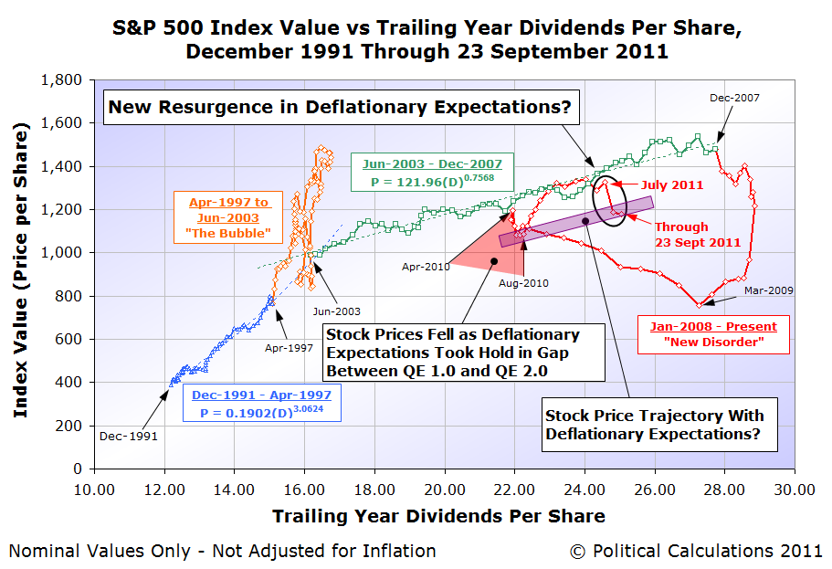
A quick story in two snapshots. First, the expected future trailing year dividends for the S&P 500 through the fourth quarter of 2012:

Second, the tax rates that apply to dividend income from 2003 through 2012, and the expected tax rates that will apply for 2013 onward, given current law in the U.S.:

What effect do you think those much higher tax rates will have upon stock prices beginning in 2013? Especially since the long-term capital gains tax rate will be so much less? Here's what history says, but remember, it ends badly, except perhaps for the insiders....
Speaking of which, here's what they're up to today!
In October 2011, China set a new record for its exports to the United States, with the value of its goods and services being imported into the U.S. reaching an all-time high of $37.807 billion.
Unfortunately, the year over year growth rate of China's exports to the U.S. indicates that the U.S. economy, while doing a bit better than the months of May through September 2011, is still near recessionary levels.

Worse, we find that the year over year growth rate of U.S. exports to China has also reached near-recessionary levels, even as the value of the goods and services exported by the U.S. to China is still on track to peak by December 2011.
What we suspect is that the respective growth rates of the trade between the two nations are reaching a near-simultaneous inflection point, where instead of growing, which we would expect if the economies of China and the U.S. were both healthy, they are instead set to go flat or to become negative, as both nations would appear to be now experiencing near recessionary conditions.
It would seem that not even the kind of massive Keynesian economic stimulus spending that China engaged in back in 2009 and 2010 is sustainable for more than a couple of years, as all bubbles end. It's only ever a question of when and how....
Labels: trade
Thanks to the Fed's excursion into Zero Interest Rate Policy (aka "ZIRP"), we can't use our dedicated tool that reckons the odds of a recession up to a year in the future.
But we can do the next best thing and listen to what the stock market is trying to tell us:

Here, we find that the private sector of the U.S. economy is set to slow down in a big way going into the second quarter of 2012, which we see as the decrease in that quarter's expected dividends per share.
Keep in mind the extremely slow growth of just once cent per share from the second to third quarters of 2011 directly coincided with what we've described as a microrecession in the United States, which we've since confirmed using international trade data.
But what does that mean for jobs? After all, as we've seen previously, the big job losses following the beginning of a recession often occur quite a bit after it has begun.
Fortunately, we have another tool we can use to predict how the U.S. unemployment rate will change, up to two years in the future! The relationship between inflation-adjusted motor gasoline prices and the unemployment rate in the U.S.!

Here, we've shifted the red curve indicating the level of real motor gasoline prices in the U.S. some two years into the future. Here, we see that the recently announced unemployment rate of 8.6% for the U.S. is right about exactly where the gas prices of two years ago would predict they would be.
(Technically, they had been higher than anticipated until the most recent employment situation report, but then, remember the U.S. went through that whole microrecession thing!)
Looking into the future, we see that the unemployment rate through 2012 is likely to fall into the range between 8.5% and 9.0%. But very early in 2013, it would seem set to skyrocket back up over the 10% mark, after beginning to rise sharply toward the end of 2012.
That won't be any microrecession. And now, you can't say you weren't warned about what now looks like is coming this way!
Elsewhere on the Web
Doug Short compares the track record of two leading economic indicators and notes that the two have diverged in recent months, with one signalling recession and the other chirping along merrily - only one can be right!...
Labels: recession forecast
How many times per minute should your heart beat while you're exercising?

It used to be really easy to calculate what your maximum and target heart rate for working out should be - you just took your age, subtracted it from 220 and that gave you your maximum heart rate. You would then try to keep your heart rate between 50% to 80% of that number to get the best cardiac workout that medical professionals could recommend.
But then, while that math works for men, it turns out that math doesn't work for women!
Fortunately, a new math formula for finding the maximum and target heart rates for women has been developed: all a woman needs to do is to subtract 88% of their age from 206 to find their maximum heart rate number, then keep their pulse rate between 50% and 80% of that result while exercising!
Since that really isn't the kind of math that people can do in their heads, our latest tool is designed to take your head out of the picture, so you can focus on that workout of yours, regardless of whether you're a man or a woman!
Just enter the indicated data into the tool, and we'll tell you just how fast you need to get your blood pumping while you're working out on that new-fangled treadmill....
So there you go - now give us 20!
Image Credit: NASA's G-Trainer. Why, it's our tax dollars at work!
As of the end of the U.S. federal government's 2011 fiscal year on 30 September 2011, the United States' total public debt outstanding was recorded to be approximately $14.790 trillion. From the end of the U.S. government's Fiscal Year 2010, the amount of the U.S. national debt has increased by 9.1% in just one year, or $1.2 trillion.
The chart below provides a preliminary look at who the biggest holders of all the U.S. government's public debt outstanding were as of 30 September 2011:

Comparing this new chart with ones we've previously featured, we've broken out the U.S. Federal Reserve's holdings from the U.S. Individuals and Institutions category, reflecting the Federal Reserve's massive purchases of U.S. Treasuries as part of its quantitative easing programs.
Overall, in the year from 30 September 2010 to 30 September 2011, the U.S. Federal Reserve increased its purchases of U.S. government-issued debt from $966 billion to $1,773 billion, an 83.5% year-over-year increase.
These figures only include the value of securities issued by the U.S. Treasury or other federal government agencies. It does not include mortgage-backed securities, such as those issued by government-supported enterprises such as the Federal National Mortgage Association (Fannie Mae) or the Federal Home Loan Mortgage Corporation (Freddie Mac).
Our look at who owned the largest shares of the U.S. national debt is only preliminary since the data for foreign nations will be revised at some time in 2012.
How Much Will Upcoming Revisions Change This Picture?
We've created an animated version of our two primary charts revealing the major holders of U.S. government issued debt through the end of Fiscal Year 2010, our original version and the updated version incorporating the U.S. Treasury's revised data, to help give an idea of how much the values and percentage shares presented in our new chart above might change when the data spanning Fiscal Year 2011 is revised:
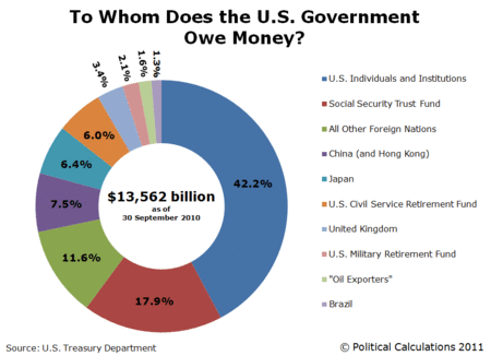
Note that the biggest change is that the share of U.S. government-issued debt held by China increases at the expense of the originally reported level of U.S. Treasuries held in the U.K. We anticipate a similar change when the data is revised in 2012, although this year, Europe's ongoing debt crisis might be playing a role in inflating the U.K.'s reported share of U.S. Treasury securities as well.
Previously on Political Calculations
Who Owns the U.S. National Debt To Whom Does the U.S. Government Really Owe Money? Summer Update: To Whom Does the U.S. Really Owe MoneyData Sources:
Board of Governors of the Federal Reserve System. Monthly Report on Credit and Liquidity Programs and the Balance Sheet, October 2011. Table 1. Assets, liabilities, and capital of the Federal Reserve System.
Board of Governors of the Federal Reserve System. Monthly Report on Credit and Liquidity Programs and the Balance Sheet, October 2010. Table 1. Assets, liabilities, and capital of the Federal Reserve System.
U.S. Treasury Department. Major Foreign Holders of Treasury Securities. Accessed 6 December 2011.
U.S. Treasury Department. Monthly Statement of the Public Debt of the United States, September 30, 2011. Table III – Detail of Treasury Securities Outstanding, September 30, 2011.
Labels: national debt
Does increasing the minimum wage increase GDP?
Bloggingstocks' Joseph Lazaro outlined the theory that it might back on 1 August 2009, shortly after the U.S. federal minimum wage reached its current level of $7.25 per hour (emphasis ours):
... the U.S. Federal Reserve will be monitoring prices and costs to see if the higher minimum wage is creating inflation havoc at a time when U.S. businesses least need another concern to deal with. Businesses have enough to worry about; and some are struggling just to maintain operations for another quarter or two -- the recession has been that damaging.
But the Fed will also be looking for signs of another side-effect, and this one is a positive one: a GDP boost. That's because millions of workers are going to get a raise that they otherwise would not have gotten, and that will increase their purchasing power.
The significance? Some of those increased-pay workers will choose to spend -- perhaps buying a washer or drier, making a down payment on a used car, or paying down a debt. It's quite possible -- although in these "frugal consumer" economic times no one is certain- - that the wage hike will increase U.S. GDP, serving as a small engine of growth as the U.S. economy inches back toward health.
It's an intriguing possibility isn't it? But has it worked out that way?
One way we can find out if boosting the federal minimum wage has boosted GDP is by examining the economic fortunes of the people most likely to be earning minimum wages in the United States: teenagers and young adults!
Together, individuals between the ages of 15 and 24 have consistently made up approximately one half of all minimum wage earners, so we should be able to use the personal income data the U.S. Census has collected and published for this age group for each year since 1994.

First, let's consider the population of 15-24 year olds in the United States, and the number of those individuals counted as having income from 1994 through 2010.
Over this time, the federal minimum wage has increased from $4.25 per hour in 1994, to $4.75 in 1996 and then 50 $5.15 per hour in 1997, where it held level until 2007. Beginning in 2007, it was increased by 70 cents per hour once a year up until it reached its current level of $7.25 per hour in 2009.
What we see however is that the number of teens and young adults with incomes has fallen over time. Our next chart shows the percentage of Americans between the ages of 15 and 24 who were counted as having income in the U.S. Census' Current Population Survey for each year from 1994 through 2010.

In this chart, we find that the percentage of teens and young adults who had incomes peaked in 1995, with 75.3% of the entire Age 15-24 population counted as having earned income in that year, which has since fallen to 59.9% as of 2010.
So far, both these charts indicate that the number of teens and young adults in the U.S. workforce has fallen from 1995 through 2010 - these charts don't tell us anything about how teens and young adults might have benefited from higher pay obtained through a rising minimum wage over time!
For that, we'll dig deeper in the U.S. Census' data and extract the data for the aggregate amount of income earned by individuals Age 15-24. Since one way of measuring the U.S. Gross Domestic Product is to add up all the income earned by people in the United States, we can use the Census' estimate of the aggregate income earned by U.S. teens and young adults to represent their contribution to the U.S.' GDP.
The easiest way to do that is to compare the amount of income earned by all U.S. teens and young adults in 1995, when the percent share of teens in the U.S. workforce peaked with the total amount of income earned by all U.S. teens and young adults in 2010, the most recent year for which we have data.

Coincidentally, selecting these particular years for comparision works especially well for our purposes, since it spans the increases in the U.S. minimum wage from $4.25 per hour to $7.25 per hour, with 1995 being one year before the first minimum wage increase in our period of interest occurred, and 2010 being one year after the most recent increase in the U.S. minimum wage took place.
We'll also adjust the numbers to account for the effect of inflation, using an animated chart to show the results.
What we find in examining this chart is that for the 15 year span from 1995 to 2010, the nominal aggregate income of U.S. teens and young adults increased by 14.75%, from roughly $302.9 billion to $347.5 billion.
But most remarkably, in terms of constant 2010 U.S. dollars, the aggregate income of U.S. teens and young adults fell by 0.56% from $349.5 billion in 1995 to $347.5 billion in 2010. For all practical purposes, despite a 70.6% increase in the nominal value of the U.S. federal minimum wage from $4.25 to $7.25 (a 21.8% increase in real terms), the total amount of income collectively earned by the predominant earners of the U.S. minimum wage in the United States is unchanged.

Let's take a step backwards and consider the nominal income distribution of teens and young adults in both 1995 and 2010 in nominal terms.
Our next animated chart shows how many thousands of Age 15-24 individuals the U.S. Census counted within each $2,500 increment of total money income in both 1995 and 2010.
Here, we find that the distribution of income has shifted primarily at the lower end of the income spectrum. Our final chart quantifies the changes for each of the U.S. Census' measured income increments.
Here, we note that an individual earning the U.S. federal minimum wage of $7.25 per hour in 2010 who works full time (2,080 hours per year = 8 hours a day, 5 days per week, 52 weeks per year), would earn $15,080 in a year. That puts all the income affected by increases in the U.S. federal minimum wage over time below this level.

What we find is that this income range at the lowest end of the income spectrum for Americans between the ages of 15 and 24 is the only income range where there have been reductions in the number of individuals with incomes between 1995 and 2010.
We also find that the number of individuals with incomes below $15,000 has fallen by 5,045,000 from 1995 to 2010. Meanwhile, we find that the number of Age 15-24 individuals with incomes over $15,000, which would be considered to be largely unaffected by increases in the U.S. federal minimum wage over time, has increased by 3,105,000.
Overall, there are 1,940,000 fewer individuals between the ages of 15 and 24 with incomes in 2010 than in 1995.
Consequently, we find that increasing the federal minimum wage has failed to increase GDP over time. Worse, we find that increasing the federal minimum wage has actually increased income inequality within the Age 15-24 population from 1995 through 2010, as the same aggregate income, when adjusted for inflation, is effectively being spread among nearly two million fewer people.
Returning to Joseph Lazzaro's thoughts on the topic:
... if the Fed and other organizations can verify that the minimum wage increase has boosted GDP without a loss of jobs, or inflation, Congress may to consider another decision in the quarters ahead: a decision to raise the federal minimum wage again, this time to $8.25 per hour.
In our view, the only reason the U.S. Congress would choose to increase the federal minimum wage again would be to ensure the onset of a new recession.
This concludes our annual anniversary post, where we celebrate the biggest ideas we've developed during the past year! This year's anniversary post was a bit unique in that it combines two of the areas in which we've made a mark (or left one!): the real impact of minimum wages on the U.S. teen population and the real nature of income inequality in the United States.
As for the biggest ideas we've developed in previous years, here's the list:
- 2005: A Year's Worth of Tools - we celebrated our first anniversary by listing all the tools we created in our first year. There were just 48 back then. Today, there are over 259....
- 2006: The S&P 500 At Your Fingertips - the most popular tool we've ever created, allowing users to calculate the rate of return for investments in the S&P 500, both with and without the effects of inflation, and with and without the reinvestment of dividends, between any two months since January 1871.
- 2007: The Sun, In the Center - we identify the primary driver of stock prices and describe a whole new way to visualize where they're going (especially in periods of order!)
- 2008: Acceleration, Amplification and Shifting Time - we apply elements of chaos theory to describe and predict how stock prices will change, even in periods of disorder.
- 2009: The Trigger Point for Taxes - we work out both when, and by how much, U.S. politicians are likely to change the top U.S. income tax rate.
- 2010: The Zero Deficit Line - a whole new way to find out how much federal government spending Americans can really afford!
Thank you for joining us for our anniversary! We appreciate that there are a lot of ways you can choose to spend your time, and we greatly appreciate your willingness to share so much of it with us over the past year.
Labels: economics, gdp, income, income distribution, income inequality, minimum wage
Four years ago, the number of employed Americans peaked at 146,584,000 in November 2007, just ahead of the U.S. economy itself peaking in December 2007, which marked the starting point for the nation's most recent economic recession.
Through November 2011, four years later, the number of employed Americans has fallen to 140,480,000. Just over six million fewer Americans are working today than were four years ago.

Overall, the jobs situation in November 2011 brightened for most Americans from October 2011, especially for those Age 25 and older, whose numbers in the U.S. workforce grew by 405,000 during the month.
Young adults however were on the losing side of the employment picture however, as 145,000 fewer individuals between the ages of 20 and 24 were counted as being employed than were in October 2011. That's disappointing because young adults had been seeing the largest gains in the number of employed in each month since July 2011, at least, until now.
Meanwhile, the employment situation of American teens continued to improve very slowly, as only 18,000 additional individuals between the ages of 16 and 19 were counted as having jobs in November 2011.
Today, the jobs lost by teens account for nearly 1 in 4 of all jobs lost since the United States entered into recession in December 2007. That's remarkable because teens represented just 3.1% of the entire U.S. workforce in November 2011. Four years ago, teens made up just 4.0% of the 6,004,000 member larger U.S. workforce.
Continuing to break down the data, young adults today represent 9.4% of the U.S. workforce, while accounting for 13.1% of the total number of jobs lost in the U.S. economy since November 2007.
Adults Age 25 or older make up the remaining 87.5% of today's U.S. workforce. Through November 2011, these individuals account for 62.0% of all the jobs that have been lost in the last four years.
Labels: jobs
If you live in the state of Washington, and you would like to do "work that matters", the State of Washington might have just the right job for you!

The inside joke here is that prior to the passage of Initiative 1183 on 8 November 2011, only the State of Washington could operate liquor stores. As a result, all the employees of the state's liquor store outlets were really employees of the state government. Because of the initiative's passage, the state is being forced by its voters to get out of the liquor business.
But apparently, the State of Washington still feels that its liquor store jobs are doing "work that matters"! (We agree, but we'll still drink to the privatization of liquor sales in Washington!...)
HT: Stefan Sharkansky.
Labels: business
Today's news that the number of initial claims for unemployment insurance benefits being filed for the week ending 26 November 2011 ticked back up over the 400,000 mark is right on track with the prediction we published over a month ago.
Here's that prediction:
... since that slowly downward trending line is currently projected to stay above the 400,000 level through the end of 2011, we can therefore expect that there is over a 50% probability that the number of new, seasonally adjusted initial unemployment claims will be above the 400,000 mark through the end of the year.
In fact, what we can expect as we go forward in time is that we'll see an increasing number of times in the weeks ahead where the number of new jobless benefit claim filings will fall below the 400,000 mark, as the number of layoffs from U.S. employers each week continues to decline gradually.
Lo and behold, that's pretty much exactly what has happened so far in the time between 21 October 2011 and today, as shown in our chart below, which adjusts the trend line slightly:

For the six most recent observations of the number of new jobless claims, which cover the period of time since we made our prediction, three have been at or above the 400,000 mark, while three have been under.
We also see that the mean trend line has shifted to be slightly steeper, which suggests that the number of initial unemployment insurance claim filings each week will be more likely to fall under the 400,000 mark in the weeks ahead.
Meanwhile, Bloomberg reports that the uptick in new jobless claims is "unexpected":
Jobless claims climbed by 6,000 to 402,000 in the week ended Nov. 26 that included the Thanksgiving holiday, Labor Department figures showed today in Washington. The median forecast of 43 economists in a Bloomberg News survey called for a drop to 390,000. The number of people on unemployment benefit rolls and those getting extended payments increased.
Whoops! There's 43 economists whose forecasting ability is now in doubt, which is a shame because the number of new jobless claims filed each week is perhaps the easiest of all economic data to forecast while its basic trend is intact!
And at present, it appears that the current trend for weekly new jobless claims remains well in force.
Labels: forecasting, jobs
Welcome to the blogosphere's toolchest! Here, unlike other blogs dedicated to analyzing current events, we create easy-to-use, simple tools to do the math related to them so you can get in on the action too! If you would like to learn more about these tools, or if you would like to contribute ideas to develop for this blog, please e-mail us at:
ironman at politicalcalculations
Thanks in advance!
Closing values for previous trading day.
This site is primarily powered by:
CSS Validation

RSS Site Feed
JavaScript
The tools on this site are built using JavaScript. If you would like to learn more, one of the best free resources on the web is available at W3Schools.com.
Other Cool Resources
Blog Roll


