It has been several weeks since we last looked at the trend in the number of new jobless claims being filed in the U.S. each week. Our chart below shows how things stand through the initial report for 19 May 2012, which has about a 98% chance of being revised upward later today:

The good news is that the number of initial unemployment insurance benefit claim filings since 11 February 2012 is rising at an average rate of 1,005 per week, but really, that's only good news in contrast to the average increase of 2,497 per week it was clocking just over one month ago!
As we've noted before, gasoline prices appear to have the ability to shift the trajectory of the trend in the number of new jobless claims filed each week once they rise above an inflation-adjusted $3.50 per gallon. Above this level, it would seem, the combination of the increased costs of doing business and the reduction in revenues as consumers are forced to use their limited dollars to buy gasoline instead of other things they might rather have can affect the bottom line of businesses by enough to affect their employee retention decisions.
If we're lucky in the short term, we'll see if the rate of layoffs that prompt new unemployment insurance claim filings shifts to a new, more positive trajectory if gasoline prices fall back below the $3.50 per gallon mark in the weeks ahead.
But then, we'll be unlucky in the longer term because that will mean that the world demand for oil will have dropped enough to make that possible, as much of the world appears headed for recession. That of course will have consequences for the U.S. economy.
In the meantime though, we continue to expect the U.S. economy will rebound a bit in the third and fourth quarters of 2012, after passing through the equivalent of a microrecession during the current second quarter. The story for 2013 will be very different, we're afraid....
Labels: jobs
Does the size of a country's national debt with respect to the size of its economy affect its economic growth prospects?
To find out, we created the following chart showing a relationship between the inflation-adjusted economic growth rates for the member nations of the Organization of Economic Cooperation and Development (OECD) against their "publically-held" debt-to-GDP ratios in 2011:

What we see is that high levels of national debt with respect to the size of a nation's economy, would appear to have a medium-strength effect upon its real rate of economic growth. For every 10% increase in a country's national debt with respect to its GDP, it would appear that its real economic growth rate is reduced on average by roughly 3/8th of a percent. A 26% increase in a nation's debt-to-GDP ratio then would coincide with the shaving of a full percent off its real GDP growth rate.
That matters because economic growth is exponential. A nation whose economy grows at an average rate of 3% per year will double in size in roughly 24 years. A nation whose economy grows a full percent less than that at an average rate of 2% per year will take 36 years to double in size. The difference between the two growth rates is very noticeable.
Looking at the United States' position on the chart, we note that the debt indicated in the chart applies only to the "publically-held" portion of its national debt - if we included the "intragovernmental" portion of its national debt, as would represent a more correct accounting of how much money the U.S. government has really borrowed, it would be over 100% of GDP in 2011.
Data Sources
CIA World Factbook. Country Comparison: Public Debt. Accessed 27 May 2012.
CIA World Factbook. Country Comparison: GDP - Real Growth Rate. Accessed 27 May 2012.
Labels: gdp, national debt
In case you're coming back from the Memorial Day holiday weekend in the U.S. with the question "Hey, are stock prices about where they should be right now?", we're happy to answer your question as follows: "Why, yes, stock prices are indeed about where they should be right now!"
As proof, here's the chart that says so, where we observe that the average change in the growth rate of stock prices as measured by the S&P 500 in May 2012 has just about converged with the long-established expected change in the growth rate of the index' underlying dividends per share that coincides with investor expectations for the fourth quarter of 2012:

We'll leave it as an exercise to our readers to divine where stock prices will go on average in June 2012. Nearly all the information you need is presented in the chart above - you just need to make an assumption about how much noise there will be in the stock market during that month!...
The electrical pylons shown in the image below haven't been built, yet, but wouldn't it be totally cool if they were?

Source: DesignDepot (HT: Core77)
Labels: none really

No, we're not making this up! In fact, we've built a tool so you can calculate your current personal happiness level. Just answer the following questions by ranking yourself from 1 (not at all) to 10 (to a very large extent), and we'll do the rest....
And now you know exactly how happy you are right now, a least as might be quantified by some sort of a scientist on a scale from 1 to 100. If you'd like to adjust your happiness to a different level, you'll likely need to make some changes. The BBC's article suggests how that might work based upon your sex:
The researchers found that different factors were important for the different sexes.
Four in ten men said sex made them happy, and three in ten said a victory by a favourite sports team.
For seven in ten women happiness was related to being with family, and one in four said losing weight.
Romance featured higher for men than women. So did a pay rise and a hobby they enjoyed.
Women were more likely to cite sunny weather.
Ultimately though, it turns out to really be a matter of choice:
Ingrid Collins, a consultant psychologist at the London Medical Centre, told BBC News Online: "I would be very surprised if people sat down and had to work out whether they were happy or not.
"We can all be happy in a heartbeat if we make the decision to be so."
Indeed. And thank you for taking the time to sit down and work out whether you are happy or not with our tool!
Labels: geek logik, tool
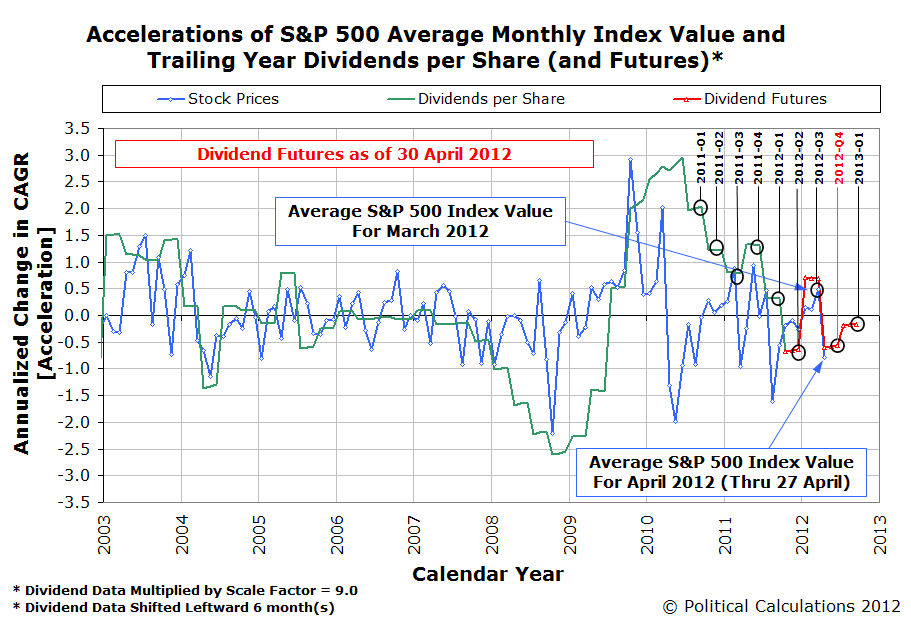
Now that we're halfway through the second quarter of 2012, how has the expected future changed for the U.S. stock market earnings changed from the beginning of the year?
Our chart below reveals the answer!

In this chart, we see that compared to our snapshot from 19 January 2012, investor expectations for earnings in 2012 have dimmed, especially for the first three quarters of the year.
Meanwhile, they appear to expect that 2013 will provide a much better environment for the S&P 500's earnings per share.
As for why they expect that the future will play out this way is something that we'll leave up to your imagination!
Having looked at how Greece arrived at its current crisis, we thought we'd turn to the next country that is coming to dominate the bad economic news in Europe: Spain.
Here's our chart showing the relationship between Spain's GDP per capita and its annual government tax collections and expenditures per capita for each year from 2000 through 2011:

Unlike Greece, we find that the Spanish government's expenditures throughout much of the period appeared to be stable, with the government running significant surpluses in 2005 through 2007.
Unfortunately for Spain however, those surpluses were based on that country's large housing bubble, which greatly increased the numbers of people paying the nation's highest income tax rates as their incomes were highly inflated during this period of time. We know this is the case because Spain's tax rates throughout nearly all of this period were very stable, and essentially unchanged from 2000 through 2010. The only way we would see this pattern then is if the distribution of income in Spain during this time shifted to increase the numbers and incomes of upper income earners, who were benefiting from the bubble economy.
Instead, we find that Spain's financial crisis came about because it also increased its spending to keep pace with its bubble economy, which simply could not be sustained. Once the bubble burst in 2008, the Spanish government found itself in a very precarious position as it was spending far more money than it could ever count upon sustainably collecting. And as the Spanish economy worsened from 2008 through 2011, it created even greater strains upon the nation's finances as the economy plummeted into deep recession, given the large scope of the malinvestments weighing it down.
That brings us to today, where the fiscal situation of Spain threatens to become even worse because of the deteriorating health of its banking system. Here, because Spanish banks were exposed to so much of the fallout from the bursting of the Spanish real estate bubble, whether or not they can continue now depends upon whether or not they can secure a massive bailout from the government and the European Union, as the threat of a national financial system collapse is becoming an almost inevitable possibility.
On Friday, 18 May 2012, the state of order that had existed in the stock market since 4 August 2011 came to an end.
You can see that is the case in our highly refined chart below, which is based upon the daily values for both the value of the S&P 500 index and its trailing year dividends per share, rather than the average monthly values for both that we typically feature at Political Calculations.

What we see is that the daily closing value of the index broke below its lower 3-Sigma "statistical equilibrium limit" curve that defines the bottom of the range where we could have reasonably expected stock prices to be found at least 99.7% of the time during this relative period of order in the stock market. The very low probability that we would see such an outcome if the statistical equilibrium defining the period of relative order was still in effect leads us to make the determination that the existing state of order in the market has broken down.
For us, "order" in the stock market can be said to exist whenever stock prices and their underlying dividends per share are closely coupled. When order exists in the stock market, the basic relationship between the two may be described in mathematical terms by a power law relationship, where the exponent is the ratio of the exponential growth rate of stock prices with respect to the exponential growth rate of dividends per share over time.
The basic variation of stock prices with respect to the mean trend curve defined by that power law relationship then may be reasonably described by a normal distribution, with the standard deviation in the data being measured by the difference between actual stock prices and the value of the mean trend curve for the corresponding level of dividends per share. Technically, this is the residual distribution of the data, which allows us to take the rising or falling value of stock prices and dividends per share into account, which would otherwise inflate the value of the standard deviation.
With that being the case, when order exists in the stock market as we have defined it, we have a potentially powerful method for forecasting where stock prices will go in the future. Under those conditions, stock prices will, 68.2% of the time, fall in the range between one standard deviation above or below the mean trend curve and will, 95% of the time, fall in the range between two standard deviations above or below the mean trend curve. As we have already noted, they will fall within three standard deviations above or below the mean trend curve 99.7% of the time when such order exists. All we need to know to successfully forecast stock prices when order exists is what the expected value of dividends per share is at a given future point of time.
That works up until order breaks down in the stock market, as it did on 18 May 2012. In which case, we have invented entirely other methods for dealing with that situation, which is really simply when chaos is in the driver's seat for determining stock prices, which we can do pretty well in the relative absence of noise.
If only we hadn't chosen to stop making these kinds of forecasts public, rather than simply offering timely observations. Again, and again and again.
Maybe then, people like Cantor Fitzgerald's Peter Cecchini wouldn't be so surprised about what's changed since April....
But then, what we're doing just isn't possible, is it? Just ask the guys over at Seeking Alpha....
Labels: chaos, dividends, forecasting, SP 500
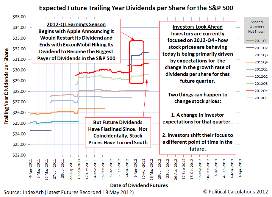
Good morning, Kremlinologists! For some seemingly inexplicable reason, we're breaking our pattern of recent weeks where we would only look at the recent performance of the S&P 500 or its dividend futures just once during a week, if that, with our third post on the topic this week! Even more curiously, it comes after one of those posts, with the cryptic title of "The Ultimate Sell Signal", where we looked at Great Crash of 1929, went viral.
But we're really taking a breather today. And perhaps for the next several days, before we'll resume posting on the topic again [3]. In the meantime, here are our three favorite charts showing the relationship between stock prices as represented by the S&P 500 and their underlying dividends per share. First up, let's look at the recent history of how the future for the S&P 500's trailing year dividends per share has changed over the past two months [1][4]:
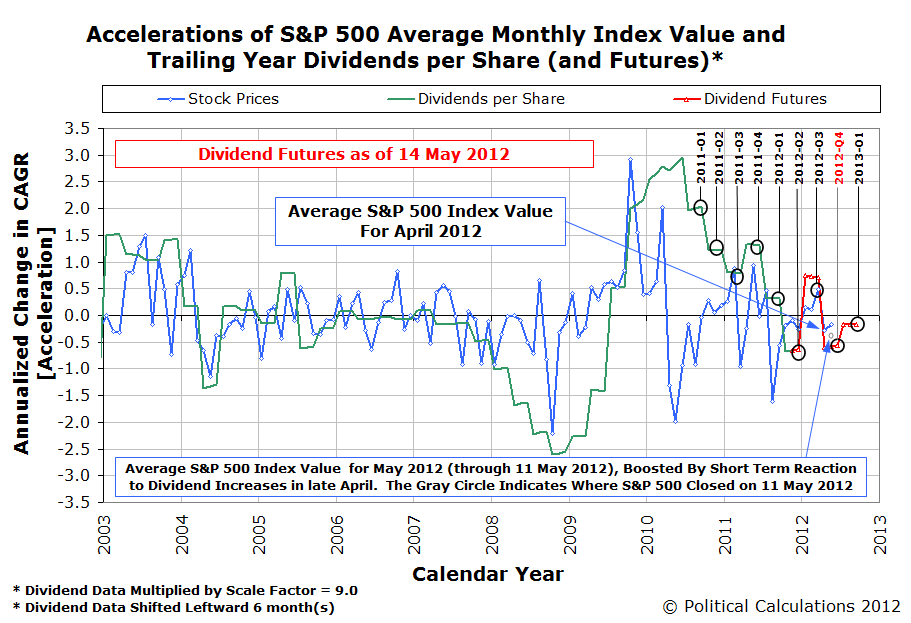
Next, let's see how the chart we featured at the end of "The Ultimate Sell Signal" changed from 11 May 2012:

Finally, let's see why we might be okay in taking a breather for a short span, with our third chart showing how closely the change in the growth rate for stock prices is pacing the expected amplified change in the growth rate for trailing year dividends per share in the fourth quarter of 2012, where investors would seem to currently be focused [2]:

Have a good weekend!
Notes
[1] Yes, we know sentences like that are difficult for many to follow. But as those of us who navigate through the time vortex that is the stock market well know, "tenses are difficult, aren't they?"
[2] See what we mean?!
[3] Update 18 May 2012, 6:40 PM EDT: Make that "hours" instead of "days".... See you next week!
[4] Chart commentary corrected to fully apply for the fourth quarter of 2012 - a portion of the comments for the original version applied to the third quarter of 2012. Our apologies for missing the error!
Labels: chaos, dividends, SP 500
How much money is the government of Greece capable of collecting?
That's the basic question behind economist Michael Rizzo's recent exploration of what he called the "Government Budget Identity" for Greece:
The "government budget identity" is simply a way to think about how a government can finance its expenditures. Suppose a government is required to help us build bridges and defend our borders – it requires funds to do this. A typical sovereign government can secure funds from three "legitimate" places. What are these sources?
- Taxes today.
- Taxes tomorrow. In other words we can borrow money today in order to build our bridge and then use future tax revenues to pay for the debt tomorrow. By the way, if the government is in the business of actually producing valuable "public goods" then you can easily think of this as value enhancing.
- Printing money. It's not generally done this way, but in effect the monetary authorities can monetize the borrowing of a sovereign entity (how they do it is beyond the scope of this post). For simplicity, imagine instead that a central bank prints new bank notes from scratch, hands them to the Treasury, and then the Treasury spends them on goods and services. This is just another form of a tax, again beyond the scope of this post.
So, this is what the government budget identity looks like for "normal" countries:
G = T + the change in debt + the change in base money
He then goes on to consider how that identity has come to only mean "G = T", where the amount of money Greece has available to spend is only what it collects in taxes today.
With that as the basic background then, Warren Meyer extended the discussion into what the math for Greece really looks like:
I think this is a useful simplification, but I wanted to add a couple other refinements (refinements by the way he did not neglect in his text, just did not put in the formula). One other source of funds we have seen in Greece is what I would call Aid, which used to be humanitarian aid (think India in the 1970s) but today tends to be bailout money and debt forgiveness. So we will write the equation
G = Taxes + ΔDebt + Money Printing + Aid
But due to the Keynesian orientation of many commenters on the Greek and European situation, it becomes useful to expand the "taxes" term into some sort of base income, which I will just call GDP for simplicity, and some sort of tax rate t. So then we get:
G = GDP * t + ΔDebt + Money Printing + Aid
The Greeks can't print money (unless the EU does it for them) and at the moment no one in their right mind will lend to them without guarantees from stronger European countries (e.g. Germany). If we call EU money printing for Greece or EU loan guarantee programs Aid, we get
G = GDP * t + Aid
As Rizzo noted, aid is drying up and Greek tax revenues are going down rather than up, so basically they are screwed. The only out seems to be for Greece to exit the Euro and then, once on the drachma again, print money like crazy and inflate their way out of the debt.
It just so happens that we've been working on a different project where we've been playing with the OECD's, Eurostat's and Knoema's available data for Greece's GDP, total tax collections and total government spending for the years from 2000 through 2011. Putting those numbers together, and then putting them into a more human-oriented, "per Capita" scale by dividing them by Greece's population, allows us to produce the following chart:

In this chart, we find that the Greek government is successfully taxing 39.2% of its GDP, while also taking in approximately $135.41 for each member of its population in the form of "aid", to reference Warren Meyer's "G = GDP * t + Aid" variation of Greece's "Government Budget Identity".
Now, notice how steady the data with respect to the Tax Revenue Trendline is throughout all these years. There is very little deviation from it in any given year. Now consider all that the Greek government has been doing to try to boost its tax collections over all this time, starting with its marginal "All-In" income tax rates, which are the income tax rates, plus Social Security-style taxes, less the money it hands back out to its people through its welfare-type programs:
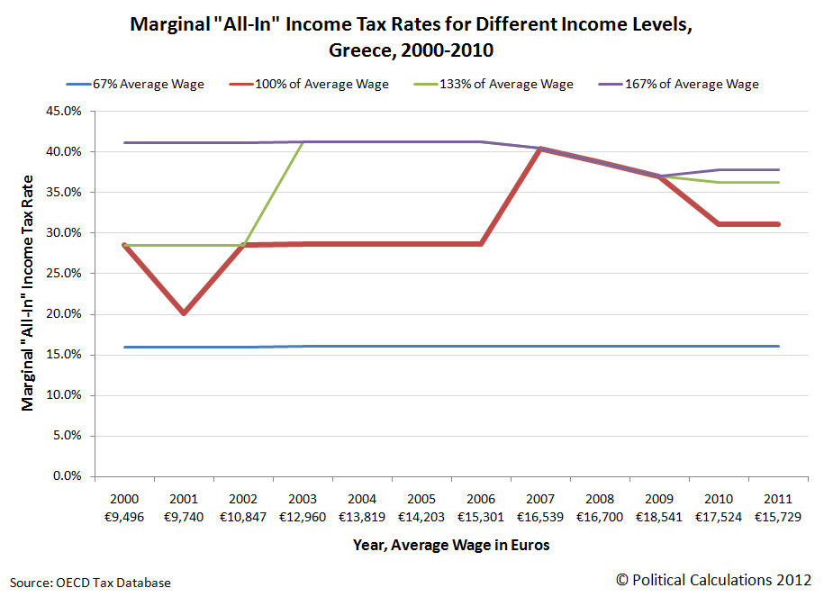
Here, we observe that significant tax rate hikes occurred in 2002, affecting people earning 133% of Greece's average annual wage, and upon middle-income earners after 2006. Although those tax rates have fallen somewhat since, all tax rates for the middle-to-upper income earners in Greece are higher than in 2006, supposedly three years *before* Greece's debt problems exploded.
In reality, and going back to our first chart, we see that a gigantic increase in annual government spending for each year from 2007 through 2009 is really what did Greece in.
Next, let's consider that tax that really hits home: Greece's Value Added Tax (VAT):

In this chart, we see that the Greek government has implemented two hikes in its value added tax, a 1% increase in the tax rate from 2005's 18% to 2006's 19%, before really turning the screws with a 4% increase to the current 23% in 2011.
We're not kidding when we say that Greece's government really turned the screws on its people with its VAT in 2011. That 4% increase in the rate of taxation should have increased its revenue from the tax by more than 21%.
And yet, it's not, as even that massive tax rate increase has had little effect upon the Greek government's ability to actually collect more taxes from its people. For that matter, neither has its increased income taxes. It's as if Hauser's Law is alive and well on the Peloponnesian peninsula!
If only the people responsible for Greece's government's spending would learn to live within that limit....
Labels: economics, national debt
We were inspired by Climateer Investing's summary of the econoblogosphere's ongoing analysis of the increasing level of disability fraud in the U.S., where hundreds of thousands of people would appear to be ending up after their extended unemployment insurance benefits expire, to ask two new questions: which Americans are benefiting from the fraud and how are they getting away with it?
To answer the first question, we started with the annual age distribution data that the Social Security Administration publishes on the number and age of that agency's disability benefit recipients. Starting with the pre-recession years of 2006 and 2007, the recession years of 2008 and 2009, as well as the post-recession years of 2010 and 2011, we created the following chart showing the number of people for each age recorded by Social Security for each year:

We see that nearly 90% of the increase in the number of people claiming disability benefits from Social Security has taken place for people Age 46 or older, with that increase outnumbering the increase in younger individuals by a factor of nearly 10 to 1.
Next, we compared a given year's number of disability benefit recipients to the previous year's number of disability benefit recipients who were one year younger. Doing this allows us to see the net number of people added to Social Security's disability rolls in each year:

Here, we see once again that it is mainly older Americans who have cashed in on Social Security's disability benefits. But this time, we see something we didn't expect - there is a very pronounced spike in the number of disability claims being awarded in each year, regardless of the condition of the U.S. economy, coinciding with Age 50.
That didn't make much sense - why would 50 year old people have such a surge in enrollment for Social Security disability benefits? Do people just suddenly break down at Age 50?
We found the answer in a blog post for a law firm that specializes in disability claims from 31 October 2005 - it's because the federal government gives people Age 50 or older a free pass for being able to claim disability benefits:
Why is age 50 so important in a SSDI case?
It goes without saying, the older you are, the better chance you have of being awarded disability. Age 50 is the “cut off” point for claimants filing for social security disability. If you had two claimants with nearly identical disabilities and backgrounds and only one of them is older than 50, the older claimant is more likely to receive benefits than the younger claimant. Claimants younger than 50 simply have a harder burden to overcome, although it is not impossible.
Why is it harder for younger claimants to receive disability benefits? If you are disabled it does not matter how old you are, right? Well not exactly. The social security administration has stated that even if a claimant cannot perform substantially all sedentary work, it does not mean that they are entitled to receive benefits. The reason being your background may dictate you working in another field. The SSA will look at your age, education, work experience, etc and determine if you have any transferable work skills that enable you to work despite your disability. This becomes important when you have a disability that prohibits you from doing substantially all sedentary work and you are below age 50. The SSA believes that claimants under age 50 have not yet reached an age that is old enough to limit their ability to adjust to other work. Is it fair, probably not especially if you are 47 and have the same disability as a claimant who is 51. But in defense of the SSA policy, there has to be some point where advanced age significantly becomes a factor.
Claimants under age 50 are put up against the task of having to rebut the testimony of a vocational expert at their hearing. This is a difficult task for many claimants. Vocational experts have often times heard several cases and have years of experience. Social security disability attorneys deal with vocational experts on a daily basis. If you find yourself in this situation, you are better off having counsel on your side to handle the cross examination of a vocational expert.
Before Age 50, the federal government puts obstacles in the way of those who might falsely claim disability benefits by actively challenging their claims. But once an individual reaches Age 50, it removes that barrier to preventing fraud.
We therefore find that the government's bureaucratic policies are enabling large scale disability fraud by not challenging all claims made by those applying to receive disability benefits. What's more, because individuals on disability status are no longer counted as being part of the U.S. labor force, the federal government is also guilty of falsifying employment situation reports, which are providing a false picture of the health of the U.S. job market.
That in turn is keeping resources that might otherwise improve that situation from being used for doing so. Because why would a policy maker take action to change the current policies of the federal government if the numbers say no action is needed?
Labels: quality
Just for fun, we've adapted one of our analytical methods for forecasting stock prices and applied it to the stock market of the Roaring Twenties, which really ran from October 1925 up through September 1929:

Keeping with our yesteryear analysis by taking only what someone in the 1920s might have known about our statistical control chart-inspired analytical methods into account (statistical control charts were invented by Walter Shewhart in the 1920s, it would still be years before Western Electric's rules for detecting breaks in trends would be well developed), the value of the S&P 500, or really, its predecessor index, in September 1929 would mark a very strong sell signal, indicating that stock prices were no longer "normal", while also being far above the mean.
What followed next in October 1929 is, as they say, history!...

The difference between the upward trajectory for stock prices in the late 1920s and the downward one in the early 1930s is most likely the expectations that investors had for inflation. That difference in trajectory is very similar in many respects to recent stock market history, where the Fed influenced inflationary expectations with its quantitative easing programs. If those expectations had been largely constant throughout this period, the vertical separation between the upward and downward trajectories would likely have been minimal.
And for a different perspective on the history of the Great Crash:
Finally, also just for fun, here's what the present period of comparative order in the stock market looks like today:

Make your own determinations.
Labels: SP 500, stock market
Back in the days of the Soviet Union, there was a whole field within political science known as "Kremlinology", where people outside the ruling circle within the Kremlin would attempt to divine what was really going on in that nation from what little information the country's bosses made public in the media they controlled.
It occurs to us that since we've stopped publicly forecasting where the S&P 500 will go next that many of our readers may be in the same boat. Especially since our last post on the topic, where we posted the following chart and offered this cryptic observation:
An objective reading of the chart indicates two changes affecting stock prices in the relative absence of noise: one in the very near short term as investors adapt to their just changed expectations for dividend payments that has shifted the future from where it was, and the other playing out in the longer term given their overall expectations for the future.
Wow! What the hell did *that* mean?
If you're one of our savvier readers, you would have taken the context of that post into account, where we had begun by noting ExxonMobil's recent increase of their cash dividend payments to become the largest dividend payer in the S&P 500.
Knowing our discovery that changes in the growth rate of stock prices closely track changes in the expected future growth rate of their underlying dividends per share when the stock market in operating in a low-noise environment, you might take our "very near short term" comment as suggesting that with the sudden improvement in the future for dividends, that stock prices would rise in the very near short term.
And you would have been right, although in reality, the S&P 500 had already risen because we were catching up to events that happened on 25 April 2012, when both ExxonMobil and Chevron, both major companies within the market capitalization weighted S&P 500 index, both boosted their dividend payments. From 24 April 2012, the day before the two oil giants' announcements that they would hike their dividends, the S&P 500 had risen from 1371.97 to be 20-35 points higher, peaking at 1405.82 by the end of the trading day following our post.
That's the "very near short term", don't you agree?
But then we went on to consider what would play out with stock prices in the longer term, given the "overall expectations" of investors for the future.
Here, in the "relative absence of noise", which for us, means investor reactions to major news events or say a new round of quantitative easing by the Fed, which are really noisy events that can cause stock prices to greatly deviate from where their dividends per share might otherwise place them, you probably can't help but observe that the expected change in the growth rate for dividends per share in the future is negative. And that's even after the effects of the major dividend increases that had just been announced.
Our sharpest readers then would be able to reasonably see the same future for stock prices that we did, but did not publicly state: after rising in the immediate reaction to the improvement in the future outlook for dividends, stock prices would resume falling, because the improvement in that future outlook wasn't enough to make it positive. Which they have, now having fallen to 1353.39 as of the close of trading on 11 May 2012, well below where they were when the last big dividend increases were announced as part of the first quarter's earnings season!
We'll close our post by showing you exactly what wee see for the future for the S&P 500 today:
It's up to you now to determine what that means for stock prices. Just remember that as the future changes, so will they!
Labels: chaos, dividends, SP 500
Haven't you ever wished, while you were drinking wine, that there was some way you might be able to improve its aroma and taste right out of the bottle? Without having to use those aerator attachments that are designed to serve that purpose?
If so, then perhaps the just recently patented Drink Swinging Apparatus might be right up your alley! Here is inventor Min Zhuang's own description of the problem he seeks to solve with his U.S. patent 8,132,960, which was issued on 13 March 2012:
Some people like drinking, especially in a festival. Drinking will enhance festive atmosphere. In addition, drinking manners vary depending upon wines. Generally, fragrance can apparently emanate from dry wine after breathing (commonly called wine breathing) by contact with air for a period of time. The breathing is carried out for wine with lower aging so as to release undesired smell and foreign substance and so as to make strong fragrance of the wine prominent. The breathing is carried out for aged wine so that fragrance can emanate from the sealed wine which is aged by means of oxidation. Therefore, before drinking, a bottle cap of grape wine or other fruit wines often needs to be opened and to be swung so that the wine at a bottom within the bottle is alternatively turned up to a surface of the wine where it sufficiently and fully contacts with air, and the undesired smell volatilizes. As a result, the breathing of the wine is accomplished, and a pure and nice taste of the wine is obtained. However, in order to make some wines pure and smooth in taste, the wines should be warmed or iced. For example, people like drinking Shao-Hsing rice wine (Chinese yellow wine) or Japanese sake at a high temperature, and beer or aquavit at a low temperature.
Accordingly, the people will prepare wines in such a manner that varies depending upon wines. Some people may pour wine in a bottle into another container so that the wine can be laid aside or a period of time so as to sufficiently and fully contact with air and to volatilize undesired smell. In other words, breathing process is performed for the wine. Some people may place a bottle with wine therein into a barrel with ice therein to be cooled. Other people may warm the bottle with wine therein in a container. Not only the undesired smell is difficult to be volatilized, but also it is difficult for the wine to be uniformly warmed or cooled in all the manners. In addition, the above manners lack inspiration, and can not add inspiration and joy into the drinking atmosphere.
So what can truly add inspiration and joy into the drinking atmosphere? Why not some sort of Drink Swinging Apparatus?! Here is inventor Zhuang's description of how his invention solves the problems he has identified:
The present invention is made to solve at least one aspect of the problem existing in the prior art.
It is an object of the present invention to provide a shaker which swings a wine bottle in a reciprocation manner so as to speed up breathing of wine, and can move to excite appetite for drinking.
It is another object of the present invention to provide a shaker which can cool or warm wine and speed up a process of cooling or warming the wine by mixing a cooling or warming liquid contained in a container by swinging the wine bottle with less energy consumption during a process of breathing.
It is still another object of the present application to provide a shaker which has less friction force and can effectively reduce noise, which is generated by components of the shaker, in use,
Here's what it looks like, in patent sketch format:
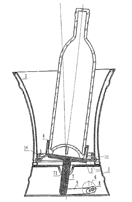
And here is how it works:
In operation, a wine bottle is placed on the bottle seat 4, and mixture of ice and water, or warm water is poured into the container 2. When the electrical motor 6 is started, the motor 6 drives the tray 5 through the crank 8 to swing rightward and leftward. The tray 5 drives a center portion of the seal sheet 3 and the bottle seat 4 to swing. While the wine bottle swings with the bottle seat 4, the water in the container is agitated, and at the same time, wine in the bottle is continuously mixed and sufficiently contacted with air so as to be oxidized by means of the swinging. Furthermore, the water in the container is agitated to be uniform in temperature by means of the swinging of the wine bottle, thereby cooling or warming the wine quickly.
But that doesn't really do justice to how Zhuang proposes to really add joy and inspiration into the drinking atmosphere with his Drink Swinging Apparatus. For that, we must consider the additional embodiments that might be used to solve this problem:
In another embodiment, a water jetting device or a mist spraying device (not shown) is disposed in the container 20. This will improve visual sense of the wine shaker, and adds interests and joyness to the people during the swinging of the bottle. Also, it achieves the flowablity of the water in the wine shaker. In a further embodiment, a decorative lamp (not shown) is disposed to the container 20. Light from the lamp can make jetting and spraying of water, and the swinging of the bottle prominent to the observers.
Although a drink shaker of the present invention is described with respect to a wine bottle as an example, it apparently can be used to other drinks, such as carbonated drinks, coffee drinks, tee drinks, contained in bottles or those similar to the bottles.
Ah yes! We look forward to the Drink Swinging Apparatus' use with carbonated drinks, especially with that water jetting or mist spraying device. What could possibly go wrong?
Alas, we must wait to find out as the invention has yet to make it to the market. In the meantime, while it may not be what you might have visualized from its name, we hope that knowing that Patent 8,132,960 has been issued adds both inspiration and joy to your drinking atmosphere this weekend!
Labels: none really, technology
What's the real story with the changing age distribution of working Americans over the previous five years? We've previously shown that large declines in the working population of the U.S. has taken place across all age groups, but how much of that might be considered to be normal, such as in the case of retirement, and how much might due to other factors? Which age groups have been hurt the most during the Great Recession, and are there any that have made out the best?
To find out, we need to go back to the Employment to Population ratio that Jed Graham used to make his original point, only we'll calculate it for each of the age groupings for which the BLS collects data for both November 2006 and November 2011. We're doing a direct comparison of each of the five-year age cohorts we have been considering, so we'll capture the shift in the age distribution of the U.S. civilian labor force, with respect to the non-institutionalized population for each over that time.
Doing this will allow us to take factors like retirement into account for older Americans. Since the data for November 2006 is well outside the period covered by the so-called "Great Recession", being just over a year before that recession would rear its ugly head, comparing the more recent U.S. workforce data for November 2011 to it will allow us to see what percentage of people in each age range might have been pushed out from participating in the U.S. labor force by other factors, at least with respect to what we'll call a "normal", non-recessionary year like 2006.
Our results are presented in our first chart below:

Here, we see that all but the oldest age groups saw declines in the percentage of individuals within each population who were counted as being employed. Only those Age 65 or older did not see decreases in the percentage share of employed in the change from November 2006 to November 2011, which is interesting because that age cohort mainly covers the so-called "Silent Generation" - the generation that immediately preceded the Baby Boomers.
Our second chart shows the difference between November 2006 and November 2011's employment to population ratio for each age grouping:
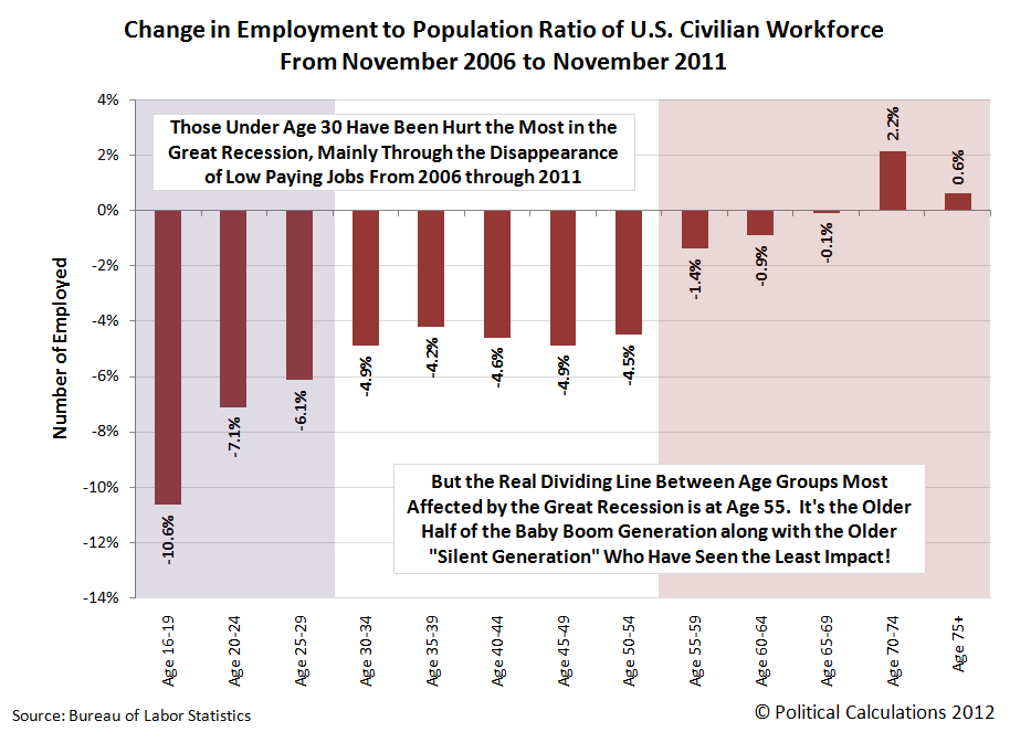
What we find it that those under Age 30 have been the most negatively affected, which we've previously observed to be the result of the disappearance of low paying jobs in the years since 2006. Here, these Americans are being hurt by not being able to even enter the workforce, which in turn, prevents them from gaining employment experience, and which in another turn, will limit their ability to earn higher incomes later in their working years.
The next most affected in the U.S. job market are those between Age 30 and Age 55, which includes roughly half of the Baby Boom generation. These individuals have primarily been hurt by the loss of jobs during the recession, with many of these jobs being lost from the Manufacturing and Trade and Transportation sectors of the U.S. economy during the large-scale automotive industry failures of late 2008 and early 2009.
But the age groups that have been the least affected are those over the age of 55. Here, the older half of the Baby Boom generation has seen little impact on their overall employment representation within their generation, while the older Silent Generation, which includes those over Age 65 in 2011, has actually seen their percentage of employed members in the U.S. workforce increase. Clearly, something has caused employers to strongly favor these individuals over all younger individuals in the five years from November 2006 to November 2011.
In the case of the members of the Silent Generation, we can definitely rule out demographic factors as being behind their apparent percentage increase in the U.S. civilian labor force, because their numbers are far fewer than the Baby Boom generation.
What Might Explain this Age-Based Job Discrimination?
When that kind of distortion exists, you can almost bank money that a perverse incentive for employers is at work - one where there are real world rewards and penalties driving the decisions for a very large number of employers. And because it would seem that a very large number of employers would appear to have acted the same way, you can almost be certain that the federal government is ultimately behind the observed distortion, which in this case, would seem to involve some very pronounced age discrimination.
As for what that might be in this case, let's consider why individuals Age 65 and older would be the only ones seeing real gains in the percentage of their population that has increased during the last five years. What characteristics do they share that might give them an edge for retaining their employment during a period of recession compared to all younger workers?
In considering what it really costs for an employer to have someone on their payroll, we find one major factor that might entirely explain what we observe: the cost of employer-provided health insurance for these individuals.
Here, since those over Age 65 are eligible to have Medicare coverage for their health insurance, that factor can put all younger workers at a competitive disadvantage in the economy, since employers would not need to provide their Medicare-eligible workers with other health insurance.
Put another way, if an employer that might otherwise struggle during a period of recession to generate enough revenue to stay in business can cut their employment costs by hiring people or retaining people on their payrolls who are eligible to have their health insurance costs covered by Medicare, instead of paying for more costly health insurance as they would have to for younger employees, they will greatly favor these individuals in the job market.
What's more, if they anticipate that those poor economic conditions will continue for some years into the future, they'll also hang onto their older employees who will soon be 65 years old, who will be likewise eligible to provide these companies with significant cost savings if they continue working.
Meanwhile, the more costly to employ younger Americans would bear the brunt of jobs lost or not even created under these economic conditions.
We find then that the young are indeed being discriminated against in the U.S. job market and that the federal government is indeed behind the perverse incentives promoting this kind of age discrimination, as the members of the Silent Generation and the older Baby Boomers are indeed being strongly favored by U.S. employers, most likely because of the economic distortions it is creating within the U.S. job market through its Medicare health insurance program.
The only problem for the younger workers being hurt in this situation is that because it is the federal government that has created the incentive to discriminate against them, only it can act to end the bias that it has succeeded in institutionalizing. Unfortunately for us all, the leaders of that government currently have no intention of ending this kind of age-based job discrimination anytime soon!
Previously on Political Calculations
- Are Baby Boomers Stealing Jobs from the Young? (Part 1)
- Are Baby Boomers Stealing Jobs from the Young? (Part 2)
- Generations
- How Much Are Geezers Displacing Teens from the U.S. Workforce?
- How Much Does It Cost to Employ You?
- Trending Health Insurance Costs
Labels: demographics, jobs
Today, we're going to start by looking directly at the evidence that would seem to support the case that Baby Boomers are making out much better than younger Americans in the Great Recession in the second part of our three-part series.
Here, we'll start by showing the number of individuals counted within each approximately five-year long age grouping recorded by the BLS as being employed in November 2006 and November 2011. Only the data for the very youngest, Age 16-19, and oldest, Age 75 and older, cover different age ranges. The data shown in our first chart applies to the BLS' non-seasonally adjusted figures for each of the indicated age groups:

Comparing the recorded values for the same age groupings in November 2006 with those for November 2011, we find that there would indeed appear to be a significant shift favoring Americans over the age of 50.
We can see that move clearly if we focus in the differences recorded in the values from November 2006 to November 2011, as shown in our second chart:
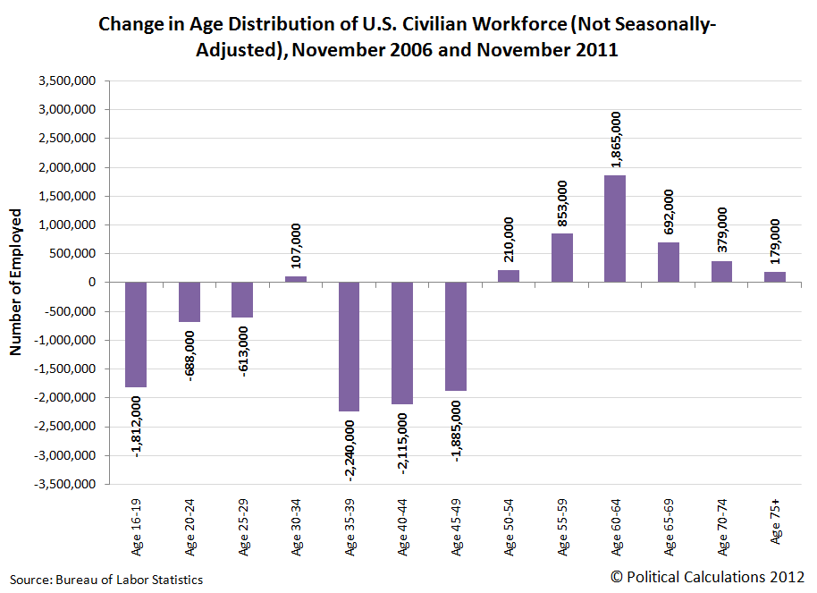
We observe that the age distribution of the U.S. workforce would appear to have shifted strongly in favor of those Age 50 and older.
Surprisingly though, we see that teens would appear to only be the fourth most negatively-affected age grouping, with the top three most-negatively affected being those Age 35 to 39, Age 40-44 and Age 45 to 50. Teens however would indeed be the most negatively affected age grouping once you take their total numbers in the U.S. workforce into account, as the total non-seasonally adjusted number of people with jobs in this age group has been reduced by over 30% from November 2006 to November 2011.
We observe that even though the Age 35-39, Age 40-44 and Age 45-49 groups had seen larger declines in their workforce numbers than U.S. teens, because so many more people in these age ranges are employed, the declines are much smaller as a percentage share of the working population for each group than it is for teens.
The age group with the largest increase in the number of individuals recorded as having jobs from November 2006 to November 2011 is the Age 60 to 64 cohort, which would represent many of the leading edge of the Baby Boom generation, which spans the years from 1946 through 1964. Individuals Age 60-64 in 2011 were born between the years of 1947 and 1951.
Unfortunately, these charts don't tell the whole story. That's because nearly all of the people in the indicated age ranges in our charts for November 2011 are not the same people who were recorded in these same age groupings in November 2006. The only exception is for the Age 75+ age grouping, which is a catchall grouping for the oldest employed Americans.
As an illustration of what we mean when we say that we aren't dealing with the same people, let's consider the individuals who were between the ages of 45 and 49 in November 2006. These are definitely not the same people who are included in the Age 45-49 age grouping in November 2011's jobs data, because they were all five years older by the time November 2011 rolled around. And because that's the case, you really can't say what happened to the net number of working people in 2006's Age 45-49 grouping by looking at that same category in 2011.
Unless you take their aging into account. If you really want to find out what happened five years later with the net employment situation of working people who were between the ages of 45 and 49 in November 2006, you need to look at the people who were between the ages of 50 and 54 in November 2011.
So that's what we've done! Our results are graphically presented below in our third chart:

Starting with the lowest age grouping on the chart, we find that those Age 16-19 in November 2011 saw their ranks within the U.S. workforce grow by roughly 4,177,000, at least compared with how many of their peers had jobs when they were between the ages of 12 and 15 in November 2006. Likewise, we see the greatest number of individuals join their peers in the U.S. workforce for the Age 20-24 group in the five years from November 2006 to November 2011, and we see a much smaller gain for those who waited until they reached the ages of 25 to 29.
Basically, what we're seeing with these younger ages are people entering into the U.S. work force within each age peer group. Going back to our first and second charts, and in particular, for the youngest age grouping of Age 16-19, we observe that these numbers are far reduced from their levels in November 2006, which indicates that jobs for teens that existed in 2006 no longer exist for the teens of 2011, which we observe in the total decline of employed individuals in this age range and which we can say with confidence because the population of teens was largely stable throughout these years.
What is more interesting though for this period of time applies for the older age groups, where it is clear that people are exiting the work force. Here we find that every older peer group, spanning the ages of 25 upward, saw their number of peers in the U.S. workforce decline in the five years from November 2006 to November 2011.
Some of that you might expect, especially once individuals reach retirement age, where many individuals in the U.S. tend to begin retiring around Age 60, while others hold on until they reach the normal retirement age to receive full Social Security benefits at or not long after Age 65.
But what you wouldn't necessarily expect is to see so many individuals between the ages of 30 to 55 exit the U.S. workforce during this time. This negative net change covers working age people who had jobs in November 2006, but were no longer counted as being employed in November 2011.
That covers a pretty big portion of the Baby Boom generation, the youngest members of which, born in 1964, would be 47 years old in 2011. We would therefore estimate that over 3 million of these individuals between the pre-retirement ages of 47 and 55 prematurely left the U.S. workforce during these five years.
Clearly, many people, including a good portion of the Baby Boomers, have left the U.S. workforce in the five years from November 2006 to November 2011. But how much is due to "normal" factors like retirement and how much might be recession-driven? And if the oldest workers are really the least affected by the recession, the question is why?
In the third and final part of our series, we'll do our best to answer these questions....
Previously on Political Calculations
- Are Baby Boomers Stealing Jobs from the Young? (Part 1)
- Generations
- How Much Are Geezers Displacing Teens from the U.S. Workforce?
Labels: demographics, jobs
Walter Russell Mead writes on the disappearance of jobs for non-Baby Boomers:
An analysis of recent jobs figures at Investor.com reveals a disturbing development: the biggest beneficiaries from the economic recovery are Boomers, while everyone else is getting the shaft.
Since the Obama administration took office, there has been an epochal shift. Young workers have continued to lose jobs and incomes, while older workers have actually gained ground.
In fact, the Obama administration has seen a boom in the prospects of the 55+ crowd; their (I should say ‘our’) employment stands at a 42 year high. Net, there are 3.9 new jobs for people over 55 since the recession began in December 2007, but there are 8.1 million fewer jobs for the young folks since that time.
Jed Graham's IBD article features a chart that shows the employment-to-population ratio that applies for the following age groupings: Age 16-24, Age 25-55 and Age 55 and up:
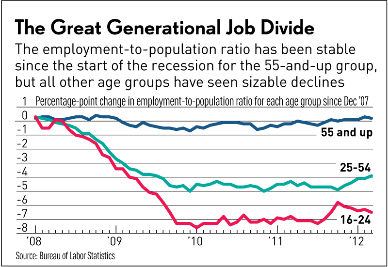
In the chart, we see that those Age 55 and older would appear to have a near constant share of their population group having jobs.
Meanwhile, we see significant decreases in the employment share of the populations for both the Age 25-54 group and especially for the Age 16-24 group since December 2007, which marks the beginning of the so-called "Great Recession".
We thought that outcome was interesting enough to dig deeper into the data to see how the age distribution of the U.S. workforce has changed over this period of time.
And to make it really interesting, we've decided to go back to November 2006 to do it. Here's why:
- The seasonally-adjusted level of total employment for the U.S. economy hit its all time peak in November 2007, just ahead of the Great Recession. Going back to November 2006 will allow us to capture the last full year of economic expansion for the U.S. economy.
- Coincidentally, the seasonally-adjusted number of teens (Age 16-19), who represent the lowest end of the age groups for which the BLS reports monthly jobs data, and is also the most negatively affected group over this period of time, last peaked in November 2006. Going back to this point in time will also fully capture what has happened with teen employment in the years since.
- The BLS breaks almost all of its age-related jobs data into five-year long cohorts, covering groupings like Age 20 to 24, Age 25 to 29, Age 30 to 34, et cetera. Going back to November 2006 will allow us to see how the employment situation for the same people whose employment was recorded in one of the age groups in November 2006 changed after they all moved up into the next higher age cohort in November 2011.
The downside to our more detailed approach is that we're not going to be able to use the BLS' seasonally-adjusted data for these older five-year age groupings, because the BLS only reports the non-seasonally adjusted data it collects for them, which means that the data we'll be using won't match these more commonly reported values. Still, because we'll be comparing the data for the same month (November) five years apart, our analysis should only differ in very minor respects from what might be achieved using seasonally-adjusted data, if it had been available.
We're going to do this in a three-part series of posts, with this post being the first. Our next stop: the change in the age distribution of the American workforce from November 2006 to November 2011!
Labels: demographics, jobs
After stalling out in March 2012, the employment situation for April 2012 in the U.S. faded across the board.
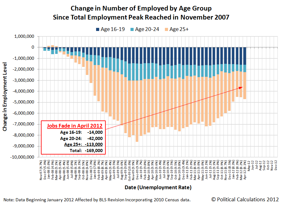
We see that for all the age groups we routinely cover. The number of teens (Age 16-19) recorded as having jobs fell by 14,000 from the level recorded in March 2012 to 4,321,000 in April 2012. Likewise, young adults between the ages of 20 and 24 saw their numbers fall by 42,000 to 13,329,000 in April 2012, while those Age 25 or older saw their numbers in the U.S. civilian workforce decline for the first time since October 2011, falling by 113,000 to 124,215,000.
Compared to November 2007, when the total employment level in the United States peaked just before the peak in economic expansion marking the beginning of recession in the following month, there are 4,730,000 fewer individuals being counted with jobs as of April 2012. There were 141,865,000 people counted as being employed in April 2012.
Of the decline in jobs since November 2007, just over 1 out of 3 of the jobs that have disappeared from the U.S. economy in the time since may be accounted for by individuals between the ages of 16 and 19. Today, these individuals represent 3.0% of the entire U.S. workforce, down from a percentage share of 4.0% in November 2007.
Another 1 out of 7 of the decline in jobs since November 2007 may be accounted for by young adults (Age 20-24). These individuals represent 9.4% of the total U.S. workforce today, which is almost identical to their percentage share of 9.5% in November 2007.
The remainder of the decline in jobs since November 2007 is obviously accounted for by those Age 25 or older, who account for 51.8% of the decline in jobs. Unlike teens and young adults however, the percentage share of these adults in the U.S. civilian labor force has risen to represent 87.6% (just over 7 out of 8) of all working Americans), which is up from 86.5% in November 2007.
The April 2012 jobs report is consistent with what we would describe as a microrecession, which we first forecast for this quarter in June 2011.
By our definition, a microrecession is a period of relatively slow or negative economic growth for a nation that is either relatively minor (say of limited scope, affecting some but not all regions across a country) or is comparatively short in duration.
We continue to anticipate that the U.S. economy will not enter into a full blown recession in 2012, and will rebound in the third and fourth quarters of 2012. We do not anticipate at this time that this expected rebound will extend very far into 2013.
Labels: jobs, recession forecast
Welcome to the blogosphere's toolchest! Here, unlike other blogs dedicated to analyzing current events, we create easy-to-use, simple tools to do the math related to them so you can get in on the action too! If you would like to learn more about these tools, or if you would like to contribute ideas to develop for this blog, please e-mail us at:
ironman at politicalcalculations
Thanks in advance!
Closing values for previous trading day.
This site is primarily powered by:
CSS Validation

RSS Site Feed
JavaScript
The tools on this site are built using JavaScript. If you would like to learn more, one of the best free resources on the web is available at W3Schools.com.
Other Cool Resources
Blog Roll


