It has been very busy behind the scenes here at Political Calculations (more on that later this week), as we've been working on a lot of different fronts.
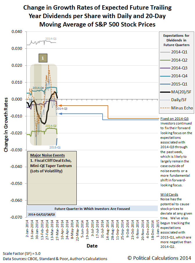
First and foremost, we've updated our chart showing the changes in the year-over-year growth rates for the future's expected trailing year dividends per share (perhaps better thought of as simply "investor expectations") and the change in the growth rates of S&P 500 stock prices.
Here's the quick summary of changes:
- We've rolled the dates from the previous version of the chart six months to the left, which means this version of the chart will cover all of 2014.
- Data for the dividends per share expected for 2015-Q1 became available in the past week, which is now shown on the chart.
- We've "grayed out" the data for 2014-Q1, since the first quarter of 2014 is now fully in the rear view mirror. The last time investors had focused on that quarter in setting stock prices was back in mid-November 2013.
We've also modified our method of accounting for the echo effect upon the growth rates of stock prices to be more adaptive. Here, the previous editions of the chart treated the size of the echo effect as if it were a constant value, which has worked out okay through this point, but we're coming up on a period after the end of April 2014 where the effect will be particularly pronounced, where continuing that approach be less than optimal.
Speaking of the future, investors would still appear to be focused on the future quarter of 2014-Q3 in managing their expectations for setting today's stock prices. That's also clear in the echo-filtered alternative futures chart below:

And for those who would like to consider what the future looks like beyond the end of this week, we've projected the future based on the snapshot of futures we took on 28 March 2014 forward another three months to the end of 2014-Q2:
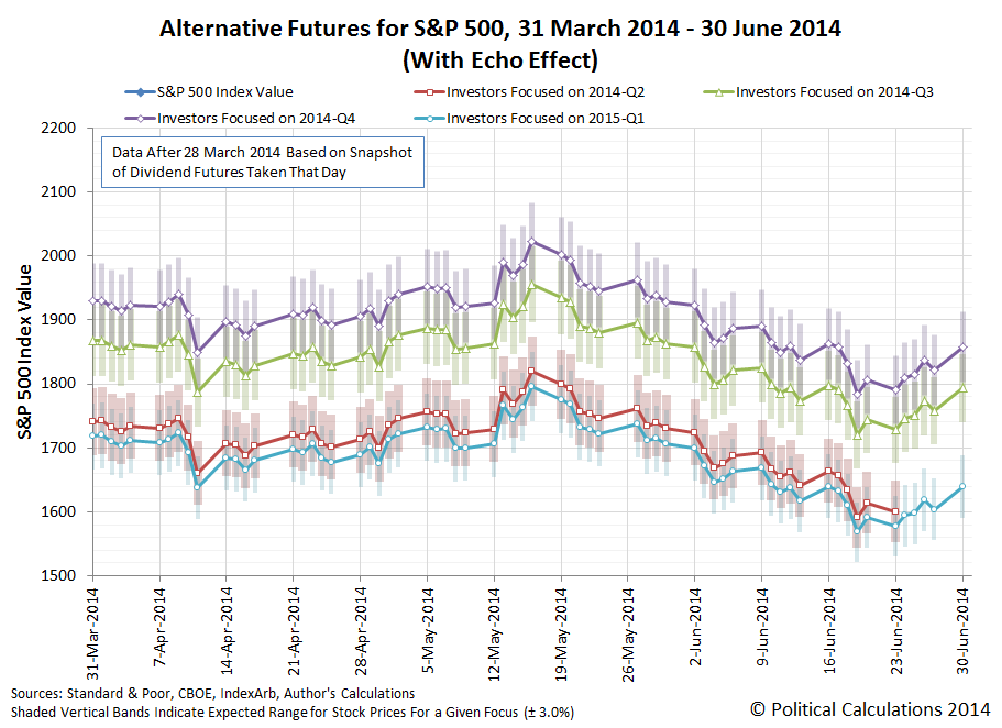
Pick your future and set your expectations accordingly!

Suppose for a moment that you were planning to enjoy some alcohol-based beverages during your lunch. But you also have to be on top of your game once you go back to your office, and certainly by the time that big meeting where you will be making a key presentation rolls around.
Do you know when to say when?
That's a subject that Adam Kucharski explored in looking for useful bits of math that can really be applied in everyday situations. He explains how we might go about resolving the question with the kind of math you should have learned in that dreaded Algebra class:
Sobriety (or lack thereof) is measured via the level of alcohol in the blood. One way to estimate blood alcohol content (BAC) is to use the Widmark formula, which was originally concocted by EMP Widmark, a Swedish doctor, in the 1930s.
If you weigh W kilos, and have consumed A units of alcohol at a lunch that started T hours before 5pm, your estimated blood alcohol content is:
BAC = (0.967 x A) / (W x C) - (0.017 x T)
(Here 0.967 adjusts for the level of water in the blood, 0.017 represents the amount of alcohol you burn off over time and C adjusts for body composition – it equals 0.58 for the average man and 0.49 for a woman.)
Now that we've shown you the math, let's next consider what might be the most difficult part to work out to make it useful - just what is a "standard" drink where alcoholic beveridges are involved?
We found the following chart posted at the U.S. National Institute of Health:

And then, we made it easy to apply this math through the following tool (click here to access it on our site) - just enter the relevant information, and we'll let you know what your blood alcohol level will likely be by the time you indicate you want to know (and to find out what it might peak at, enter zero for the number of hours).
Our "Bottom Line" comment focuses on several key levels for your potential blood alcohol content, but if you would like to know more about how you might be negatively impaired for various levels of excessive alcohol consumption, we'll turn your attention to the experts at Clemson University.
Otherwise, enjoy your lunch!
Following our most recent post looking at the current trends in U.S. median new home sale prices, we were forwarded the following question:
"Can you quickly and easily 'real dollar' this chart?"
By "this chart", our inquisitor is likely referring to the following chart, showing the overall trend for median new home sale prices with respect to median household income since 1967:
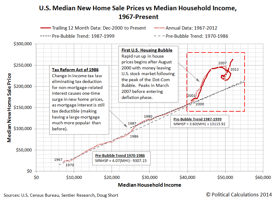
And the answer to their question is: "Why, yes we can!"

It's not as pretty as our nominal value chart, which better describes the world in which people actually live and buy things, but it does clearly show housing prices defying the post-2000 recession as real median incomes fell during the first U.S. housing bubble, and again at present in the second U.S. housing bubble, as median new house prices began rising in 2011, but with no meaningful increase in median incomes to support them.
As for what a non-bubble driven housing market looks like, since we've already demonstrated that household income is *the* primary driver of home prices, we should see a close coupling between median incomes and median sale prices, with both either rising or falling at rates consistent with those observed over extended period of time.
That we're instead seeing nearly vertical movements for prices with respect to household income indicates that other factors have created a situation where housing is becoming increasingly unaffordable.
After all, if the families who earn the median household income are increasingly unable to afford the median price of new homes for sale, something other than the fundamental driver of house prices is seriously skewing the real estate market.
And history tells us that the other factors that can affect home prices do not have any significant "staying power".
Labels: data visualization, real estate

If you're an investor, how do you play a bubble?
Let's take a step backward first and define just what a bubble is. A bubble may best be thought of as the situation where the price of an asset in a well-established market first soars and then plummets over a sustained period of time at rates that are decoupled from the rate of growth of the income that might be realized from owning or holding the asset.
For an asset like stock prices, the income that might be realized from owning or holding shares of ownership in a publicly-traded company are called dividends. We can easily visualize when a bubble exists in the stock market by seeing how far stock prices deviate from the level that the basic relationship between stock prices and their underlying dividends per share would set them.

Viewed this way, it is very easy to see when stock prices deviated from the level that would be supported by their long-term established relationship with their trailing year dividends per share during the days of the Dot-Com Bubble, which ran from April 1997 to June 2003. We likewise see that there is no significant bubble in the stock market today.
The Dot-Com Bubble consisted of two major phases: an inflation phase that ran from April 1997 to August 2000, which marked the peak of the bubble, and a deflation phase that ran from August 2000 to June 2003, after which order returned to the market. [We've previously commented on the cause of the Dot Com Bubble.]
Now, here's the thing. During the inflation phase of the Dot-Com Bubble, there was never a good indication of how or when asset prices would peak. Using a tool like the chart above, an investor would know that something other than the basic driver of stock prices was affecting them, but there was never an indication of how high they would go. Nor was there any indication of how long the inflation phase of the bubble would last.
So if you're an investor, one who seeks to maximize your gains, how would you have played the Dot-Com Bubble?
We'll revisit this topic in an upcoming post....
Labels: investing, stock market
Now that the U.S. Census Bureau has finally posted the income data that it collected in January 2014 through the Current Population Survey (over a month late, the Bureau posted its data for February 2014 at the same time), we can now check in on the status of the second U.S. housing bubble. The chart below reveals what we find:

Here, we see that the second U.S. housing bubble continued to inflate through January 2014, although at a slower pace than it did during its initial phase, which ran from July 2012 through July 2013.
The pace of inflation would seem to affected by changes in U.S. mortgage rates, which spiked upward in mid-2013 as the Federal Reserve announced its decision to begin tapering its purchases of mortgage-backed securities and U.S. Treasuries, but which have since fluctuated between 4.3% and 4.5%.
That doesn't seem like a big range to drive the trend for median new home sale prices, but in the latter half of 2013 through January 2014, the rate of change of median new home sale prices would appear to be affected by those fluctuations, rising faster when mortgage rates drop to the low end of the range and rising at a slower pace when rates rise.
That, of course, is the result of median new home sale prices being very much at the economic margin, which is the reason why we pay such close attention to them.
We'll close with an updated look at the long-term trends in median new home sale prices in the U.S., which put the recent bubbles in U.S. new home sale prices into better context.
We don't yet know what level mortgage rates would have to reach to send the trend for median new home sales on a downward trajectory to begin deflating the second bubble. Given how apparently weak the U.S. housing market continues to be, we hope to not find out anytime soon.
References
U.S. Census Bureau. Median and Average Sales Prices of New Homes Sold in the United States. [Excel Spreadsheet]. Accessed 24 March 2014.
Sentier Research. Household Income Trends: January 2014. [PDF Document]. Accessed 20 March 2014. [Note: We've converted all data to be in terms of current (nominal) U.S. dollars.]
Board of Governors of the Federal Reserve System. H.15. Selected interest Rates. 30-Year Conventional Mortgage Rate. Not Seasonally Adjusted. [Online Database]. Accessed 24 March 2014.
Labels: real estate
Following Janet Yellen's comments at the press conference following her first testimony before Congress since becoming the head of the U.S. Federal Reserve, to which investors responded by focusing tightly upon the future defined by the expectations associated with 2014-Q3 in setting today's stock prices, we didn't have long to wait for noise to re-emerge as a factor affecting how stock prices behave.
We can see that in our echo-filtered alternative futures chart - instead of rising on Friday, the S&P 500 fell slightly instead:
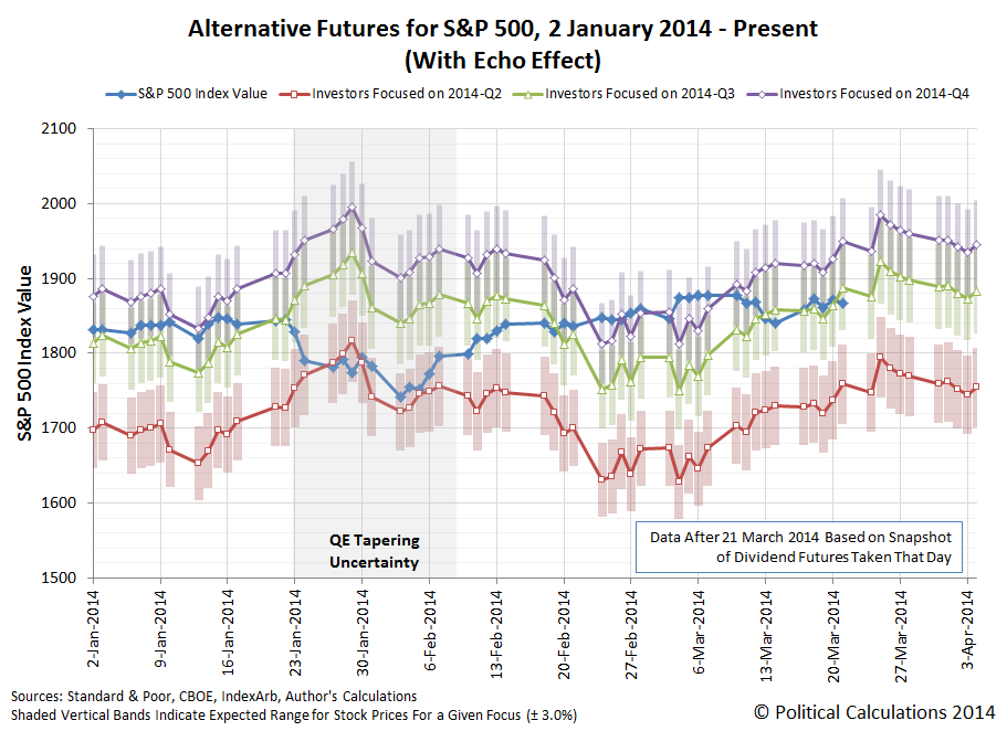
What was interesting during the day is that investors tried to boost stock prices as our chart would suggest, as the S&P 500 set an all-time record intraday high of 1883, just four points lower than the midpoint target range for an investor focus on 2014-Q3 shown on the chart.
Alas, after 11:35 AM EDT, noise began to increase in volume, as 21 March 2014 was also a quadruple witching day, where the expiration of a number of individual and index stock futures and options contracts can make for volatile trading sessions. The S&P 500 went on to close at 1866.62 for the day.
As for what to expect next, well, we've already covered what our hypothesis suggests would likely happen, haven't we?
It's been a big week for physics, with the detection of gravitational waves now confirmed. That news overshadows another recent discovery, which came two weeks earlier when mathematicians from the University of Sheffield unveiled the formula for producing the perfect pancake.
Really. We're not making this up! Although to be fair, the math is really about the perfect pancake portion....
In a collaboration with Meadowhall Shopping Centre, students from the University's Maths Society (SUMS) developed, trialled and tested a formula which enables pancake-lovers across the world to rustle-up pancakes to their own personal preference, taking into account the number of pancakes required, thickness and pan size.
Whether you're feeding a hungry family of six or simply wishing to treat yourself on Shrove Tuesday, the formula which has been turned into a calculator below will help you prepare the perfect pancake feast.
Tested by chefs at Meadowhall's Frankie and Benny's restaurant, the formula translates to:
Gaby Thompson, President of the University of Sheffield's Maths Society (SUMS), and one of the formula's creators, said: "Cooking is full of scientific and mathematical formulas, so when Meadowhall approached us to see if we'd like to join in the fun, we jumped at the chance.
"Cooking is a fun and innovative way to demonstrate how maths can be used and explored in everyday life and we hope by developing this formula it will encourage more people to engage with the subject and help to combat maths phobia."

Now, that's the kind of practical discovery for which we like to mark with the creation of a new tool! Just enter the indicated parameters in the tool below, and we'll work out how much batter you need to finally achieve success in making pancakes according to your optimal parameters.
Mmm... pancakes! Now, all you need is a good recipe, and for that, we'll refer you to The Pioneer Woman, who is similarly obsessed with creating perfect pancakes.

What happens when the new Chair of the Federal Reserve, Janet Yellen, tells investors exactly how far forward in time they need to look for setting their expectations in making their investment decisions today?
Calculated Risk's Bill McBride reports:
During the Q&A today, Fed Chair Janet Yellen said:
"[T]he language that we used in the statement is considerable period. So I, you know, this is the kind of term it’s hard to define. But, you know, probably means something on the order of around six months, that type of thing.”
She was referring to the sentence in the FOMC statement:
The Committee continues to anticipate, based on its assessment of these factors, that it likely will be appropriate to maintain the current target range for the federal funds rate for a considerable time after the asset purchase program ends, especially if projected inflation continues to run below the Committee's 2 percent longer-run goal, and provided that longer-term inflation expectations remain well anchored.
For better context, here's the WSJ's video of Yellen's comments.
What Yellen is communicating here is that about six months after the Fed terminates the tapering of its current quantitative easing programs, it is likely that the Fed will begin increasing the Federal Funds Rate and, in effect, increasing all interest rates in the U.S.
But that's not the key date here, at least where investors are concerned. The key event that would set that clock ticking is something that the Fed will most likely announce at the end of the Federal Open Market Committee's September 2014 meeting: the exact timing for the end of its current Quantitative Easing (QE) programs, which will then set that new six-month long clock to higher interest rates ticking.
In essence, in making this statement, Yellen is really directing investors to focus their forward-looking attention toward 2014-Q3 ("this fall") and the expectations associated with it, because that will coincide with the Fed's announcements for how and when QE will end.
So how do you think stock prices reacted to that direction, when it became known just after 3:00 PM EDT on 19 March 2014?

If you said, absolutely predictably, for a forward-looking focus fixed upon the expectations associated with 2014-Q3, then you're right. Updating the chart we featured last Tuesday, 17 March 2014:

With that focus now set, in the absence of other news that might prompt investors to focus their attention on a different focal point in the future, the main driver of variation in stock prices in the short term will likely be noise events. At least until the FOMC's next meeting, when perhaps, Janet Yellen will apply the lessons she's now learning after her first press conference as Fed Chair in how to provide this kind of forward guidance.
We just hope that the next time, she points to a future with a more promising outlook for the expectations associated with it.

What happens to a stock market index when a record number of companies buy back a record number of their own shares from investors?
The question is relevant because 2013 was just such a year, and a good question to consider is how much stock prices could have been driven by a reduction in the number of shares issued to the public and their effect upon the standard tools that investors use to assess the performance of a company.
Also called share repuchases, Investopedia describes stock buybacks and the basic motivation behind them:
A program by which a company buys back its own shares from the marketplace, reducing the number of outstanding shares. Share repurchase is usually an indication that the company's management thinks the shares are undervalued. The company can buy shares directly from the market or offer its shareholder the option to tender their shares directly to the company at a fixed price.
The Harvard Business Review describes how share buybacks can affect the value of a company:
Buybacks affect value in two ways. First, the buyback announcement, its terms, and the way it is implemented all convey signals about the company's prospects and plans, even though few managers publicly acknowledge this. Second, when financed by a debt issue, buybacks can significantly change a company's capital structure, increasing its reliance on debt and decreasing its reliance on equity.
For investors though, the immediate impact of a company's share repurchase program is seen in measures like earnings per share. Investing Daily's Chad Fraser explains:
Companies have two main ways of returning cash to shareholders: buybacks and dividends. The latter are pretty straightforward: the company pays a certain amount for each stock held, usually on a quarterly basis.
Under a share buyback, a company purchases a certain number of its own shares. It may do this on the open market or by giving its shareholders the option to tender their stock to the firm, usually at a slight premium to the market price. It then cancels the purchased shares, reducing the total number outstanding and giving each shareholder a larger slice of the company.
Buybacks also increase earnings per share (because total earnings are divided by fewer shares) and tend to increase the value of the remaining shares.
It's that latter effect, multiplied across dozens of large companies, that has the potential to affect large market indices, such as the Dow Jones Industrial average or the S&P 500.
The answer is: it depends upon the index. S&P's Howard Silverblatt recently offered the following comment in S&P's Earnings and Estimates report (Excel Spreadsheet), where we've added the paragraph breaks for the sake of better readability:
Buybacks do not increase S&P 500 Index earnings-per-share (EPS), the Dow is a different story. On an issue level, share count reduction (SCR) increases EPS, therefore reducing the P/E and making stocks appear more 'attractive'. SCR is typically accomplished via buybacks, with the vital statistic being not just how many shares you buy, but how many shares you issue.
In the most recent Q4 2013 period we saw companies spend 30.5% more than they spent in Q4 2012, though they purchased about the same number of shares. The reason is (in case you didn’t notice), that prices have gone up, with the S&P 500 up 29.6% in 2013, and the average Q4 2013 price up 24.7% over Q4 2012.
Many companies, however, appear to have issued fewer shares, and as a result have reduced their common share count. The result is that on an issue level it is not difficult to find issues with higher EPS growth than net income (USD) growth. A quick search found that over 100 issues in the S&P 500 had EPS growth for 2013, which was at least 15% higher than the aggregate net income. The result for those issues, were higher EPS and a lower P/E.
On an index level, however, the situation is different. The S&P index weighting methodology adjusts for shares, so buybacks are reflected in the calculations. Specifically, the index reweights for major share changes on an event-driven basis, and each quarter, regardless of the change amount, it reweights the entire index membership. The actual index EPS calculation determines the index earnings for each issue in USD, based on the specific issues’ index shares, index float, and EPS. The calculation negates most of the share count change, and reduces the impact on EPS.
The situation, however, is the opposite for the Dow Jones Industrial 30.The Dow methodology uses per share data items. So if a company reduces its shares, with the impact being a 10% increase in earnings (as an example) with a corresponding 5% increase in net income, the Dow’s EPS will show the increase in EPS. Again, the impact would be mostly negated in the S&P 500. This is not to say that buybacks don’t impact stock performance, and therefore the stock level of the indices (and price is in P/E). It is only to say that the direct impact on the S&P 500 EPS is limited, even as examples on an issue level are becoming easier to find.
Consequently, a price-weighted index like the Dow Jones Industrial average will be affected by share buybacks for its 30 component companies, but the value of a market capitalization-weighted index like the S&P 500 won't be impacted to anywhere near the same degree, given the difference in how the indices are constructed.
Labels: stock market
Whatever happened to the echo effect? After all, it's been a couple of weeks since we last mentioned in any meaningful way - you would have to look pretty closely at the margin of our favorite chart in our post yesterday to even see it referenced.
Even though we're still rooting against it, given that it makes the math we do more complicated, filtering for the echo effect would still seem to be providing a better frame of reference for describing why the stock prices are behaving as they are. Here's the echo-filtered version of the alternative futures chart we presented yesterday:

For an example of why filtering for the echo effect would appear to provide a better frame of reference than the unfiltered version, let's look at the change in the value of the S&P 500 from Friday, 14 March 2014 to Monday, 17 March 2014. Here, after investors had fully shifted their forward-looking focus to the expectations associated with 2014-Q3 on Thursday, 13 March 2014, stock prices drifted lower on Friday so that they fell below the level where they would be if they were centered on that target.
Our hypothesis for how stock prices really work says that whenever they deviate from the level associated with the forward-looking expectations of investors, which we measure as the change in the year-over-year growth rates of trailing year dividends per share expected from one future quarter to the next, they will tend to move to the level that is consistent with the future quarter to which investors have focused their attention. And sure enough, that's exactly what happened on Monday, 17 March 2014, as investors maintained their forward-looking focus on the expectations associated with 2014-Q3, for the reasons we discussed yesterday.
Now consider this question - if stock prices truly do have the property of being mean-reverting, what defines where the mean is?
We like the alternative futures chart because, for us, it emphasizes the quantum nature of stock prices - that they chaotically move from one level to another like an electron orbiting a hydrogen atom as they either gain or lose energy. Only here, that happens as investors shift their attention from one alternative future to another and adjust their investment strategies accordingly to the expectations associated with the future upon which they focus.
So we find ourselves in the odd position of knowing what the future for stock prices is (or more accurately, what the alternative futures for stock prices are), or would be, provided that we can identify or accurately predict which future's expectations will signal and hold the attention of investors.
And yet, it's unpredictable because there are random and chaotic elements behind when those shifts might occur. We call that noise, which while causing stock prices to deviate from the targets investors would set, is necessary for the market to behave efficiently.
But that's a whole different topic for a different day.
This week, we're going to present our charts tracking the behavior of stock prices with respect to their underlying expectations associated with dividends to be paid in future quarters in a different order from what we normally do. Our first chart shows how stock prices changed with respect to the where the expectations for dividends in the next three quarters would set them, depending upon which future quarter investors might be focused upon:

Since last week, and definitively since last Thursday, investors would appear to have shifted their forward-looking focus away from the more distant future quarter of 2014-Q4 to instead focus upon the future quarter of 2014-Q3, as developing uncertainty about the Fed's future actions in the face of unsettling news spurred investors to focus on the nearer term in setting today's stock prices. Our next chart shows what that means for the key measures of the change in growth rates for both stock prices and the dividends expected in each of the future quarters for which we have data:

Because it plays such a role in this week's analyst notes, here's the text from the margin of the chart above, which for the record, we wrote last Friday (as we do most weeks!):
The forward looking focus of investors shifted to 2014-Q3 on Thursday, 13 March 2013, as uncertainty began to outweigh the effects of positive economic reports about new jobless claims and retail sales earlier in the day. Why 2014-Q3? This future quarter coincides with the timing of when the Fed would be making its final announcements for the end of its QE programs. In the absence of noise, we may see a shift in focus following the Fed's meeting on 18-19 March 2014.
And now for the fun part!...
Analyst Notes
We have a really surprising example of how the shifting focus on investors drives stock prices, in what is perhaps one of the oddest bits of modern journalism we've ever seen.
By "modern journalism", we mean journalism in the age of Internet-based reporting, where the apparently "same" article is rewritten periodically throughout the course of a day. On 13 March 2014, CBS Marketwatch initially featured an article with the following headline:
U.S. Stocks Boosted by Upbeat Data
Alas, that headline wouldn't hold for long on that Thursday, as the S&P 500 began to fall steadily throughout the day after having gapped upward from the previous day's close to open.

By midday, the original text of the article had changed to include the following description of what was really driving stock prices downward that day:
But investors turned all their attention to the Fed policy-setting meeting next week while keeping a weary eye on Crimea’s vote this weekend to decide whether to stay with Ukraine or join Russia. The FOMC policy setting meeting is scheduled for March 18-19 and Fed Chairwoman Janet Yellen will give her first press conference in her new role.
Let's give credit where it's due - that's pretty good financial reporting. It's fully consistent with what we observe with how stock prices behaved that day, as they dropped to a level fully that corresponds to a forward-looking focus on the future as measured by the dividend futures of 2014-Q3. That is the quarter in which the Fed will make its final determinations for how it will complete its exit from its QE programs, which is why investors concerned about how the Fed's actions might affect their investments would choose to focus upon that specific point of time in the future.
After the trading day was over however, the text of the online article morphed once again, with the final version posted at 5:09 PM EST now reading as follows:
In the absence of major economic news, investors will focus on the Fed’s policy-setting meeting, scheduled for March 18-19, at which the central bank is expected to keep up the pace of monetary stimulus reduction.
That's something that we could just as easily have written based solely upon our observations of how stock prices behaved that day! The only thing the team of CBS Marketwatch journalists missed is the connection between the day's stock prices and the role of the dividend futures for 2014-Q3 in setting them, which simply isn't something of which they are even aware.
But what makes this surprising example so odd is the permanent URL for the online article, which makes us smile every time we read it, considering that the day, according to stock price futures before the market even opened, was originally going to be very different:
http://www.marketwatch.com/story/us-stocks-boosted-by-upbeat-data-2014-03-13
Much like earnings, stock price futures have very little influence over how stock prices actually behave!

What is the natural rate of unemployment in the U.S. going into 2014? And how much slack is there in the U.S. job market?
We have the tool to answer those questions, and we now also have the finalized data for the number of employed and unemployed Americans as well as the job turnover rates for which Americans were being hired into new jobs or separated from their old ones through the end of 2013.
Those values for December 2013 have been entered in the tool below - the only thing separating you from the answers is your clicking of the "Calculate" button!
What we find is that the natural rate of unemployment has fallen to 6.53% in December 2013, while the actual rate of unemployment to close out the year was 6.68%.
With less than a half-percentage point difference between these values, these figures suggest that there is some, but not much, slack in the U.S. job market. Comparing these figures to our results from a year ago, we see that the amount of slack has slightly narrowed.
We do not however see any indication of overheating in the job market, which would be the case if the actual unemployment rate were above the natural rate, suggesting that the overall trajectory of jobs will continue to follow a trend of slow improvement.
Want to Run the Latest Numbers for Yourself?
You can get the most recently reported data through the links below - take care though to avoid mixing and matching the data for different months!
- Employment Situation (EMPSIT)
This report is produced monthly and contains the number of employed and the number of unemployed for the total U.S. civilian workforce. The appropriate data is found in Table A-1 in the data section of the report.
- Job Openings and Labor Turnover (JOLTS)
This report is produced quarterly and provides the numbers of those newly hired or who have recently separated from their previous employment in the civilian workforce. This data is found in Table A of the main body of the report.
Previously on Political Calculations
We learned something really surprising about the wind energy industry from President Obama's FY2015 budget proposal. He doesn't believe that the industry will ever be capable of economically sustaining itself.
Here's how we know. Tucked away within the proposal, President Obama is proposing making the wind energy production tax credit permanent.
Mr. Obama’s budget would permanently extend the production tax credit for wind electricity, which expired last year after Congress failed to pass a bill renewing it. Over the next 10 years, the tax credit would cost $19.2 billion, according to the budget plan.
Senate Finance Chairman Ron Wyden (D., Ore.) has indicated he wants to pass a bill extending this tax credit and other temporary ones. But it’s unclear whether he has enough support to pass it in the full Senate, and the House seems even less likely to support such a proposal.
Originally established in 1992, the wind energy production tax credit has had a lot to do with fueling the growth of the nation's wind energy generating capacity since its inception. The National Renewable Energy Laboratory reports just how much the installed capacity for wind has grown in the years from 2000 through 2012, much of which has been enabled by the wind energy production tax credit subsidy:

So with that kind of "success", why does the wind energy industry need a permanent tax credit? After all, the purpose of the tax credit was to greatly accelerate the growth of the nation's installed capacity for wind energy - not to permanently sustain it.
That's why the U.S. Congress is willing to do away with the wind energy industry's tax credit:
This sweetheart deal looks to be on its way out, in part because it succeeded in what it set out to do. Over the past five years, wind has accounted for 36 percent of all new electricity generation installed in the U.S., second only to new natural gas installations. Wind now supplies more than 4 percent of the country’s electricity. At about 60,000 megawatts, there’s enough wind energy capacity to power 15.2 million U.S. homes, a more than twentyfold increase since 2000. It’s still tiny compared to fossil fuel: Combined, coal and natural gas supply roughly two-thirds of U.S. electricity. But wind produces about six times more electricity than solar. That’s led Congress to take steps to do away with tax incentives first established in 1992 to help the fledgling industry take root. In December lawmakers allowed the credit to expire.
The problem though is that for all its apparent success, wind energy is far from being as reliable as the fans of renewable energy would make it seem:
In Texas, the wind tends to blow the hardest in the middle of the night. That’s also when most people are asleep and electricity prices drop, which would be a big problem for the companies that own the state’s 7,690 wind turbines if not for a 20-year-old federal subsidy that effectively pays them a flat rate for making clean energy no matter what time it is. Wind farms, whether privately owned or part of a public utility, receive a $23 tax credit for every megawatt-hour of electricity they generate. (A megawatt-hour is enough juice to power about 1,000 homes for one hour.) This credit, which was worth about $2 billion for all U.S. wind projects in 2013, has helped lower the price of electricity in parts of the country where wind power is prevalent, since wind producers can charge less and still turn a profit. In Texas, the biggest wind-producing state in the U.S., wind farms have occasionally sold electricity for less than zero—that is, they’ve paid to provide power to the grid to undercut the state’s nuclear or coal energy providers.
To find out how reliable wind energy is for utility consumers, we've taken the NREL's data and calculated the average production for the nation's installed wind capacity, which we've presented in the table below:
| U.S. Total Installed Wind Electricity Capacity and Generation | ||||
|---|---|---|---|---|
| Year | Installed Capacity [MW] | Electricity Generation [MWH] | Average Electricity Produced [MW] | Percentage of Installed Capacity |
| 2000 | 2,578 | 5,593,000 | 638 | 24.8% |
| 2001 | 4,275 | 6,737,000 | 769 | 18.0% |
| 2002 | 4,686 | 10,354,000 | 1,182 | 25.2% |
| 2003 | 6,353 | 11,187,000 | 1,277 | 20.1% |
| 2004 | 6,725 | 14,144,000 | 1,615 | 24.0% |
| 2005 | 9,121 | 17,811,000 | 2,033 | 22.3% |
| 2006 | 11,575 | 26,589,000 | 3,035 | 26.2% |
| 2007 | 16,812 | 34,450,000 | 3,933 | 23.4% |
| 2008 | 25,237 | 55,363,000 | 6,320 | 25.0% |
| 2009 | 35,159 | 73,886,000 | 8,434 | 24.0% |
| 2010 | 40,267 | 94,652,000 | 10,805 | 26.8% |
| 2011 | 46,916 | 120,177,000 | 13,719 | 29.2% |
| 2012 | 60,005 | 140,089,000 | 15,992 | 26.7% |
For our calculation of Average Wind Energy Produced, we divided the total electricity generated by wind by 8,760, which is the number of hours in a year. The result gives us a good indication of how much of the claimed "Installed Capacity" for wind energy was actually realized, for which we've also calculated the percentage.

That math assumes that the wind power generating equipment that has been installed would be running 24 hours a day, which is far from the case, as the strength of the wind varies throughout the course of a day, and also for more mundane reasons, such as the need to perform periodic maintenance, during which the wind turbines are shut down from operating. As such, it does not give an indication of the efficiency at which electricity is generated while the wind turbines are running.
What it does do however is give us a good sense of how reliable wind energy is in generating electricity for utility consumers. From 2000 through 2012, what we find is that wind energy delivered anywhere from 18% to 29% of its installed capacity, demonstrating a considerable degree of unreliability for utility consumers compared to other methods of generating power. Going by the wind energy industry's own claims, instead of powering the equivalent of 15 million American homes, it's actually only powering enough power for somewhere between 2.7 and 4.35 million 8.7 and 14 million of them.
Update 16 March 2014: Michael Goggin of the AWEA trade organization caught an error in our math for the calculation of the equivalent amount of power that would be consumed by a "typical" U.S. household. For the 18-29% range indicated above, we should have found that the amount of power generated through wind energy would be equivalent to that consumed by anywhere from 8.7 to 14 million U.S. homes.
He also indicates that the wind industry installs the bulk of its new capacity near the end of each year, which means our percentage estimates are somewhat understated. Matching the energy actually produced in a given year with the installed capacity reported in the previous year increases the actual realized capacity factor to be between 25% and 38%, which would coincide with an amount of power generated to the equivalent of between 12.1 and 18.4 million U.S. homes, or rather, 15 million homes, give or take 3 million (about 20%).
Unfortunately, the 13 percentage point spread for the 25-38% range that comes from matching a year's actual electricity production with the installed capacity reported in the previous year indicates that wind power is somewhat more variable and less predictable than our original calculation found.
Related corrections are presented in boldface font throughout the remainder of the post.
Put another way, for utility consumers, wind energy is only capable of delivering somewhere between one-fifth to less than one-third of its promise can fall up to 20% short of its promise in a given year. And even then, it doesn't deliver what it produces when it's really needed.
That's why the wind energy industry badly needs its production tax credit to be made permanent:
That the green energy lobby is now working to make the wind energy tax credit a permanent burden upon U.S. taxpayers, even as the industry supporters claim the industry's "success", really means that the entire industry's business model is fatally flawed. In calling to make the tax credit permanent at their behest, President Obama is really communicating on their behalf that the wind energy industry will never be able to sustain itself without it.
A smart investor would recognize these things and cut their losses so they could move on to greener opportunities. Allowing the wind energy industry's tax credit to permanently expire rather than be made a permanent burden for American taxpayers would make that possible.
Alas, President Obama is not a smart investor. Especially where green energy is involved.
Labels: business, math, saving energy
Did you know that the Great Recession ended for Americans Age 25 and older in February 2014?
If we're to believe the latest employment situation report, it did, as 1,195,000 more American grown-ups were counted as having jobs in February 2014 than in January 2014, bringing their total number in the U.S. civilian labor force up to 127,259,000.
That figure is the highest number of employed American adults Age 25+ ever recorded, beating the previous record of 126,828,000 recorded in February 2008, just two months after the previous period of economic expansion peaked in December 2007.
Meanwhile, February 2014 was an awful month for American teenagers (Age 16-19) and young adults (Age 20-24). Our chart below shows how the number of each of these age groups with jobs has changed since total employment in the U.S. peaked in November 2007:
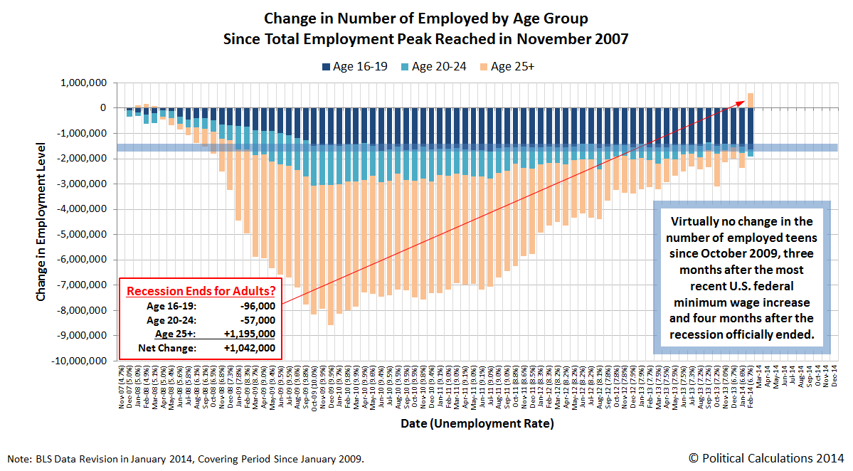
In our view, the age-based jobs data for February 2014 is likely an anomaly. The household portion of the employment survey was conducted during the week of 12 February 2014, which coincides with a period of abnormally heavy winter weather in much of the U.S., and especially in Washington D.C.
That's significant because while we don't think the winter weather had much of an impact on the actual employment situation in the U.S., we do believe it affected the ability of the federal government's survey takers to collect data during that week, which subsequently skewed the results of the survey.
So we don't think the Great Recession is over quite yet for America's Age 25 and older population. We'll see how things stand next month now that we're outside of the worst of the season's worst weather.
Labels: jobs
Welcome to the blogosphere's toolchest! Here, unlike other blogs dedicated to analyzing current events, we create easy-to-use, simple tools to do the math related to them so you can get in on the action too! If you would like to learn more about these tools, or if you would like to contribute ideas to develop for this blog, please e-mail us at:
ironman at politicalcalculations
Thanks in advance!
Closing values for previous trading day.
This site is primarily powered by:
CSS Validation

RSS Site Feed
JavaScript
The tools on this site are built using JavaScript. If you would like to learn more, one of the best free resources on the web is available at W3Schools.com.
Other Cool Resources
Blog Roll


