Now that we've demonstrated that the passage of the Affordable Care Act has resulted in a declining quality of life for average Americans since 2009, we thought we'd next discuss how that outcome came to pass, but first, we thought we'd first illustrate the trade off that American consumers are being forced to make using a production possibilities frontier curve - perhaps the first time in living memory that such a curve has been developed using real life data!

A generic version of this curve is often presented in basic economics textbooks, where it is often referred to as the "Guns and Butter" curve, which is used to illustrate the trade offs that consumers have to make when they have limited resources and are forced to choose how much of two very different goods they can afford to obtain based on their cost.
We bet you never expected the choice to be between health insurance and entertainment! As the chart reveals, consumers in recent years have found themselves in the situation where they are being forced to give up entertainment because of the rising costs of health insurance. Because entertainment is always a voluntary expenditure, which people choose to do in their leisure time as they engage in their preferred activities, anything that negatively impacts their ability to consume entertainment-related goods and services can be considered to be something that negatively affects their quality of life.
In this case, the negative impact upon their quality of life is the result of the passage of the Patient Protection and Affordable Care Act (PPACA), which is alternatively known as just the Affordable Care Act (ACA) or more popularly as "Obamacare".
We'll demonstrate how the passage of Obamacare has resulted in a decrease in the quality of life for average Americans with the next several charts, in which we'll track how and why health insurance expenditures have changed in the period from 2005 through 2013. We selected this specific period of time because online health insurance brokerage firm eHealth has consistently published data indicating the average premiums that individuals have paid for their health insurance coverage by age group over this time, which helps explain the specific dynamics of why the cost of health insurance has increased so much following the passage of the Affordable Care Act into law on 23 March 2010.
Our first chart shows the annual average premiums for health insurance for the Age 18-24, Age 25-34, Age 35-44, Age 45-54 and Age 55-64 cohorts for each year from 2005 through 2013 - the typical costs paid by the non-Medicaid and non-Medicare eligible portion of the U.S. population who chose to buy health insurance policies for Single coverage during these years.

In this chart, we see that the cost of health insurance is age dependent, with the youngest Americans paying the least and the oldest Americans in the market paying the most. That makes sense not just because the oldest age group of Americans will typically have health care expenses that are six times those of the youngest age group of Americans, but also because this demographic group has the third highest incomes and also the greatest wealth by a wide margin.
Never the less, we see that except for a brief decline from 2005 to 2006, the cost of health insurance has increased for each age group.
But as we'll show next, it has risen more for some age groups much more than others.
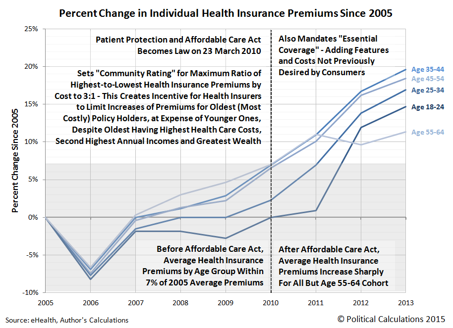
In this chart, we've calculted the percent change in Individual health insurance premiums that have been recorded since 2005. What we find is that in the years from 2005 through 2009, the cost of health insurance paid by all age groups ranged from a low of -7% to -8% in 2006 to fall in a band from 0% to +7% in 2009.
But beginning in 2010, which saw the passage of the ACA in the first quarter of the year, the cost of health insurance began to increase greatly, as health insurers moved to comply with the new requirements imposed upon them by the law.
In explaining why so many people during this time had their previous health insurance coverage cancelled, attorney Jason Cheung of LegalMatch explains the aspects of the Affordable Care Act that really jacked up the cost of health insurance in the U.S. during these years:
Why Has My Insurance Policy Been Cancelled?
Under the Affordable Care Plan, health-care insurance plans must meet a minimal standard of coverage. In order for an insurance plan to legal under the Affordable Care Act, the insurance plan must contain essential health benefits and it must have limited cost-sharing. If a plan does not meet either of those requirements, that plan is subject to cancellation.
What Are Essential Health Provisions?
The essential health provision requires that the insurance plan must at least contain the following benefits:
- Ambulatory Care
- Emergency Care
- Maternity Care
- Substance Abuse Treatment/ Rehabilitate Services
- Laboratory Services
- Prescription Services
- Children’s Dental and Vision Care
- Mental Health Care
- Preventative Services and Chronic Disease Management
- Coverage of Hospitalization
The Affordable Care Act requires that all preventative services be covered with no out-of-pocket costs and that the mental health and substance abuse treatments meet federal standards. In addition, insurance companies cannot impose annual dollar limits on the coverage of any benefit considered "essential."
Many of these "essential" benefits are actually unnecessary for many patients. Men typically do not want maternity care; some people will never have children, while some patients will never abuse substances. Many state plans do not include a benefit or two even though the benefit is considered "essential." If you feel that an "essential" benefit is not needed, you can either seek a grandfather plan exception or move to another state.
Mandated to provide previously unwanted levels of coverage to all health insurance policy holders, health insurers passed along their higher costs to health insurance consumers.
But that burden wasn't equally shared by all health care consumers. As our chart above confirms, the Age 55-64 cohort saw their health insurance costs go up the least during this time, which is due to another mandate in the law: the "community rating".
Here, the law was set up so that the highest premiums that would be paid by health insurance policy holders could be no more than three times the amount charged to those with the lowest premiums. As we noted early, the Age 18-24 group has the lowest premiums and the Age 55-64 group pays the highest premiums.
But to stay within that limit, health insurers had to increase the amount of premiums paid by all younger groups to compensate for the greater amount of health care consumed by this oldest age group. Our next chart reveals the ratio of each age group's health insurance premiums with respect to those paid by the Age 18-24 age group, who collectively pays the lowest premiums.
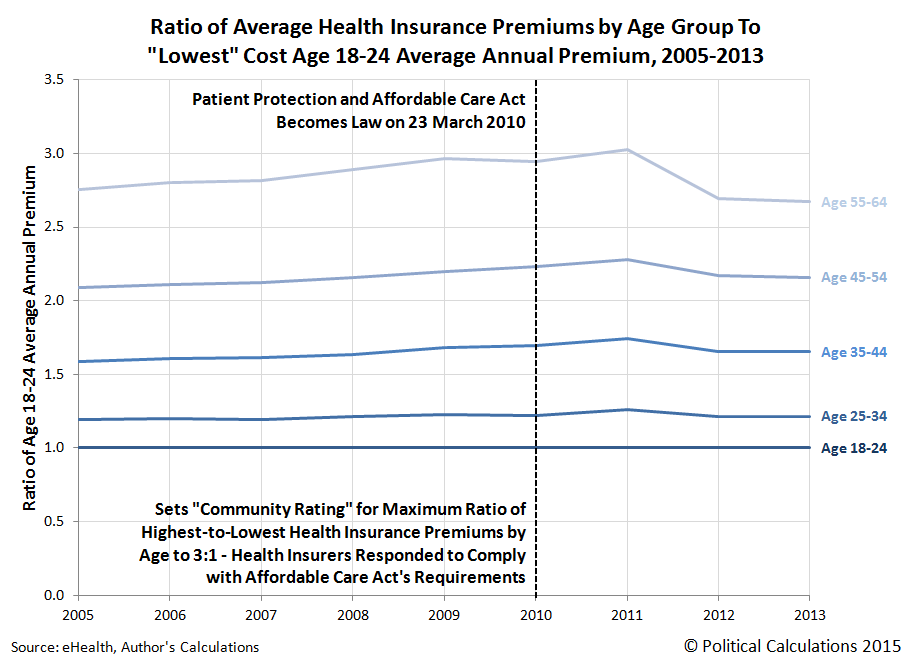
Here, we see that the health insurers satisfied the law's requirements for the community rating by a small margin (we should note that these ratios are based on average health insurance premiums paid - to stay inside the law's community rating mandate without triggering government penalties, health insurers would need that margin to accommodate their most costly policies.)
But because the premiums paid by those consuming the most health care services (the Age 55-64 group), satisfying the Affordable Care Act's community rating mandate requires health insurers to further jack up the costs paid by younger Americans - adding to their increased costs. This is very specifically why U.S. health insurers jacked up the cost of health insurance for the Age 18-24 group as sharply as they did after 2011.
That's how the implementation of Obamacare decreased the quality of life for average Americans by driving up the cost of health insurance. By forcing average American consumers to only be able to choose policies with unnecessary and bloated coverage and by forcing them to subsidize the demographically higher income and the wealthiest consumers of health care services through their premiums or else pay higher income taxes, the ACA is costing tens of millions of Americans hundreds and thousands of dollars each that they can no longer spend how they would rather choose.
No matter how you slice it, the passage of the Affordable Care Act has reduced both the quality of life and standard of living for average Americans. As we've just shown, the younger you are, the worse off you are.
Data Sources
U.S. Bureau of Labor Statistics. Consumer Expenditure Survey. Multiyear Tables. 1984-1991. [Text Document]. Accessed 23 March 2015.
U.S. Bureau of Labor Statistics. Consumer Expenditure Survey. Multiyear Tables. 1992-1999. [Text Document]. Accessed 23 March 2015.
U.S. Bureau of Labor Statistics. Consumer Expenditure Survey. Multiyear Tables. 2000-2005. [Excel Spreadsheet]. Accessed 23 March 2015.
U.S. Bureau of Labor Statistics. Consumer Expenditure Survey. Multiyear Tables. 2006-2012. [Excel Spreadsheet]. Accessed 23 March 2015.
U.S. Bureau of Labor Statistics. Consumer Expenditure Survey. 2013 Current Combined Expenditure, Share, and Standard Error Tables. Region of Residence. [Excel Spreadsheet]. Accessed 23 March 2015.
U.S. Bureau of Labor Statistics. Consumer Price Index - All Urban Consumers (CPI-U), All Items, All Cities, Non-Seasonally Adjusted. CPI Detailed Report Tables. Table 24. [Online Database]. Accessed 24 March 2015.
eHealth. Cost and Benefits of Individual and Family Health Insurance. Average Individual and Family Premiums and Deductibles (with Year-Over-Year Change) 2005-2013. [PDF Documents: 2005, 2006, 2007, 2008, 2009, 2010, 2011, 2012, 2013.] Accessed 30 March 2015.
Cheung, Jason. What Is the Affordable Care Act? LegalMatch. [Online Article]. 20 November 2014.
Labels: data visualization, demographics, economics, health care, insurance, quality
Today, we're going to follow up an observation we made when we examined the major trends for how the consumer spending patterns of Americans has changed from 1984 through the present, where we observed that since 2009, increases in expenditures for health insurance are being paid for by the reduced consumption of entertainment.
Let's start first by focusing just on the trends in consumer spending for the larger categories of Health Care and Entertainment. The chart below shows that from 1984 through 2009, the share of average annual total expenditures for both these items were less than one percent of total spending different from one another. But after 2009, that difference grew beyond that margin as something clearly changed to cause spending on the Health Care category to increase at the expense of the Entertainment category.

The Consumer Expenditure Survey provides some details on the components of spending that make up both the general Health Care and Entertainment categories. Focusing on the period since 2008, we've identified and broken those items out in the following chart, in which we've calculated the actual change in the dollar values of each of these components since 2008:

What we observe is that since 2008, consumer expenditures for health insurance has begun growing at an exponential rate, which we observe in the curving up trajectory of this category of spending, to where by 2013, average consumer expenditures for health insurance has increased by nearly $600 above their recorded 2008 level.
We also see that spending has increased by much lesser amounts in two other components of the general Health Care category, Medical Services and Medical Supplies. Both however are within $100 of what the average expenditures were for each in 2008. Meanwhile, we observe that spending for drugs, such as prescription medication, has been essentially flat since 2008.
By contrast, we see that average consumer expenditures for all components of the general Entertainment category have declined by anywhere from $40 to $120 per category, indicating a broad-based decline for Entertainment-related goods and services as a whole.
In our next chart, we focus just on Health Insurance expenditures and the combined Entertainment expenditures to find out the extent to which consumers have offset the exponential growth of health insurance costs beginning in 2009 with reductions in their expenditures for Entertainment.

In this chart, we find that through 2013, the total reduction in average Entertainment expenditures per consumer unit has offset $353 of the $576 increase in Health Insurance expenditures since 2008, or 61% of the increase. American consumers have offset the remaining 39% of the exponentially increasing cost of health insurance from 2009 onward through reductions in other categories of consumer expenditures, most likely those that have already established declining trends over the long term, such as those for Apparel and other Miscellaneous goods and services. We also identify the cause of the increase in average health insurance costs per American consumer unit: the Patient Protection and Affordable Care Act, which became law early in 2010.
Since we have already demonstrated that the real level of average annual total consumer expenditures has not significantly changed in the last 30 years, what this result means is that the documented increase in health insurance costs from 2009 onward as a consequence of the Affordable Care Act is in large part being paid for by Americans cutting back on their expenditures for these other categories of consumer goods and services.
This direct evidence strongly indicates that Obamacare, as the Affordable Care Act (ACA) is more popularly known, has directly led to a decline in the quality of life of American consumers since its passage, as American consumers are now much less able on average to consume other goods and services to the same extent they were prior to the passage of the law.
More on Political Calculations
Update 10 April 2015: We've followed up this post with more direct evidence of how Obamacare decreased the quality of life for Americans.
Data Sources
U.S. Bureau of Labor Statistics. Consumer Expenditure Survey. 1984-2013. [Online Database]. Accessed 14 March 2015.
Previously on Political Calculations
- Calculating the National Dividend - We solve a 109 year old challenge for how to quantify the national dividend as a consumption-based measure of the well being of the people of a nation!
- The National Dividend vs GDP - We show how our new National Dividend compares with GDP.
- An Almost Perfect Correlation - We demonstrate an almost perfect 1:1 relationship between average annual expenditures per consumer unit and median household income and explain the cause of the major variances with respect to that relationship.
- The Evolving Expenditures of U.S. Households - We take a step back to show how the major trends for consumer expenditures for U.S. households has evolved over the thirty years for which we have data.
- A Direct Cause of the Declining Quality of Life for Americans - We reveal how the Affordable Care Act has led to an indisputable decline in the quality of life of average American consumers.
Labels: economics, health care
Last week, we explored the history of the right triangle. This week, we're going to add an extra side and two extra dimensions as we consider the four dimensional cube!

Or, as Phys.org would describe it: "A rotating two-dimensional projection of the four-dimensional tesseract. The projection appears to change as it rotates even though the four-dimensional polytope is symmetrical because it is warped by the loss of two dimension[s]. [Image] Credit: Wikimedia Commons."
Here's hoping we all don't lose two dimensions and become asymmetrically warped this weekend!
Labels: math
Some time ago, we recognized that the number of companies acting to cut their dividends each month seemed to be a very good and simple predictor of the near real time state of the U.S. economy. Today, we're going to compare our performance against the supposed best economic forecasters of the world: the U.S. Federal Reserve and the Blue Chip Economic Indicators!
How we'll do that is pretty novel. We'll compare what our simple indicator was signaling once a month about the state of the U.S. economy throughout the first quarter of 2015 against the evolution of the actual range of forecasts offered by the Blue Chip Economic Indicators and the Federal Reserve's GDPNow forecast, as documented by the research department at the Federal Reserve Bank of Atlanta as of Wednesday, 25 March 2015.
Let's start with our own analysis, with the snapshot we took of the U.S. economy at the end of 2014, which we posted on 7 January 2015:
In December 2014, the number of publicly-traded U.S. companies announcing that they would reduce their dividend payments jumped up to 25, a level that we believe is consistent with contractionary distress being present within the U.S. economy.
From our observations of the limited data available, having 10 or more companies announce that they are cutting their dividend payments in a single month is sufficient to indicate that there are recessionary conditions in the U.S. economy. When that figure rises above 20 per month, it tends to coincide with some degree of contraction within the U.S. economy, which can impair the nation's GDP.
That's not to say that level of contraction qualifies as a full-bore recession - from all indications, it's more a sign that there is an increased degree of distress within the U.S. economy that is, as yet, too limited in scale, scope or duration to qualify as an official period of recession as might be determined by the National Bureau of Economic Research, which we describe being in a state of microrecession.
Next, here's our first look at how the U.S. economy was performing in the first month of the first quarter of 2015, which we posted on 3 February 2015:
Going by the number of publicly-traded companies that acted to cut their dividends in January 2015, the U.S. economy didn't just experience recessionary conditions during the month. Instead, it outright contracted.
Or perhaps a better description of what happened is that the U.S. oil industry's efforts to push its luck as far as it could has run out of good luck to push.
By that, we're referring to the consequences of falling oil prices, which are forcing an increasing number of companies tied to oil extraction activities in the United States to take the dramatic step of slashing their dividends. With 57 U.S. companies taking that action in January 2015, the number of companies taking that action in a single month is consistent only with previous months in which the U.S. economy either experienced contraction or in response to major dividend tax rate hikes.
January 2015 saw no major tax rate hikes on dividends, so contraction it is.
Our last snapshot of the state of the U.S. economy was posted on 3 March 2015 and takes us through the month of February 2015, where once again, we find that the U.S. economy was undergoing contraction.
Following its apparent contraction in January 2015, it appears that the U.S. economy continued to contract in February 2015.
We're basing that assertion on the number of publicly-traded U.S. companies that announced they would be reducing their cash dividend payments to their shareholders during the month of February 2015. With 38 companies taking that action, the number is lower than the 57 firms that took similar actions in January 2015, but is still well elevated above the number that would appear to correspond to a shrinking economy.
So there we are. On record as having described the U.S. economy as either experiencing or being in contraction at the beginning of each month in 2015-Q1.
We won't have the data for March 2015 until after the month has ended, but our early indication from our tracking of the actual announcements of firms that have acted to cut their dividends during the month is consistent with an ongoing period of contraction in the U.S. economy. We continue to believe the data indicates that the U.S. entered 2015 experiencing contraction and that it has experienced negative economic growth during the first quarter of 2015.
Now, let's see how that compares with the forecasts of the Blue Chippers and the evolution of the Fed's GDPNow indicator as it stood on 25 March 2015:
The GDPNow model forecast for real GDP growth (seasonally adjusted annual rate) in the first quarter of 2015 was 0.2 percent on March 25, down from 0.3 percent on March 17. Following this morning's advance report on durable goods manufacturing from the U.S. Census Bureau, the nowcasts for real equipment investment and real inventory investment declined slightly.
Here, we see that back in mid-to-late January 2015, which is consistent with where it entered the year, the "Blue Chip Consensus" forecast ranged from a low of 2.5% to a high of 3.4%, and was centered on a GDP growth rate of 3.0%. By the time of our second observation in early February, in which we declared that the U.S. economy was contracting, the range of the Blue Chip forecasts had widened to run from 2.1% to 3.5%, with the mid-range consensus set at 2.7%. One month later, as we indicated that the U.S. economy was continuing to experience contraction in 2015-Q1, the Blue Chippers were indicating the likely range for annualized GDP growth was now anywhere from 1.6% to 3.2%, with an overall consensus of 2.5%.
By contrast, the Fed's GDPNow forecast always ran to the low side of the range of the Blue Chip forecasts, starting at about 2.1% at the time of our contraction call in early February 2015 and falling to 1.2% at the time of our "continued contraction" call in early March 2015. Now at the end of the month, it is just 0.2% away from agreeing with our long-established assessment that the U.S. economy has been undergoing a period of economic contraction.
The difference, of course, is that we got there months ago with our very simple national economic health indicator.
Going back to 7 January 2015, you really have to feel sorry for the people who relied upon "most economists" or President Obama's Council of Economic Advisors to get their sense of the state of the U.S. economy going into the first quarter of 2015.
Labels: dividends, recession forecast
We've been exploring data found in the U.S. Bureau of Labor Statistics and U.S. Census Bureau's Consumer Expenditure Survey, which has provided a window into the annual consumer expenditures of American households (or rather, "consumer units") since 1984. Today, we thought it was time to take a look at how the major categories of that spending has evolved over the thirty years for which we have data.
Our first chart shows the average annual amounts that American households spend on things like housing, transportation, food and alcoholic beverages, life insurance and pension savings (IRAs, 401(k), Social Security), health care, apparel and other consumer products and services, entertainment (including reading), education and also how much they donate to charitable organizations.
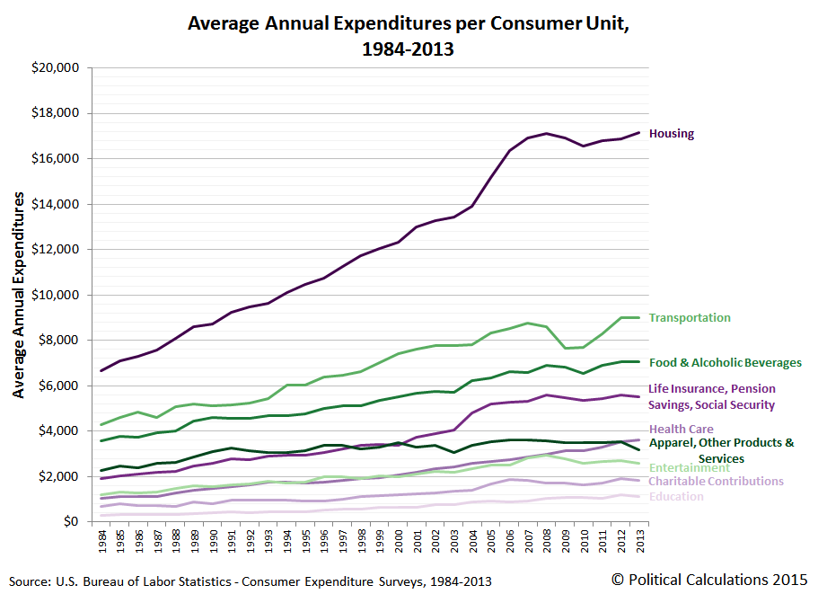
Next, we calculated the percentage share of these major categories with respect to the average annual total expenditures of U.S. consumer units, which reveals how much Americans have changed how much they spend on these major categories over the thirty years from 1984 through 2013:
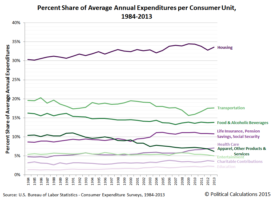
Because we've already demonstrated that in real terms, the total amount of money that the average American household spends on their annual expenditures has been essentially flat over the past 30 years, this chart reveals how Americans have shifted their spending over that time, increasing the share of money they spend on housing, life insurance and pension savings, health care, charitable contributions and education, while reducing the share of money the spend on transportation, food and alcoholic beverages, apparel, and other products and services, and entertainment.
Speaking of which, note the trends for health care and entertainment, which are nearly equal to one another from 1984 through 2008, but which diverge beginning in 2009. It is as if Americans are increasingly paying their increasingly higher health care insurance bills and expenses with money they might previously have spent on entertainment related expenditures, which means that the efforts of so many Hollywood celebrities to push Obamacare onto financially illiterate consumers has backfired on their industry.
Our final chart stacks these percentage shares to reveal how they fit into the whole of annual consumer expenditures for the average American household:
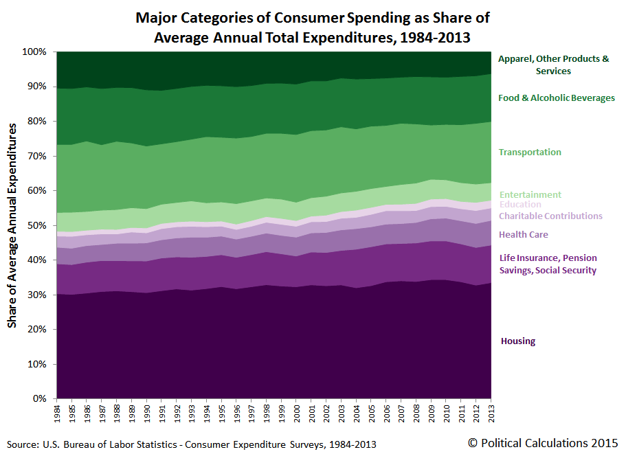
In this chart, we've ranked the major categories from greatest percentage share reduction at the top (in green) to greatest percentage share increase at the bottom (in purple) from 1984 through 2013.
Data Sources
U.S. Bureau of Labor Statistics. Consumer Expenditure Survey. Multiyear Tables. 1984-1991. [Text Document]. Accessed 23 March 2015.
U.S. Bureau of Labor Statistics. Consumer Expenditure Survey. Multiyear Tables. 1992-1999. [Text Document]. Accessed 23 March 2015.
U.S. Bureau of Labor Statistics. Consumer Expenditure Survey. Multiyear Tables. 2000-2005. [Excel Spreadsheet]. Accessed 23 March 2015.
U.S. Bureau of Labor Statistics. Consumer Expenditure Survey. Multiyear Tables. 2006-2012. [Excel Spreadsheet]. Accessed 23 March 2015.
U.S. Bureau of Labor Statistics. Consumer Expenditure Survey. 2013 Current Combined Expenditure, Share, and Standard Error Tables. Region of Residence. [Excel Spreadsheet]. Accessed 23 March 2015.
If you're one of those people (such as "Seeking Alpha commenters") who would like to see any the data we've presented above in real terms, you're welcome to do that math yourself. All you need is the data from the original sources we've linked above and the relevant Consumer Price Index data, which we've linked below, to do the math you want to do - it's super easy!
U.S. Bureau of Labor Statistics. Consumer Price Index - All Urban Consumers (CPI-U), All Items, All Cities, Non-Seasonally Adjusted. CPI Detailed Report Tables. Table 24. [Online Database]. Accessed 24 March 2015.
Labels: data visualization, economics, personal finance
Unlike a lot of analysts, we've always approached the Patient Protection and Affordable Care Act, which is perhaps better known as "Obamacare", from the perspective of personal finance. We care about what President Obama's "signature" achievement in office means to the bottom lines of ordinary Americans, which is to say that we care more than President Obama does about such things.
Because of that approach, we've recognized from the very beginning that for a lot of Americans, it would make significantly more sense to take a pass on buying the kind of "affordable" health insurance coverage that would be marketed to consumers in favor of paying a much more affordable "penalty" tax when they file their annual tax returns.
2014 was the first year in which Americans were mandated by the law to either pay health insurance premiums or pay higher income taxes. Let's see how real people are making that choice under the terms of the law:
WASHINGTON—A special enrollment period to obtain health insurance for millions of uninsured people who owe a tax penalty under the Affordable Care Act is off to a slow start.
The health law requires most Americans to have insurance or pay a fine at tax time. The open enrollment period under the health law ended Feb. 15, but the Obama administration said it would allow people who discover they owe a fine to sign up for coverage through April, at the end of the tax season.
Major tax-preparation firms say many customers are paying the penalty and not getting health insurance. It is still early, since the special enrollment period launched Sunday, but research also suggests that many people who lack health insurance will pay the penalty and not get covered this year.
Only 12% of uninsured people would buy policies if informed of the penalty, according to a survey of 3,000 adults polled through Feb. 24 by McKinsey & Co.’s Center for U.S. Health System Reform.
At H&R Block Inc., “our analysis indicates that a significant percentage of taxpayers whose household members were not covered for at least a portion of 2014 are opting” to pay the penalty, said Mark Ciaramitaro, a vice president of health-care enrollment services at the tax-preparation firm.
If it helps provide more insight into what's going on here, let's revisit our tool that applies specifically for those who will be making this personal finance choice during the remainder of the 2014 tax filing season. If you're considering buying health insurance between now and Thursday, 30 April 2015, our tool below will estimate what doing so may potentially cost you in 2015 (that's for 2015 only - the math won't apply for other years):
One important thing to keep in mind is that you won't get any meaningful benefit for having health insurance until after you've paid your annual deductible, which is the amount of out-of-pocket expenses for health care services that you agree to pay as part of the coverage level you select for your health insurance coverage. That means that you could be out-of-pocket on both your premiums and your deductibles before your Obamacare policy even begins to cover a portion of your actual health care expenses, so unless you can reasonably expect that you will have such large expenses (such as if you're expecting a baby or have a pre-existing condition), you should carefully weigh our tool's results.
Here's how one real person made their choice:
Richard Gonzalez, 59 years old, of Navarre, Fla., found out he will pay a $250 penalty for going without insurance. The retired employee of United Parcel Service Inc. said he won’t take advantage of the special enrollment period because it is cheaper for him to pay out-of-pocket for health care than to buy insurance on the exchange. He said he shopped on the exchange but would have to pay $400 a month for a plan with a $6,000 deductible.
“I think it’s wrong I have to pay the penalty,” said Mr. Gonzalez. “But it beats paying more than $10,000 a year.”
Richard Gonzalez appears to be a savvy consumer - we're pretty sure that he'll be more than capable of finding an appropriate and much more affordable alternative - including some where he might even avoid having to pay the tax as well!
As for other scenarios you might consider running in our tool above, you might consider the health insurance premium costs shared by "ScottinSC" via Twitter. And speaking of which, is it any wonder that one of the Patient Protection and Affordable Care Act's and President Obama's biggest boosters in the media is no longer describing the law as "affordable" in its headlines?
We confirm then that Americans can actually do the math for themselves when it comes to the Affordable Care Act. We're just happy to have developed a timely tool for making that personal finance math a lot easier to do!
Legal Disclaimer
Materials on this website are published by Political Calculations to provide visitors with free information and insights regarding the incentives created by the laws and policies described. However, this website is not designed for the purpose of providing legal, medical or financial advice to individuals. Visitors should not rely upon information on this website as a substitute for personal legal, medical or financial advice. While we make every effort to provide accurate website information, laws can change and inaccuracies happen despite our best efforts. If you have an individual problem, you should seek advice from a licensed professional in your state, i.e., by a competent authority (such as a licensed insurance broker, medical professional or legal services provider) with specialized knowledge who can apply it to the particular circumstances of your case.
Note that we didn't include "Healthcare.gov Navigator" or "community organizer" in the category of "competent authority".
Labels: health care, insurance, personal finance, tool
Now that we've established both how to calculate Irving Fisher's consumption-based measure of the size of the nation's economy as it matters to ordinary Americans (the national dividend) and compared that result with the alternative production-based measure of the national income of Gross Domestic Product (GDP) developed by other economists, the next question we'll address is how well does the national dividend line up with the incomes earned by the ultimate end consumers?
We'll do that as simply as possible, in nominal terms, by determining the correlation of the average annual total expenditures per consumer unit, which is the near equivalent of a U.S. household, with median household income over the thirty year span for which we have data for both series. The chart below shows the result of that very simple linear regression analysis.

What we find is an almost perfect correlation for the years from 1984 through 2013, where the relatively small deviations from the otherwise nearly 1:1 linear trend are easily explained by the following factors:
- The Dot-Com Stock Market Bubble (1997-2003)
- The First U.S. Housing Bubble (2001-2007)
- Fuel, Oxidizer and a Spark (Part 1)
- Fuel, Oxidizer and a Spark (Part 2)
- Fuel, Oxidizer and a Spark (Part 3)
- The Second U.S. Housing Bubble (2012-Present)
Otherwise, with such an almost perfect 1:1 correlation, we confirm that our consumption-based national dividend for the U.S. almost perfectly represents the national economy as experienced by its most typical and ultimate end consumer representative: the median U.S. household.
Data Sources
U.S. Bureau of Labor Statistics. Consumer Expenditure Survey. Total Average Annual Expenditures. 1984-2013. [Online Database]. Accessed 14 March 2015.
U.S. Census Bureau. Income, Poverty, and Health Insurance in the United States: 2013 (P60-249). Current Population Survey. Annual Social and Economic Supplement (ASEC). Table H-5. Race and Hispanic Origin of Householder -- Households by Median and Mean Income. [Excel Spreadsheet]. 16 September 2014. Accessed 21 March 2015.
Previously on Political Calculations
Once upon a time, last Wednesday, we solved a problem that had stymied economists since 1906. And we made it look easy!
Labels: economics, math, real estate, stock market
The YouTube video is one that high school math teacher Mr. D put together for his class that provides a brief history of the Pythagorean Theorem:
Just in case you were ever curious about how long math students have been having to learn about the Pythagorean Theorem because of how long people have been using it. And as a bonus, there's an ancient religious cult involved!
Labels: math
After discovering that it is now possible to calculate a consumption-based national dividend as originally proposed by Irving Fisher back in The Nature of Capital and Income back in 1906 (also available as a PDF document), we thought we'd next look at how our results for the U.S. from 1984 through 2013 compare to the Gross Domestic Product over that time.
To do that, we've taken our data for the average annual expenditures reported by the BLS and Census Bureau through the Consumer Expenditure Survey and multiplied those figures by the reported number of "consumer units" in the nation, which is roughly the equivalent of U.S. households, since such consumer units/households would represent the ultimate consumers in the nation.
Let's go straight to the charts. The first shows our results for the nominal national dividend for all U.S. consumer units/households.

Here, we see that in the nominal aggregate, both the total and true national dividend for American consumer units has increased over time. We also see that rather than follow steady trajectories over time, there is a remarkable chasm in the data for the true national dividend that runs from 2001 through 2007, which corresponds to the evolution of the first U.S. housing bubble, which was fed by an outflow of funds from the U.S. stock market after the inflation of the Dot-Com Stock Market Bubble peaked in 2000.
Let's next adjust the data to account for the effects of inflation. Since we're dealing with a measure of the consumption of all American consumer units/households, we've done this math using the CPI-U index.
Unlike what we observed in the trends for the real national dividend per consumer unit, which was characterized by a flat trend for the total national dividend per consumer unit and a falling trend for the household debt adjusted national dividend, we see that there has generally been a rising trend over time for the entire population of American consumers.
What that result suggests is that the real national dividend for the U.S. has increased over time only because its population has increased over time.
In our final chart, we'll calculate the relative percentage share of the national dividend, as measured by the aggregate total of consumer expenditures in the nation, with respect to the nation's GDP. This calculation will give us a sense of how well GDP works as an indicator of the quality of life of U.S. consumer units/households.

What we discover is that over time, GDP has become less and less indicative of the quality of life of American consumer units/households. In 1984, the national dividend in our implementation represented 49% of the nation's GDP, which has since fallen to 38%. What that outcome suggests is that the nation's GDP growth is not diffusing to the benefit of U.S. consumer units/household.
We suspect that has a lot to do with the increasing financialization of the U.S. economy, which is also reflected in the increasing degree to which American consumer units/households are maintaining their real standard of living with increasing levels of debt.
We should also recognize that the downward trajectory in the total national dividend as a percent share of GDP has not been steady over time. The decline of the national dividend has instead occurred in steps, which largely correspond to the terms of different U.S. Presidents, and which would suggest that changes in national policies applied in the Executive branch of the U.S. government are largely responsible for evolution of the trend.
This is where having more historic data would really be useful, but where we are limited because the available data only extends back to 1984. Never-the-less, we do observe that there is a distinct and steady downward trend during the terms of Democratic administrations, while the trend tends to be mostly flat during the terms of Republican administrations. There is one exception, which occurs between 1986 and 1987 during the term of President Reagan, which might perhaps be explained as an outcome of the 1986 Tax Reform Act.
This overall pattern might perhaps be explained by the unusual level of accommodation that Democratic presidential administrations provide to the nation's financial industry and big corporations after being elected with large amounts of funding from these actors, who then gain without sharing any of the benefits they receive to regular American consumer units/households.
That dynamic would then seem to explain why we've see GDP grow over time, without a corresponding improvement in the national dividend for American consumer units/households.
Data Sources
U.S. Bureau of Labor Statistics. Consumer Expenditure Survey. Total Average Annual Expenditures. 1984-2013. [Online Database]. Accessed 14 March 2015.
U.S. Bureau of Labor Statistics. Consumer Price Index - All Urban Consumers (CPI-U), All Items, All Cities, Non-Seasonally Adjusted. CPI Detailed Report Tables. Table 24. [Online Database]. Accessed 14 March 2015.
U.S. Bureau of Economic Analysis. National Income and Product Accounts Tables. Table 1.1.5. Gross Domestic Product. [Online Database]. Accessed 14 March 2015.
Labels: dividends, economics, politics

Is GDP growth a good indicator of improving quality of life?
That's a question that is featured at Debate.org, where at this writing, online polling indicates that 32% of respondents say yes while a wide majority of 68% of respondents say no.
We're not going to debate the topic - we're simply going to recognize that GDP really doesn't communicate how well the quality of life may be changing for a nation's people. That's because it's not really designed to address that question.
So what would be better?
In researching the topic, we dug deep into the history of how Gross Domestic Product became the defining measure of a nation's economic performance. Here, the godfathers of GDP were Alfred Marshall and A.C. Pigou, who originally developed the concept of a "National Dividend" or interchangeably, a "National Income" early in the 20th century. Their work was built upon by Simon Kuznets, who actually developed the prototype accounting calculations for GDP as we know it today.
But almost lost in that early history was a very different concept developed by Irving Fisher, who instead of focusing on production as Marshall, Pigou and Kuznets did, defined his concept of the National Dividend around what people consumed. And while Fisher's concept put the focus on the end consumers in a nations, people living in households, where their consumption of goods and services would provide a measure of their quality of life, it was never fully developed because of the challenges that lay in quantifying it.
Fisher's definition
This definition is entirely different from that of Marshall or of Pigou. Marshall and Pigou have approached national income from the production end, Fisher approaches it from the consumption end.
His definition is as follows:
"The national dividend or income consists solely of services as received by ultimate consumers, whether from their material or from their human environment. Thus, a Piano or an overcoat made for me this year is not a part of this year's income, but an addition to capital. Only the services rendered to me during this year by these things are income".
Thus, according to Fisher, the national income of a country is determined by annual consumption. Suppose, a piano of the value of $20,000 was manufactgured in the year 2009, then according to Marshall and Pigou, the entire sum of $20,000 will be included in the national income of 2009. According to Fisher, only the money value of the actual consumption of the piano in 2009 will be $1,000. Therefore, according to Fisher, $1,000 only should be added to the national income of 2009, and not $20,000 as would be suggested by Marshall and Pigou.
Fisher's definition appears to be better and more scientific than that of either Marshall or of Pigou, because he includes in the national income of the country only the money value of the actual consuption of goods and services during the year.
But Fisher's definition has little practical value. The reasons are as follows:
Firstly, since there are so many commodities and so many varieties that is is exceedingly difficult to estimate the money value of total consumption in the hands of millions of consumers in the country.
Secondly, it will be very difficult to allot a definite life to each and every good in order to find out the money value of its consumption in a particular year.
Thirdly, it will be a difficult task of calculating the money value of the consumption of durable consumer goods which will pass thorugh the hands of many persons.
We see that historically, the main obstacle to making practical use of Fisher's consumption-based definition of the national dividend results from the lack of adequate data to describe the consumption of millions of consumers in the country. But that hasn't been true since 1984, when the U.S. Bureau of Labor Statistics and the U.S. Census Bureau teamed up to conduct the Consumer Expenditure Survey. We actually now have three decades worth of solid data to estimate the money value of total consumption in the hands of millions of consumers in the country. That's something that wasn't possible in the early 20th century when these concepts of National Dividends or National Income were being fleshed out.
On reflection, we think that the second and third arguments listed above turn out to be immaterial, in that it is not necessary to allot a definite life to each and every good in order to find out the money value of consumption in a particular year.
Here's why. Taken in the aggregate, all consumer goods and services purchased in a given year are, in effect, fractionally consumed among all consumers, or as the BLS and Census Bureau affectionally refers to them, "consumer units", which are roughly the equivalent of households.

For example, in 2007, the CEX reports there were 121,700,000 consumer units counted in the U.S. economy, who purchased some 62,536 new pianos, to use Irving Fisher's example. The number of purchases in that year automatically incorporates the durability factor of pianos, because those who purchased new pianos in previous years are still in the process of consuming them. Except perhaps for the fraction of those whose pianos have reached the end of their lifespan, who will stop consuming their old pianos.
If you were then to add up the fractional consumption of pianos across all piano consumers in the nation, we should reasonably expect their total number to work out to be well within the ballpark of the number of new pianos purchased annually. And while supply and demand factors will most certainly apply, changes in the number of new pianos consumed annually could also be considered to be varying with respect to the desired consumption rate of pianos across the nation, where their expected effective duration of consumption from year to year is a driving variable.
In practice, we would potentially see that dynamic play out with piano consumers holding off on making new purchases and extending the life of their old pianos during periods of recession, and perhaps more often retiring and replacing their pianos at a much faster pace during periods of economic expansion, where they would increase their consumption of new pianos.
There is also the challenge of how to cope with changes in the value of durable goods like pianos whenever they are exchanged among the population of consumers.
But we think that's also immaterial, because it's really a matter of how the consumers choose to pay for the exchange. As a general rule, piano consumers have two ways in which they can obtain a piano in a transaction. First, they can transform assets they already hold, and which are not counted as part of the National Dividend under Fisher's definition, such as tapping the cash they may have in a savings account, to pay what they believe is an equivalent value for the piano they would rather have. In this case, there is no net change in the measurable quality of life for those participating in this kind of transaction because they have only exchanged assets of equal value between themselves.
Second, since a durable good like a piano can also represent a relatively high dollar purchase for most households, costing anywhere from $3,000 to $100,000, piano consumers could also finance some or all of their acquisition with debt. In this case, we can consider the term of their loans to be reasonably proportionate to the expected life of their new asset, where their debt payments will be spread out over the life of the instrument, reflecting its expected consumption.
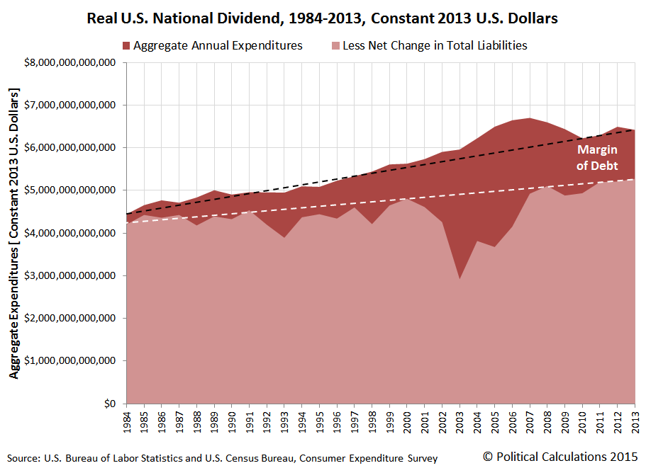
That means that we can directly calculate a true national dividend representing by taking the aggregate total of all consumer expenditures among all consumer units/households by subtracting the net change in their total liabilities from one year to the next. The result of that math would be a good indication of degree to which such consumers in the aggregate have sought to attain a particular level of quality of life today at the expense of impairing their quality of life tomorrow, as the bills for their desired consumption come due.
Let's do that math now with the data available from the Consumer Expenditure Survey. Our first chart shows the National Dividend for the average American consumer unit/household in nominal (current year dollar) terms for the thirty year period from 1984 through 2013:

Let's next adjust these numbers to account for the effect of inflation over time, with respect to the Consumer Price Index for All Urban Consumers, in All Cities, for All Items, so that the values are expressed in terms of constant 2013 U.S. dollars.

Examining this second chart, we find that over time, an increasing level of debt is being used to sustain the quality of life of American consumer units (households) at a relatively constant level. After accounting for the accumulation of debt via the true national dividend however, we confirm that the typical American consumer unit household would appear to becoming worse off over time.
There are a lot of questions that need to be addressed in this kind of analysis that we haven't yet touched upon. For example, how much could the shifting age demographics of the U.S. population of consumers be contributing to this pattern? Likewise, could generally falling levels of prices for major consumption items like food over time be responsible, which would actually represent an improvement in quality of life as measured by our application of Irving Fisher's national dividend concept?
For a concept that's been around since 1906, we're only just now at the beginning of understanding what the calculation of the national dividend is telling us.
References
U.S. Bureau of Labor Statistics. Consumer Expenditure Survey. Total Average Annual Expenditures. 1984-2013. [Online Database]. Accessed 14 March 2015.
U.S. Bureau of Labor Statistics. Consumer Price Index - All Urban Consumers (CPI-U), All Items, All Cities, Non-Seasonally Adjusted. CPI Detailed Report Tables. Table 24. [Online Database]. Accessed 14 March 2015.
U.S. Bureau of Economic Analysis. National Income and Product Accounts Tables. Table 1.1.5. Gross Domestic Product. [Online Database]. Accessed 14 March 2015.
Kennedy, M. Maria John. Macroeconomic Theory. [Online Text]. 2011. Accessed 15 March 2015.
Chand, Smriti. National Income: Definition, Concepts and Methods of Measuring National Income. [Online Article]. Accessed 14 March 2015.
Labels: dividends, economics, gdp, personal finance, quality
Welcome to the blogosphere's toolchest! Here, unlike other blogs dedicated to analyzing current events, we create easy-to-use, simple tools to do the math related to them so you can get in on the action too! If you would like to learn more about these tools, or if you would like to contribute ideas to develop for this blog, please e-mail us at:
ironman at politicalcalculations
Thanks in advance!
Closing values for previous trading day.
This site is primarily powered by:
CSS Validation

RSS Site Feed
JavaScript
The tools on this site are built using JavaScript. If you would like to learn more, one of the best free resources on the web is available at W3Schools.com.
Other Cool Resources
Blog Roll


