Reuters has sounded some dire news:
Wall St. tumbles as investors flee equities on Greek debt crisis
U.S. stocks fell sharply in heavy trading on Monday and the S&P 500 and the Dow had their worst day since October after a collapse in Greek bailout talks intensified fears that the country could be the first to exit the euro zone.
The European Central Bank froze funding to Greek banks, forcing Athens to shut banks for a week to keep them from collapsing.
And Greece appeared to confirm it was heading for a default after a government official said the country would not pay a 1.6 billon euro loan installment due to the International Monetary Fund on Tuesday.
U.S. investors also worried about Puerto Rico's debt problems and a bear market in China the day before quarter-end and ahead of Thursday's U.S. jobs report and the long weekend for U.S. Independence Day.
So are U.S. investors really "fleeing" the U.S. stock market based on the situation in Greece, Puerto Rico and China?
Well, if we look at what our standard model of how stock prices behave, we find that the level of stock prices is within the range of values we would reasonably expect them, whether U.S. investors were focused on either the third quarter of 2015, the fourth quarter of 2015 or the second quarter of 2016!
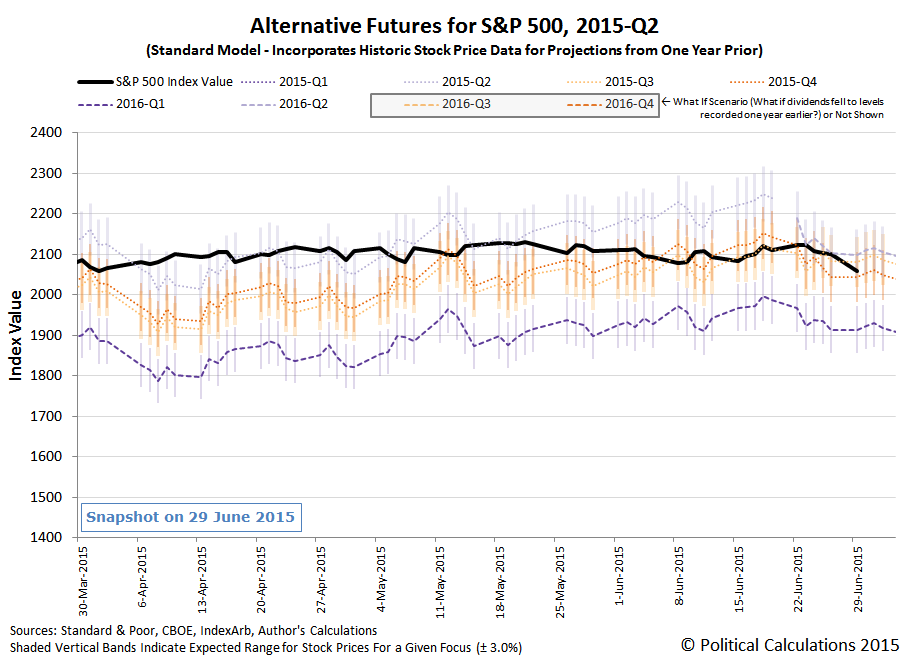
That's really a consequence of how tightly compressed the expectations for the change in the year-over-year growth of dividends per share in each of these future quarters is at this time - there's really not that much difference between them at this point (although watch out below if investors suddenly focus on 2016-Q1!).
But more practically, if we had to pick one future quarter where the expectations associated with are currently driving the trajectory of the S&P 500, we'd go with 2015-Q3, for reasons not having anything to do with Greece, Puerto Rico or China, so the answer to that first question is... not so much.
Which will be nice while and as long as that lasts, but perhaps a better and more relevant question to ask at this point is how close is order to breaking down in the U.S. stock market?
Keeping in mind that the answer is presently rising at a rate of just under 1 point per trading day, the answer that applies the S&P 500's closing value of 2067.54 on 29 June 2015 is about 1.3%, or 27.4 points away from the key statistics-based threshold.

More interesting is that its happening at nearly the four year anniversary of the last time order broke down in the U.S. stock market, after 30 June 2011, when the Federal Reserve's QE 2.0 bubble suddenly deflated.
So will the period of order that began on 4 August 2011 finally break down after holding for four years? Well, if we consider each of the alternative trajectories for which we have sufficient data to project into the future using our standard forecasting model is any indication, the answer is... almost certainly yes.
We've got about a month where we can continue to use our standard forecasting model for the S&P 500 in 2015, before we'll need to switch to our rebaselined model to work around the effects of the echoes resulting from last year's stock price volatility upon our standard model.
But this will likely be the last time we share what the alternative futures for the S&P 500 look like this year, as we'll have other things going on that will demand our attention.

We have been following the negotiations between Greece's new government leaders and the nation's European creditors with some interest as the nation would seem to be diving headlong into defaulting on its debt interest payments at the end of June 2015. Last week, we finally got the details for how each of these parties propose to both cut the Greek government's spending and by how much they would hike Greece's taxes through 2016.
As best as we can tell, Greece's economy is about to be struck with another body blow regardless of which bailout proposal might go forward as the stage is set for tragedy, no matter what.
But you don't have to take our word for it. Since we're the ones who built the tool that calculated, with uncanny mathematical precision, how the tax hikes and spending cuts approved by previous Greek government leaders and the nation's major creditors wrecked the Greek economy by ensuring that the nation would fall into deep depression, we're going to do that same math all over again.
The first set of numbers we'll be using in this exercise represent the tax and spending changes that Greek Prime Minister Alexis Tsipras' government has proposed to accept as a condition for receiving a new bailout, which were reported in The Guardian, and which Grumpy Economist John Cochrane featured on his blog. Totaling the detailed expected tax collections and spending cuts by year presented in the table above, we obtained the following hard numbers proposed for each in both 2015 and 2016:
| 23 June 2015 Greek Government Proposal for Tax Hikes and Spending Cuts | ||
|---|---|---|
| Tax Collections [millions of Euros] | 2015 | 2016 |
| Value Added Tax Hikes | 680 | 1,360 |
| Corporate Tax Hikes | 945 | 815 |
| Retirement and Pension "Social Contribution" Hikes | 350 | 800 |
| Other Tax Hikes | 320 | 397 |
| Total Proposed Tax Hikes | 2,295 | 3,372 |
| Spending Cuts [millions of Euros] | 2015 | 2016 |
| Retirement and Pension Cuts | 60 | 300 |
| Defense Cuts | 0 | 200 |
| Total Proposed Spending Cuts | 60 | 500 |
We'll also use the OECD's 2014 estimate of Greece's GDP of 179,080.6 million Euros as the baseline reference from which we'll forecast how Greece's GDP will change as a result of the Greek government's tax and spending proposals and we'll set the amount of quantitative easing that the European Central Bank might adopt at 0, which will give us an idea of the total amount of fiscal drag that the current Greek government would appear to be ready to impose on the Greece's economy.
The default data in our tool below is set up with the data for 2015, where we'll use the results for that year to repeat the calculations as they would apply for the proposed tax hikes and spending cuts in 2016. If you're reading this article on a site that republishes our RSS news feed, click here to access a working version of our tool!
Without any quantitative easing specifically targeting the Greek economy on the part of the European Central Bank to offset the negative consequences of the Greek government's proposed tax hikes and spending cuts for 2015, we can reasonably expect Greece's economy to contract by about 3.9% in 2015, with its GDP falling to 172,159.6 million Euros. Using that GDP number and substituting the Greek government's proposed 2016 tax hikes and spending cuts, we can reasonably expect that Greece's economy will further contract by an additional 6.0% from that lower level to 161,743.6 million Euros in 2016. Altogether, the Greek economy would be 10% smaller in 2016 than it was in 2014.
And that would be the consequences to Greece's economy that Greece's own government has proposed to accept as a condition for continuing to be allowed to borrow money from its international creditors. The situation for Greece's economy would be even worse under the counterproposal offered by those parties, who would have Greece increase its Value Added Tax collections by up to 1,789 million Euros in 2015 and up to 1,838 million Euros in 2016 (1% of the GDP they project for Greece in those years), while also boosting the amount of Greek defense cuts to 400 million Euros in 2016.
Adjusting the numbers in our tool above to reflect 3,404 million Euros worth of tax hikes in 2015 (still coupled with 60 million Euros of spending cuts) would have Greece's GDP in 2015 fall to 168,832.6 million Euros. In 2016, with an additional 3,850 million Euros of tax hikes paired with 700 million Euros of spending cuts, Greece's GDP would fall to 156,862.6 million Euros - a 12.4% reduction from 2014's GDP figure.

The reason why the negative impact on Greece's GDP is set to be so large is because the proposed conditions for receiving a new bailout to avoid a Greek default on its debt are so heavily weighted toward tax hikes over spending cuts, where tax hikes outweigh spending cuts by roughly a 10-to-1 ratio. The negative impact to the nation's GDP would be considerably less if the ratio were reversed - as it stands, they might as well burn the bailout money they receive as part of the deal being negotiated because they won't get any benefit from it.
The wild card in our analysis is the Quantitative Easing (QE) program that the European Central Bank might adopt to offset these negative impacts within Greece. The question is whether they are capable of working QE within just Greece itself to specifically offset the negative impacts that would be caused by their tax-dominant austerity plan within that nation. If not, the ECB would have to apply their QE programs across Europe as a whole where their efforts would have to be much, much, much bigger to be able to reach enough into Greece to avoid it falling even deeper into economic depression.
Neither option seems likely at present. Especially since the international creditors, made up of the European Central Bank (ECB), the International Monetary Fund (IMF) and the European Union (EU), actually seem to be intent on breaking both Greece's economy and the democratically-elected Greek government. And even more especially after the Greek government called to put the creditors' bailout measure up for a public referendum on Sunday, 5 July 2015, prompting the creditors this past weekend to cut off Greece's available lines of credit and thereby guaranteeing its default on 30 June 2015.
The international creditors' strategy at this point would not appear to have anything to do with genuinely resolving Greece's debt and economic problems, which they have been party to creating. They're trying to send a message to others in Europe who might threaten their supremacy by challenging them, where it seems that Greece is to be the example of what they mean will happen whenever they say "or else".
Why else would they reject Greece's proposal, in which the Greeks offered to slit their own economic throats and slash their own GDP by 10%, to instead demand that the Greeks slit their own throats even deeper and slash their GDP by 12.4% as a condition of keeping their IV drip of credit hooked up?
We can only conclude that things other than common economic sense are motivating the parties in this deal.
How Greece Got Here, or Rather, Previously on Political Calculations
We've been periodically monitoring Greece's deteriorating fiscal situation for a number of years. Here's our previous analysis, presented in chronological order.
Labels: gdp forecast, national debt
There are two ways to watch the following performance of Emimem's Lose Yourself: first with the sound on, and then with the sound off. Both are awesome!
HT: Kottke.
Labels: none really

After having worked out how many calories you're really eating, we thought we'd next turn our attention next to working out how many calories you're really burning when you engage in the two most common forms of physical activity: running and walking.
With these activities, there's an old rule of thumb that says it's the distance that matters most in determining how many calories you burn, where whether you run or walk, the amount of calories you burn will be the same if the distance you cover is the same.
That rule of thumb is something you'll often see if you monitor your estimated calories burned on a modern treadmill, which for every mile you walk or run on it, will often indicate that you've burned about 100 calories.
It turns out though that the amount of calories burned by running or walking over a given distance are different, as Amby Burfoot of Runner's World explains after investigating a contrary claim by David Swain, an exercise physiologist at Old Dominion University:
In "Energy Expenditure of Walking and Running," published last December in Medicine & Science in Sports & Exercise, a group of Syracuse University researchers measured the actual calorie burn of 12 men and 12 women while running and walking 1,600 meters (roughly a mile) on a treadmill. Result: The men burned an average of 124 calories while running, and just 88 while walking; the women burned 105 and 74. (The men burned more than the women because they weighed more.)
Swain was right! The investigators at Syracuse didn't explain why their results differed from a simplistic interpretation of Newton's Laws of Motion, but I figured it out with help from Swain and Ray Moss, Ph.D., of Furman University. Running and walking aren't as comparable as I had imagined. When you walk, you keep your legs mostly straight, and your center of gravity rides along fairly smoothly on top of your legs. In running, we actually jump from one foot to the other. Each jump raises our center of gravity when we take off, and lowers it when we land, since we bend the knee to absorb the shock. This continual rise and fall of our weight requires a tremendous amount of Newtonian force (fighting gravity) on both takeoff and landing.
Burfoot went on to provide the math formulas that would provide a better estimate of actual calories burned per mile by either running or walking, which we've adapted into the following tool. All you need to do is to enter your weight, whether you're running or walking and also the distance you're covering, and we'll do the rest!
In the tool above, the results for walking apply for walking speeds between 3 and 4 miles per hour. However, Burfoot reports that walking at speeds of 5 miles per hour or faster will actually burn more calories than running, since walking is more energy-intensive than running is at those speeds.
In terms of calories burned, the net calories burned figures are the important results in the tool, since those results account for your basal metabolism, or rather, how many calories you would have burned anyway over the elapsed time of the activity if you hadn't been either running or walking.
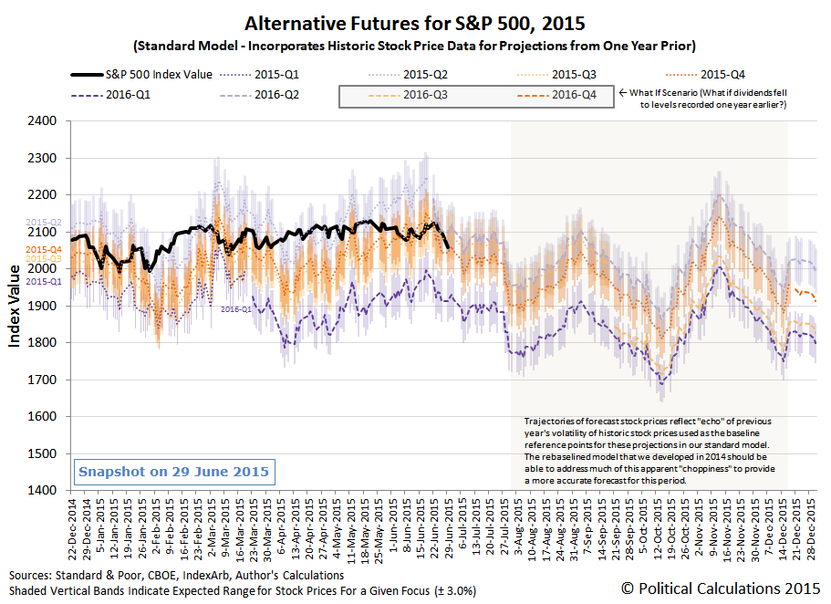
We now have a handle on what the expected future for the S&P 500's dividends per share is through 2016-Q2. Our first chart shows the recent past history of how Standard and Poor has recorded each quarters dividends from 2013-Q1 through 2015-Q1, with the expected future dividends as recorded by the CBOE's dividend futures contracts as of 19 June 2015, the expiration date for the 2015-Q2 dividend futures contract:

Standard and Poor will report its dividends per share figure for 2015-Q2 after the end of the month.
The most important thing to take away from the dividend futures data presented in the chart above is that the rate at which dividends are expected to increase is decelerating. Which is the biggest factor behind why stock prices have mainly moved sideways to slightly higher in 2015 to date.
More interesting though is how quickly investors have shifted their forward looking focus since last week, when they were tightly focused on 2015-Q3 as they went about setting stock prices. In the last two days, they've moved their focus in stages to the more distant futures of 2015-Q4 and then 2016-Q2.

And in making that last move, they've pretty much found the fundamental ceiling for the S&P 500, as the potential for continued upward movement through the end of June 2015 is limited to what we consider to be our typical margin of error.
That's not to say that stock prices couldn't move higher, but that would be consistent with what we would describe as a noise event, which would likely not be sustained in the absence of a significant improvement in the expectations for future dividends.
All noise events end. It's only ever a question of when.
Last week, when we unveiled our charts showing the historic price of the No. 1 can of Campbell's Condensed Tomato Soup for almost every month since January 1898 to the present, we couldn't help but notice that its price trajectory seemed to be pretty similar to that of the price of gold in the U.S. So, just for fun, we plotted the price of each on the same chart, in logarithmic scale:

So not quite parallel, but remarkably similar. That got us thinking - there are a lot of people who would really like to see the U.S. go back onto the gold standard, where the value of a U.S. dollar was set to be equal to a specified amount of gold, with the idea that would keep prices stable over time. But what if that's the wrong standard to use?
How do we know, for instance, that there isn't some sort of gold bubble that has inflated in the years since the U.S. went off the gold standard in 1971?
It occurs to us that's something that would become immediately apparent if we used a different standard to set the relative value of the U.S. dollar. Something like, say, a can of Campbell's Condensed Tomato Soup....
So we calculated the number of No. 1 cans of Campbell's Condensed Tomato Soup that it would be equivalent in value in U.S. dollars to the price of an ounce of gold. Our results are illustrated below:

We'll go over the history in greater detail at a future point of time, but what's immediately clear is that when the U.S. strictly followed the gold standard, the equivalent value of cans of Campbell's tomato soup was pretty stable. In the years from 1898 to 1933, we see that an ounce of gold would pretty consistently buy a little over 200 cans of tomato soup. After the U.S. devalued the U.S. dollar with respect to gold in 1933, we see that ratio jump up to 500 cans of tomato soup per ounce of gold until 1943, when it finally dropped below 400 cans per ounce of gold.
From there, the number of cans of tomato soup per ounce of gold ranged between 300 and 400 cans per ounce of gold until 1971 when the U.S. officially went off the gold standard. We see the ratio of cans of tomato soup per ounce of gold spike upward to be over 1,300 cans per ounce in 1974 before the price and wage controls that were imposed when the U.S. went off the gold standard were allowed to expire after the 1971 price and wage controls failed to cure inflation, allowing the ratio of cans of tomato soup per ounce of gold to fall back down to 600 in 1976 as tomato soup prices inflated sharply.
After that period of adjustment, gold prices grew much faster than tomato soup prices as the ratio of cans of tomato soup to ounces of gold spiked to 2,800 in 1982, before crashing back to between 1,500 and 1,600 cans per ounce of gold in the late 1980s and then dropping further to range between 650 and 1,000 cans per ounce of gold up into 2005.
Beginning in 2005, we see a new major bubble form in gold as it spiked upward once again to 2,600 in 2012, before falling back to where it is today, with a value of roughly 1,400 Number 1 cans of Campbell's Condensed Tomato Soup per ounce of gold.
As for whether gold or Campbell's Tomato Soup would be a better standard by which to index the value of a U.S. dollar, just answer the following question: After the zombie apocalypse, which do you suppose would make a better and more useful currency?
Labels: data visualization, food, inflation, soup
A week ago, we went to the very specific trouble of spelling out three very specific "what-if" scenarios for the trajectory that U.S. stock prices, as measured by the closing value of the S&P 500, would take during the week to be. Thanks to optimal forecasting conditions, one of those scenarios was almost perfectly dead on target.

The what-if scenario in question is the one where we projected what the S&P 500 would be if investors were to shift their forward-looking focus to 2015-Q3 in making their current day investment decisions. As for what made our forecasting conditions optimal, we have to thank the relative absence of noise in the market, where the Federal Reserve's Open Market Committee meeting provided the primary market news for the week.
That news was that economic conditions had improved since the first quarter of 2015, which investors interpreted as indicating that the Fed would be likely to act sooner rather than later to start hiking short term interest rates, which had become the dominant expectation on Monday, 15 June 2015. Although the Fed did not commit to a specific timetable or other details for its interest rate hiking plans, our standard model suggests that the stock market behaved in a way that is fully consistent with investors shifting their focus from 2015-Q4 in the previous week to instead fix their focus on 2015-Q3 and then holding it there through the end of the week.
So how come we couldn't have specifically forecast that specific trajectory? Why would we go to the very specific trouble of forecasting three separate likely trajectories for stock prices that differed only by how far in the future investors might focus their attention?
Well, as we keep saying, it is because stock prices obey the rules of quantum physics, where stock prices actually exist in a state of superposition, much like atoms and subatomic particles.
One mind-boggling consequence of quantum physics is that atoms and subatomic particles can actually exist in states known as "superpositions," meaning they could literally be located in two or more places at once, for instance, until "observed" — that is, until they interact with surrounding particles in some way. This concept is often illustrated using an analogy called Schrödinger's cat, in which a cat is both dead and alive until beheld.
Superpositions are very fragile. Once disturbed in some way, they collapse or "decohere" to just a single outcome.
For stock prices, the things that exist in superpositions are the expectations for the amount of cash dividends that will be paid out by specific points of time in the future, so we automatically have the situation where multiple expectations exist simultaneouly in the market. When investors observe, or in our terminology, "focus" upon a specific point of time in the future in response to new information as it becomes known, stock prices will collapse or decohere to a single outcome that is consistent with the expectations for dividends at the point of time they've focused upon within a relatively small margin of error - at least, given the amount of noise that typically exists in the market.
That situation applies when nearly all investors shift their attention to a single point of time in the future. There have been times when we've observed investors splitting their forward-looking attention between two separate points of time in the future, with stock prices falling between the "100% focused" trajectories our model forecasts, with stock prices being weighted accordingly with respect to the percentage split in investor focus.
As you might imagine, depending upon how different the expectations are for different points of time in the future, changes in stock prices that result from shifts in how far ahead in time that investors are focusing their attention can be very pronounced. Those shifts are a major contributor to volatility in the stock market when they occur and account for much of the apparently chaotic behavior of stock prices.
Knowing all that then, projecting the future trajectories of stock prices with some degree of accuracy is a complex proposition, but not a difficult one once you have the data that applies for each future point of time whose expectations for dividends are known. Anybody who can solve a simple quantum kinematics problem can do it.
Labels: chaos, forecasting, SP 500
Search engines like Google and Bing try to make searches faster by attempting to predict what you might be searching for based upon what other people using the search engines have been seeking. We wondered what would happen if we simply asked each of these search engines "why". The screen shots below reveal what we found. First, here are our results from Bing:

And then we repeated the exercise for Google. Here are the autocomplete suggestions that it offered when we simply asked "why":
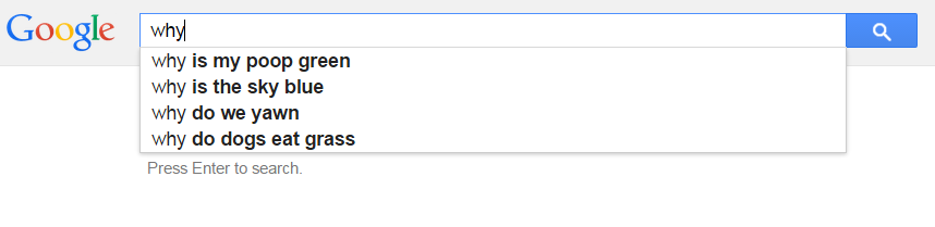
And so we discover that the people who use Bing have a lot less icky health situations than people who use Google. And that the users of both search engines are particularly curious about why their dogs are eating grass.
Who says that Google automcomplete is not as weird, dark or fun as it used to be?
Labels: none really, technology
The print edition of the New York Times has been disappearing, but the rate at which it is disappering appears to be slowing down. Through the end of 2014, the newspaper's weekday circulation stood at 648,900, which is just 57% of what it was as recently as 2006, the last time the newspaper's print circulation peaked, and is 55% of what it was in 1993, the first year for which the New York Times Company's (NYSE: NYT) annual reports documenting the newspaper's circulation were filed online with the Securites and Exchange Commission.
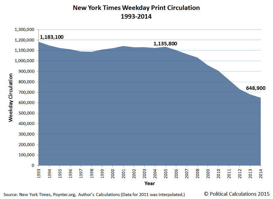
The New York Times has been seeking to transform itself into a primarily digital entity, as the company has gone from zero paying digital subscribers in 2010 to 910,000 in 2014. The company will likely surpass one million digital subscriptions by the end of the second quarter of 2015.
While that change has been going on, New York Times has also been transforming itself into primarily a national entity, rather than a regional one. The company's 2014 annual report is the first that provides no breakdown of how its circulation is divided between the 31-county region that had defined its "home" market and the rest of its circulation.
In 1993, the New York Times 31-county home market had accounted for 64% of its total weekday circulation. As recently as 2013, that figure had fallen to 43%, which had been buoyed up in part from previous years by its recent increase in digital subscriptions.
Since beginning its digital conversion after 2009 when it had a total revenue of $1.58 billion, the New York Times Company's revenues have fluctuated between a low of $1.55 billion (2011) and a high of $1.60 billion (2013), falling to $1.59 billion in 2014. Since 2009, the company has largely exchanged revenue from advertising, which has fallen from $797 million to $662 million, for revenue from circulation, which has increased from $683 million to $837 million. Combined, those changes represent a net gain for the New York Times Company of $19 million in revenue over the last five years.
It certainly can be a lot of work to just tread water.
Data Sources
The New York Times Company. Annual Reports (10-K SEC Filings). 1993-2014. Accessed 17 June 2015.
The New York Times Company. The New York Times Announces Solid Circulation Gains. [Press Release]. 1 May 2014. Accessed 17 June 2015.
Beaujon, Andrew. New York Times passes USA Today in daily circulation. Poynter. [Online Article]. 30 April 2013. Accessed 17 June 2015.
Labels: business
You know those calorie counts on the nutrition labels that appear on food packaging and also, thanks to Obamacare, restaurant menus? The ones that the federal government wants you to use as indicated in their instructions below before each and every single time you ever eat?

Science says those "Nutrition Facts" labels are wrong. All of them.
Almost every packaged food today features calorie counts in its label. Most of these counts are inaccurate because they are based on a system of averages that ignores the complexity of digestion.
Recent research reveals that how many calories we extract from food depends on which species we eat, how we prepare our food, which bacteria are in our gut and how much energy we use to digest different foods.
Current calorie counts do not consider any of these factors. Digestion is so intricate that even if we try to improve calorie counts, we will likely never make them perfectly accurate.
So if you're trying to reach or maintain a particular weight, those labels aren't going to do you very much good, are they?
Definitely not if you use them the way most nutritionists would have you use them, which perhaps shouldn't be a surprise given the close association that has developed between spurious nutrition claims, including many of those issued by the U.S. government, and junk science. And of course, because such people are usually unhappy and petty little power mad tyrants, what they want you to do is to document the calorie/carb/fat/salt/fiber/et cetera content of everything you eat, as you eat it, in a food diary so your shameful behavior is fully documented so that your guilt can be counted upon to motivate you to achieve your desired weight. Mainly because it makes them feel better.
That's despite their knowing that kind of calorie counting can really be considered to be a kind of eating disorder all its own. Worse, that food journal you might have diligently worked to document your food sins is really just a book of lies, because every nutrition label is wrong.
What if we could get you to your goal weight without all the guilt and hassle? And if you like, by eating the same food you eat today and maintaining the same activity level, with just some simple adjustments in the amounts of food you eat?
It turns out that there's a super simple way to estimate not just how many calories your body is currently effectively consuming, the same math can be done to estimate how many calories you would need to eat on average each day to reach and maintain your "ideal" or target weight.
Let's just get straight to it, shall we? Enter your current and "ideal" weight in our tool below, or if you're reading this on a site that republishes our RSS news feed, click through to a working version of our tool at our site, and we'll do the math.
For your results, the "Percent Adjustment" is the amount by which you would need to alter the amount of food that you eat today to reach your target weight over time, assuming that you maintain the same level of activity as you do today and continue to eat the same diet. Given what real science says about how how human metabolism works, the reading on your scale should slowly drift in the direction you want it to go.
See? Minimal grief! And the best part is that you no longer have to rely on junk nutrition "science" to work out both what and how much you should be eating or waste any of your valuable time either reading U.S. government-mandated "nutrition facts" labels or documenting what they indicate your calorie consumption is.
After all, your body is also saying that information is all wrong. You'll never get anywhere you really want to go by buying into a premise that's false to begin with.
Previously on Political Calculations
Elsewhere on the Interwebs
Added 24 March 2017: Habit Nest's Ari Banayan reviews math and strategies that can be used to be successful in achieving desired weight loss.
Added 24 March 2017: Dilbert cartoonist and business book author Scott Adams describes how two changes to your thought process can rework your psychology to promote both better eating and easier weight loss if those are your goals.
Labels: food, junk science, tool
How much has it cost to buy a typical can of Campbell's Condensed Tomato Soup since it was first produced sometime in 1897?
For the latest in our coverage of Campbell's Tomato Soup prices, follow this link!
Our latest project, in which we've documented the actual prices at which American consumers could buy a Number 1 can of the iconic product in each month since 1897 at discounted sale prices from their local grocers as documented in their ads in local newspapers, is incomplete, but we have enough data to provide the overall picture of the price history of a product that has been a top seller among all grocery items sold in the United States almost from its very introduction to the U.S. market.
The chart below reveals the data that we do have spanning the period from January 1898 through June 2015 and its trailing twelve month moving average, while also explaining just what we mean by a "typical" can!
Bonus Update: We've updated the price data through January 2021 in a new article, which includes filling in many of the missing months of data detailed below!
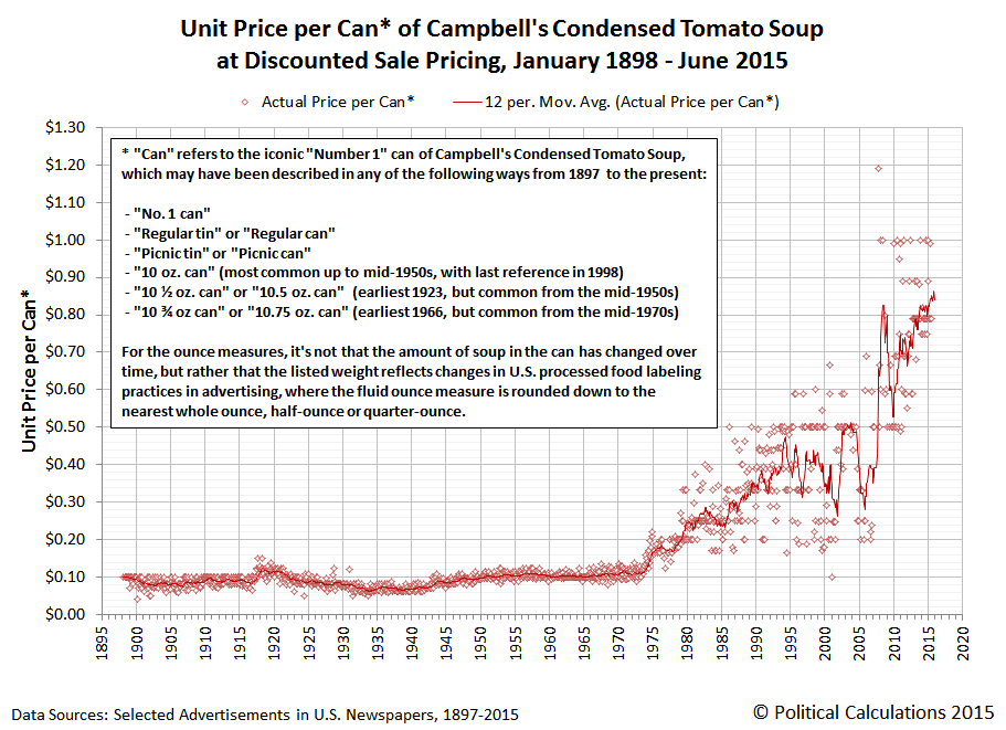
Here's the same information again, but this time, with the vertical axis changed to be in logarithmic scale and without the can trivia.

Although we suspect that some of our readers might like us to produce a chart showing this data after it has been adjusted for inflation, we would point out that those readers have missed the entire point of why anyone would document the actual prices that consumers paid for a single consumer product over 117+ years of its history - especially a product with the price history we've revealed....
Future Analysis
We're just rolling out the visualization of the data we have available today - we're not finished building the dataset yet! When we do finish however, we'll have solid data spanning the entire 20th century and the 21st century to date that can provide some really intriguing insights into the economic history of the U.S. Not to mention a database that can be tapped to explore the price history of other grocery items, which we'll make available after we've filled in as much missing data as we can.
About the Data
Our primary focus has been to identify the discounted sale price of Campbell's Condensed Tomato Soup - the price that Americans who might be casual or frequent shoppers at their local grocers or supermarkets would pay, without any manufacturer's coupons, reward programs, or other special requirements, such as a discounted price that would apply only if the consumer's bill reached a particular threshold or if the purchase of other items was required.
We also focused on the "regular", "Number 1" or "picnic"-size can of Campbell's Condensed Tomato Soup that has been continuously produced since J.T. Dorrance first formulated Campbell's condensed soup in 1897. Campbell's had been producing non-condensed tomato soup that it sold in a quart-size can for a number of years before its condensed soup version was brought to the market, which was also advertised in late 19th and early 20th centuries, and which was ultimately replaced by the condensed version, which would feed the same number of people (after water and heat was added, of course!)
Other than the size of the can, almost nothing about Campbell's Condensed Tomato Soup has been a constant over the food's history. Everything about it has changed incrementally over time: the tomatoes, the recipe, the can, the label, where its made - everything about it has been tweaked or adjusted in some way in an extraordinarily competitive and challenging business and economic environment.
And yet, it is as much of a constant as we suppose anything made by and for people can be, because of all that!
Filling In the Missing Data
We would like to request your assistance to help fill in the missing months where we don't yet have a documented source to reference the price of the regular/typical/picnic/10 oz./10.5 oz. or 10.75 oz. tin/can of Campbell's Condensed Tomato Soup. Here is the list of months we're missing, starting with those in the 19th century:
- 1897: All months
- 1898: February, March, April, October
During our project, we believe we found the first advertisement that ever appeared for Campbell's Condensed Tomato Soup, which appeared in a local newspaper as the product was first being introduced to what would prove to be a key growth market. Curiously, the grocer's ad omits the name of the famous soupmaker, but provides enough information to identify the product, while subsequent advertisements for the grocer would appear to confirm the mysterious condensed soupmaker's identity as the Campbell company!
We have data spanning each month of the next 95 or so years before we began running into blanks in the available archive data we were accessing:
- 1993: May
- 1994: April
- 1995: June, July
- 1996: May, June
- 1997: April, June
- 1998: April
- 2000: February, May, June, July
- 2001: January, September
- 2002: February, March, August
- 2003: April, May, June, July, August, November
- 2004: April, May, June, July, December
- 2005: July, December
- 2006: February, March, April, May, June, July, December
- 2007: April, May, June, July, August, October
- 2008: March, April, June, July, August, December
- 2009: January, March, April, June, July, December
- 2010: June
- 2011: April
- 2012: May, July
- 2013: July
While we could easily interpolate the missing data, we would very much rather be able to directly cite actual sources for the information we don't yet have - particularly where we have consecutive months of missing data during periods of significant changes in prices.
Nearly all of the missing data occurs during the last 20 years, with the biggest gaps concentrated in the period from 2000 through 2009. As it happens, this period coincides with the decline of the newspaper industry in the United States, which might partially account for the disappearance of many of the newspapers where grocers had previously advertised their product sales.
Beginning in mid-2009 however, we're grateful for the rise of "extreme couponing" as a pastime for a number of American consumers that, along with blogging, has proven invaluable for documenting in real time the kind of discounted price data we were seeking as part of this project.
Data Sources
Our primary sources comprise a number of library archives of microfilmed newspapers that have been digitized and, thanks to automated optical character reading technology, are also searchable - including the Library of Congress' Chronicling America, Newspapers.com, NYS Historic Newspapers, and the Town Crier of Tewksbury-Wilmington, North Carolina.
Beyond that, we extracted discounted price data from a number of coupon bloggers and discussion forums, including Springs Bargains, Hot Coupon World, Common Sense with Money, Hip2Save, Wild for Wags, and the Krazy Coupon Lady!

Image Source: Pacific Northwest National Laboratory.
Labels: data visualization, food, inflation, soup
The single best measure of the relative state of the U.S. economy when it is experiencing some degree distress is perhaps the number of publicly-traded U.S. companies that announce they are cutting their dividends each month. Through 12 June 2015, that indicator suggests that the U.S. economy has taken a positive turn beginning in May 2015, which we can confirm because the cumulative number of dividend-cutting firms in the U.S. in the second quarter of 2015 is now coming in quite a bit lower than the pace that was established in the first quarter, which experienced negative GDP growth:

But you wouldn't know that's the case from the U.S. stock market, which has basically been slipping sideways or only slightly moving higher throughout the whole second quarter of 2015:

The reason why the market has been moving sideways has to do with the complex nature of how stock prices work (described in math here), but in a nutshell, the explanation is this - while the U.S. economy is indeed performing better than in the first quarter of 2015, it hasn't translated into a robust improvement in the outlook for cash dividends expected to be paid out in future quarters.
Instead, the change in the year-over-year growth rates for each of the future quarters for which we currently have data (2015-Q3, 2015-Q4 and 2016-Q1) is such that stock prices are such that when we translate those expectations into the likely trajectories that stock prices are likely to follow, we find that they are much more likely to either continue moving sideways or to fall than rise, with the actual trajectory dependent upon the future point in time to which investors fix their attention.
That forward-looking focus appears to have become highly correlated with the U.S. Federal Reserve's plans for hiking short-term interest rates in the U.S. Here, the timing of when that might begin to happen has become a key driver for U.S. stock prices.
At present, the dynamics of that factor are as follows:
- For a hike in 2015-Q3, stock prices would initially dip a bit, before resuming a largely sideways trajectory in the short term (through the end of June). This scenario would correspond to the Federal Reserve coming to the conclusion that the U.S. economy is performing so strongly that it must act to begin cooling it off.
- For a hike in 2015-Q4, stock prices would move sideways to slightly higher in the short term. This scenario would correspond to the Fed seeing a slower rate of improvement in the U.S. economy.
- For a hike in 2016-Q1, stock prices would fall sharply before stabilizing at a level about 5% lower than the current level. This scenario would likely play out if the Federal Reserve comes to the conclusion that the outlook for the U.S. economy is likely to slow down from how it began performing in May 2015, and might also be influenced by external factors, such as Greece's looming debt default in Europe and its effect upon global markets.
The wild card in this is that we do not yet know what the expectations are for dividends in 2016-Q2. We'll know more about what the stock market future associated with that quarter sometime next week.
Today, we're featuring a nearly brand new invention, in that it was just awarded a U.S. Patent on 12 May 2015! And better still, it solves a problem that we suspect very few realized needed a solution. But we'll let its inventor, Elliot Zachary Kampas of Syracuse, New York explain via the "Background of the Invention" section of U.S. Patent 9,027,807:
This invention is directed to a wearable cup and/or bottle holder, that also serves as a hands-free utility storage device that can be strapped or fastened around a person's leg so that he or she will have a place to hold their beverage while seated or standing in a stadium or other arena, or at the beach or at a picnic, while riding in a car or boat, fishing, and even when walking in the park.
There has long been a need for some means to secure beverage cups or bottles when at an event, especially when the seating at the event provides no place to set down the cup or bottle securely. Cups and bottles are frequently knocked over and spilled when persons move around at the events. Frequently, persons can lose track of which cup or container belongs to which person, as well. Accordingly, a convenient holder worn on a leg, positioned anywhere below the hip all the way to the ankle, has been needed.
Well, when it's put like that, the solution becomes obvious, doesn't it? But in case you need some help visualizing it, we'll suggest you turn your attention to Figure 4 in the patent so you can see it exactly as envisioned by the inventor:
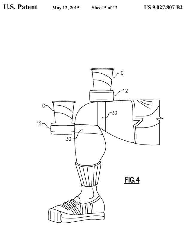
So we see that our drink consumer has at least two options by which the leg-mounted cupholder might be positioned for optimal positioning.
But wait, it gets better! Inventor Kampas reveals just who he envisions is the target market for his leg-mounted cupholder in Figure 6....

Notice the design on the invention user's shirt? Why, that's almost the Pittsburgh Steelers logo, as might be drawn to avoid running into any issues with copyright and trademark infringement!
But wait, it gets better! Our heroic inventor goes on to demonstrate in Figures 7 and 8 that the invention can also be used while at the beach. Whether standing...

or sitting....
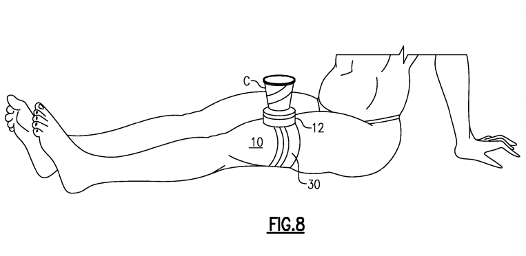
Alas, the inventor may not have considered the potential for producing unfortunate tan lines that might result from the latter application!
Other Stuff We Can't Believe Really Exists
- Inventions in Everything: The Leg-Mounted Cupholder
- Inventions in Everything: The Toilet Snorkel
- Inventions in Everything: Antiterrorism Barriers
- Inventions in Everything: Geothermal Beer Coolers
- Inventions in Everything: The Salmon Cannon
- Powdered Wine: Just Add Water!
- Fail: The Newest Innovation in Ice Cream
- Unlimited Virtual Legos
- Inventions in Everything: The Ultimate Turkey Blind
- Inventions in Everything: Turning Cans Into Sippy Cups
- Inventions in Everything: Anatomical Lego Figures
- It's Not What You Think....
- Inventions in Everything: Soup Bowl Attraction
- Inventions in Everything: Making Life More Difficult
- Inventions in Everything: The Oreo Separator Machine
- Air Shark!
- Markets in Everything: Stormtrooper Motorcycle Suit
- The Bike That Rides You
- One Inventor's Stick-to-itiveness
- High Five!
- Inventions for Everything
- The Best Mousetrap Ever
- An Invention for the True Wine Connoisseur
- Three of Ten Things You Don't Need on St. Patrick's Day
- The Future Just Got a Lot Cooler Than It Used to Be
- The Worst Piece of Design Ever Done
- The Magic Marker of the Future
- Coming Soon, to a Gym Near You!
Labels: none really, technology
Welcome to the blogosphere's toolchest! Here, unlike other blogs dedicated to analyzing current events, we create easy-to-use, simple tools to do the math related to them so you can get in on the action too! If you would like to learn more about these tools, or if you would like to contribute ideas to develop for this blog, please e-mail us at:
ironman at politicalcalculations
Thanks in advance!
Closing values for previous trading day.
This site is primarily powered by:
CSS Validation

RSS Site Feed
JavaScript
The tools on this site are built using JavaScript. If you would like to learn more, one of the best free resources on the web is available at W3Schools.com.
Other Cool Resources
Blog Roll


